Hey everyone,
Here are some useful things I took from these practices that you can test today!
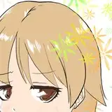
Miyazaki's Fan Art - Likeness and Proportions
"It's difficult," the caption says in this screenshot of Miyazaki's. I assumed it captured the moment of struggle while trying to create something. I felt very related, so I decided to give it a try. Although the portrait was very simple, I struggled to get the likeness on Miyazaki's anatomy proportions; this is mostly line art work. The trick is to compare the distance between shapes, like paying attention to the position of the nose in relation to the center of both eyes, the distance from the nose to the mouth, or the curve the cheek has in relation to the point of the nose. When I'm mapping the face shape, I'm always looking for spots to compare distance and make corrections; this sometimes becomes quick, but sometimes doesn't. It's a good thing to consider when trying out. For the rest of the render, I tried to keep it as simple as possible, as I was confident enough to get something interesting to show in the line art work.

.
Food Stand - Dynamism Shortcut
What I loved about this practice was the inclined angle the floor had in relation to the stand, also the color palette, where the turquoise contrasted the monotonous purple, almost grey. To get a similar result with perspective as I did slightly in this practice, when approaching front-view compositions, once you finish all the lines, select the whole drawing, hit Ctrl+T, and either incline toward one direction or use the perspective feature to make the top wider or tighter; this adds a bit of dynamism.

.
Sad Dumpling - Render Folds Are Universal
The same type of technique I've been sharing when rendering cloth also applies to this particular material. I wanted to keep all shadows sharp, but it looked way too different from the reference, so I decided to smooth a big portion of the shadow silhouette and leave sharp only the top. Not smoothing the whole thing I take as a way of stylizing the render; otherwise, it would be just another copy of a picture. So why is he sad? I just thought if he had a face, I'm sure it's melting, so, sad = melting, for some reason.

.
Giraffe Love - The Perfect Reference
After searching extensively for a reference I felt compelled to try, I found this warm moment in which the giraffe tongue struck me as unusual. I find this picture perfect because of the composition, positioning a nice moment right at the bottom, the giraffe mother (I assume) occupying a big space in the composition, making her size contrast greater with the little one, and finally the value contrast in their skin, combined with color, and as a last touch, the contrast of the purple in relation to the white and orange tones. The execution was very straightforward; I did not overcomplicate the render or drawing. I must say, if you joined Patreon because of this practice, this practice was great because the picture I chose was great. Check the references I've been saving on Raindrop; you might find more there.

.
Mouths - A Simple Tip for Teeth
I've not tried this sort of mouth anatomy practice, and since I did a nose one a few weeks ago, I decided to give it a try. Luckily for me, it was the same mouth, so I did not have to overcomplicate with colors or different tones of values, but with a very clearly defined line art, that's where most of the work went. A simple line art thing I like to do is to never define the line between teeth but still use the shape that separates the teeth from the gums very clearly. I think lines between teeth make them look a bit grotesque, unless you're aiming for realism. I choose this way of simplification to make them look cleaner.

.
Screw - Why Metal Is So Attractive
One last metal practice during this session because I can. I like to paint metal; I think this is because it looks so complex yet in execution can be very simple. The difference with the render in metal is that in most surfaces I paint, the part where the shadow is stays dark, but with metal, you can have light there as well, as a reflection from that side of the composition. This complex distribution of white and black values in the metal is what I believe makes it interesting to look at. Give it a try.

.
Practice 60/61 Process Video: https://youtu.be/2a01MEasd3g
Brushes: https://drive.google.com/drive/folders/1wHu8wuEHjDk-VfnZqv8iy8rwnvu8Ngmj?usp=sharing
Pre-order my book Life in Every Sketch on the 3DTotal shop: https://rebrand.ly/The-Art-of-RamonN90

Please let me know if you have any questions!