Okay y’all, I recently got super down in the dumps and I drew a four-page comic as therapy! It is called TFW, and I am gonna quickly show page-by-page the process of its creation.


PAGE 1: Probably one of the first things you’ll notice is the change in the caption; that day, I was feeling QUITE useless in my life, since I had to leave work after only 2 1/2 hours because I couldn’t stop crying. So that wasn’t great. It’s also not great when your boss seems frustrated, even when you damn well need to take care of your mental health. Whatevs.
The change in caption came from the fact that the rest of the comic didn’t really feel like it flowed well from that idea. It was more about being sad in general, and less about how it is to feel useless. So I changed it to fit more in line with the rest of it.
(Quick side-note: I am gonna soon write a post for my five dollar backers about my process of creation as a general thing, but I DO have to say right now that I write my comics as I draw them, and not before; page creation happens literally as I am drawing, and I often don’t know what’s fully going on with a page until I have finished it.)
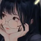
Initially I thought this comic could be one page, with the first panel being my facue next to window blinds, but I liked the face so much I just drew my whole body, this making me do a multi-page comic, instead (since I didn’t want to just draw a pin-up).
After pencilling the rest of the page’s, I went through and inked the outline as always, and then kinda figured out the best way to fill in the black spaces - sometimes I know what I am doing with that, and sometimes not. I am most happy with the hair in this panel. I previously really sucked at inking long hair, but this has the most appealing shine to it for me, so fuck yeah. Afterward, I had to texture the background, which is THE BIGGEST BITCH. I chose that weird volleyball pattern and added a bit of shading here and there to hopefully make the image as a whole pop more. All-in-all, it’s my favorite image I have ever drawn of myself.


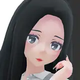
Page 2: I believe in paneling that produces contrasts between each other so that the eye is led around in fun ways, and not stuck reading everything just...across. So for me, the middle panels here were the hardest. When I pencilled them, I knew they were gonna suck to figure out how to keep that contrast going, because when I consider what I left white and open, it didn’t have an up and down like I intended. So...I kinda just said, “Fuck it,” and textured the shit out of it, because I was annoyed with how much white space I was letting stay.
I drew this page because it was very literally what I had just gone through after coming home. I think I started writing a little bit of stuff, but I didn’t have anyone around to make me feel better, and so I just...I had taken a break from social media to help get my head straight, and so I didn’t want to turn to that to feel better, either.
That pattern on the journal is far from the pattern on mine. Often time when I am drawing for reference, I get SUPER lazy. I thought I remembered what my journal looked like, but that seemed to tough to draw, and so I just went with something random but hopefully eye-catching. The next day, I looked at my journal again, and realized the pattern was way easier not only than I remembered, but than I had drawn (of course I would be the type to make things harder on myself). I literally hadn’t looked at my journal for reference because it was sitting away from me across the room, and I was inking in bed. I suck.
Another example of that same thing - if you look at the inking on my hair in Page 1 and then Page 2, it looks noticeably different, and that’s because I was too lazy to go check how I did it, relying solely on faulty memory, even when the goddamn page was sitting my lap (fixed that for page 3, tho). So I essentially don’t like how I inked my hair on this page very much, although I do like the drawing of me on the sad and angry panels (Tho not the happy or thoughtful ones).
I find influences weird - I think I pull from a lot of manga and anime stylistics without that ever having been a HUGE part of my life (more anime than manga, tho, as I watched a lot of DBZ and Pokémon and shit), and so that last whole panel-less image is basically just my version of sadness as funneled through a million things.


Page 3: First - better hair than page 2. Second - WHEW was this page a pain in the ass. Like, it looks so simple! Just two panels! How could it be so tough?? But like...grrrrrrr.
I hadn’t really done a two-panel page before, but I really love it when one panel leads very very directly into the next from a simple action - in this case, a frightened realization that changes the entire mood.
I actually pulled the look of panel two from a comic I was drawing last summer that I never completed. It was some girl who realizes there is some creeper watching her on the street - the panels of her before she realizes that are some of muh faves I have done, but like, I’ll never finish that, and so I can recycle my own shit!
THAT SAID, I had no idea how to actually ink that hair whipping around, and so I just took my brush-tip micron pen and carefully, like, figured it out. It’s imperfect, but I am pretty happy with the result.
This was another page where background texturing was stupid, and I only figured it out in the VERY late stages (in fact, the stippling I did on panel one there was the last thing I did in the whole comic). I did all black for panel two and then realized that I could kind of have this sad darkness enclosing as this sad realization is about to hit. I also left my friends as these almost ghostly versions of themselves (as in, not fully realized art with regard to texturing and shading) to kinda show how distanced I can feel even when I am surrounded by those I love).
Friends in panel one from left to right: Jenna, Kris, Olivia, Marcos.


Page 4: I fucking hate stippling, but it’s one of the background textures I use most frequently because, when done well, it looks really dope; still, it’s always one of those “I hate my life” kinda things.
You might notice how I didn’t have the descending head-turning-out-and-getting-smaller thing inked on that second page, and that’s because I didn’t know if I actually wanted to do that or not. Like, maybe it would be enough to have just the upside-down silhouette above my head!! But the I realized that, going with those words about “getting my head straight,” it would be both a cool and useful effect to visualize that in the comic - and so here we are. My face at the bottom there looks dumb, but that’s what happens when you have to draw small people on 8 1/2X11x and you’re fairly inexperienced at it.
Still, I think it’s a kind of effective way to end a comic! But I did wonder when I was working on it - is it enough to sit here and give no ways TO get my head straight? Just talk about the fact that I need to do that? I didn’t really know, but I knew I wanted a four-page comic, and I had four pages. Plus, like, I actually DON’T have that answer. Some things help in certain circumstances and can hurt in others. It’s really...it depends so much in any given situation. I think I mostly wanted to convey the feeling of being lost while you’re reeling, even if it’s a kind of sad realization to have when you notice that you DON’T know how to move forward. Whatever. To move forward, I drew a comic. I just didn’t want to get that meta here. :/
AND SO, that about wraps it up for this one! I hope my rambling was in some way enlightening to y’all! This comic took about a week and a half to complete, but it really got me back in the creative zone and made me a lot happier. Also, usually when I finish a big project like this I can’t pick up art again for a while, but the very next day after I published this, I pencilled another four-page comic about naked men fighting in the snow, AND SO THAT CREATIVITY IS STILL ALIVE, BABY!!!