INTRO:
So as I stated previously, I am doing a deep-dive analysis of my 2019 comic My Life to Live; it’s something I have been wanting to do for some time, simply because I feel I have a lot to say about it, and as much as I believe in letting art speak for itself, I think enough time has passed (over two years, already!!!) for me to feel comfortable doing this!
To start: back in early 2019, I ran into my friends Becky and Michael, both comics industry professionals, who pushed me to sign up for a table at Staple! Independent Expo, essentially a very popular zine and comics convention held in Austin every year. In doing so, I knew it would give me the impetus I needed to get a completed book done (if I paid all that money for the table and told everyone I was working on a book and then didn’t have a book when I finally tabled, I would have failed both myself and everyone else, something I would not let stand!). But what would the book be?
In April of that year, I took a trip to NYC - my first time ever as an adult - and I ended up seeing more movies in theaters in that brief week than I had probably in like the whole year prior. It reminded me that, if we’re supposed to write about what we know, then why don’t I write about the thing I spent a decade of my life studying: cinema! So the combination of the big city vibes I’d always wanted, and this kind of cinematic existence, paved the way for what would become My Life to Live.
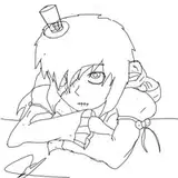
Back in Austin, I tried to get to work on a story, but to little avail. The initial idea for a movie-based comic sprung up from this page:

And following that, I drew a few mock-ups of pages, just for design:

Now this story was very different from the final book; this one, in fact was an erotic comic with a punchline. Essentially, it was about a girl who goes to a theater one day and is just like, “Uh yeah, movies are whatever,” because she’s never had any kind of communal experience at the movies. The theater is showing Tsai Ming-Liang’s incredible but definitely pornographic movie The Wayward Cloud. Everyone in the theater is making out and people start fucking each other; it eventually turns into a giant orgy in which she is also a willing participant, and everyone orgasms at the same time. At that point, security comes in and kicks them all out. As they all walk back out into the open air, she finally understand the communal experience of theater-going.
It was a funny idea that I liked! But it also felt slight, and I didn’t know if my art chops were up to it. So I ended up dropping it.
One day I put on the Wong Kar-Wai movie Fallen Angels (an incredibly gorgeous, albeit incredibly boring, movie) for inspiration, and I was caught off-guard by the first shot, because it just immediately starts and has so much power. I did a little sketch from it and posted it on my Instagram story that I was gonna base an entire comic around it - which I didn’t even know at the time would end up actually true haha!


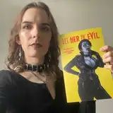
THE COVER:
The cover was drawn quite a bit after I had drawn most the rest of the book. The design is pulled directly from this very famous image of Jean-Luc Godard in which he holds a film strip up to the light while wearing sunglasses:

The title, too, also comes from Godard; it’s actually the English translation of the title of his feature film Vivre sa Vie. Because the book operates in this world that is so heavily derived from cinema, and has such a specific outlook on cinema, it seemed only appropriate to have such blatant references directly at the outset. But I did want to make sure that I also acknowledged that this very specifically WAS a comic book, and how that impacts every aspect of how this book plays out, and so I did that by using only a CMYK color scheme, which is the basis for a lot of comics printing. Honestly, I am still proud of this cover, my first ever!
PAGE ONE:

My method of comic making, mostly, does not rely on scripting first, but rather just DRAWING and then building off that. My brain has certain narrative trajectories that it tends to follow, a lot of which come from various narrative-based or avant-garde cinemas, and so it ends up flowing kinda wild. That was exactly the case with this book, which I was constantly figuring out as I was going along (completely refiguring the final page on the final day I could possibly draw it).
So when I comes to My Life to Live, I didn’t know what I was doing. I drew a page with three long, equal panels, and then just these three short panels in front of each. The original idea was a time-stamp in the first panels on each row, and then three different girls looking over their shoulder at…something! I didn’t exactly know what, nor what that would lead to, and so I started over. So instead, I redrew (from memory, which provided a few inconsistencies) the opening shot of Fallen Angels, but with different people in place. I thought, well, she looks pissed, and he looks fucked up, but generally pleasant, and so maybe there is some antagonistic vibe here. And then I just ran with that!
Before I ever came out as trans, I told myself and others that, if I ever realized I was a girl (uh HINT HINT, BABY CHLOE), I would name myself either Alice or Claire (LOL). And so I gave the girl the name Alice, and I thought of the vibe at the beginning of Godard’s Vivre sa Vie, in which Anna Karina (Godard’s real-life wife) argues with a Godard stand-in named Paul. And so I stole that, too. She leaves Paul at the end of that scene, and I don’t think she sees him again.
Paul’s opening line was supposed to be a reference to Monty Python’s Holy Grail, but I also realized it was a reference to Shakespeare (Mercutio gets stabbed in Romeo and Juliet and he tries to play off that he is barely harmed).
The heist idea just came from the fact that there had to be some reason they’re in such poor shape and pissed. I also thought that breaking up the opening caption gave it this fractured feeling, like the cuts to titles in a Godard movie (Jesus Christ, Chloe, calm down with the Godard love).
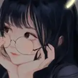
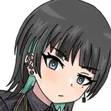
And Alice, of course, wears leather because I drew her and created her, so like duh. The freckles and mole, tho, were fun, because I think it’s really important for characters to have distinguishing features, especially since I am not the best at doing OTHER distinguishing features (tho I try pretty hard with noses!).
PAGE TWO:

The idea of the book having a movie within a movie within a book structure came about as I was figuring it all out mentally over the course of a few days. I came up with having a title fake-out which would possibly make people turn back to the cover to make sure they were reading the right book, only to realize later what the hell is going on.
Alice here is walking down an alley away from the world. Initially, I was going to draw a couch to the left of her in which Paul would be sitting, OR a door opening into the alley from which she just walked out, but honestly it came down to my poor knowledge of perspective and not reaaaaally caring about that, because I think the image has a good impact even without really knowing why this image is even happening.
The impact, too, is heightened by a really important factor, and that is: THE PAGE TURN! If you have read the book only in PDF form, this plays differently, but I very carefully and methodically crafted each series of pages to almost never have the biggest, punchier images on the right side of a two-page spread, because it just doesn’t hit the same way. Sometimes I would extend a sequence in terms of page count ONLY to allow for the most impacting image to be on the page-turn. But that’s just comics, baby!
This page in particular pulls a ton from José Muñoz, whose work on Alack Sinner was incredibly influential on the style of this whole book. Now unfortunately I did not have the confidence of Muñoz to create the kind of contrast he does, with intersecting black shapes creating the whole world (he doesn’t have to draw everything visibly in the panel for you to get to general feel and mood he’s approaching), but with regard to energy - that’s what I really needed! He also really does a good job of just creating a whole New York vibe, which was incredibly important for me.


One thing to really keep an eye on is Alice’s (and eventually Claire’s) position within the frame: she is almost always facing toward the left. It was initially kinda just accidental, having drawn this second panel, but it’s so wholly important to the the entire book. Because people in the west generally read left to right, if you put something in the frame facing the opposite direction, it creates this backlash with how you perceive it - it butts up AGAINST you. In this case, it means that she is not actually pushing herself forward, but rather just stuck in her mind in the past. That will be the case for the first two-thirds of the book.
Both of these panels are loaded with references. In panel one, we have the obviously stolen title of WKW’s Fallen Angels - but we have it both in the English alphabet AND in Chinese characters (directly to the right of the title, on the building sign). Behind Alice, there is a building sign that cuts off which would fully read “Rohmer’s,” a reference to the filmmaker Eric Rohmer, whose written dialogue was always so life-like that it completely changed the way I thought about speech in cinema. And the graffiti at the right of the panel reads “T M-L,” a reference to Tsai Ming-Liang, whose film Goodbye, Dragon Inn (one of my absolute favorites - the whole thing takes place in a movie theater) I somehow entirely forgot to reference in the theater portion of the book.
In the second panel at the left, here we have a version of Ron Burgundy from Anchorman post-being fired taking about how bad of a choice milk was because it’s so hot outside. The sign on the window is a reference to filmmaker Jean Eustache; while his movie The Mother and the Whore is one of the greatest ever made, I think his other feature, Mes Petites Amoureuses, which has extended sequences within a movie theater, laid a greater foundation for this book. And then, the boy with the little fauxhawk and the earbuds? Why, that’s the first reference to me in the book - albeit me from 2014!
Fundamentally, it’s incredibly important to understand something: this book is everything I had wanted to achieve narratively for going on a decade, and the transformative aspects of it really reveal a lot about my own experiences with art (seeing Sin City opening day on April 1, 2005, forever changed the course of my life by making me shift my focus from wanting to do comics to wanting to do film) and with life. I LOVE the idea of magical transformations and I think I was able to get that across and still have this wild narrative structure here that was still able to create a POINT. But this reference, in which a forward momentum boy-Chloe sweats it out while trying to move forward in life, is nowhere near as uhhhh hilarious and accurate as the one on page three.
PAGE THREE:

This page is somethin’(!!!), and I think it’s one of the more cinematic pages of the entire book. After the book released, I had several people tell me how cinematic it was, and honestly while that was great to hear, it also kinda freaked me out; since I studied movies for so long, I just developed this very filmic language, even for comics. That’s really cool and all, but suddenly I was just like OH SHIT, NOW I NEED TO BE ABSOLUTELY SURE EVERYTHING I DO IS CINEMATIC; it’s honestly dumb to think that, tho, because it’s me and how I tell stories, and so there’s almost no way what I do WON’T be cinematic!
This is also one of THE most reference-heavy pages in the entire book. Just reference after reference, mostly just of stuff that I love, and primarily because it’s a city shot and New York has billboards like EVERYWHERE and I could just load the image with whatever I wanted to fill it out (ehehe).
So in Panel 1, from the top left, we have an ad for Sprite (my favorite soda, despite primarily just drinking water); below that we have “Hong’s Chick-In,” (don’t know why it wasn’t Chick-Inn, but whatevs) which is a reference to two things: 1) Hong Sang-soo, my favorite living filmmaker, whose movie Our Sunni has an early extended sequence that takes place in a second-story chicken place, and 2) this one-page comic I did back in like 2016 where the restaurant first appeared, as I was inspired by the exact same movie:

(This one page actually includes a lot of things that My Life to Live references, including Eustache and the famous Godard image [as a picture on the wall by the table], which tells you that I kinda stopped engaging with movies in any new way after a certain point.)
Next to Hong’s, we have “Agnes V’s,” a reference to the immense treasure of a filmmaker, Agnes Varda, whose movie Le Bonheur, with its specifically targeted narrative-unfolding, shocked my system to its core. Next to that, we have “Fred’s Bank,” a reference to one of comedian Steve Martin’s early stand-up specials (either A Wild and Crazy Guy, or Let’s Get Small) in which he said banks are named the intense way they are because no one would trust putting their money in something called Fred’s Bank. Above the bank sits a billboard for Charli XCX’s newest album (which I think was on its way but not out yet when I first drew this), CHARLI:

Then we have a billboard for my favorite movie, Yi Yi, with an image I pulled from the Criterion cover:

And then lastly down there we have an image of some eyes with glasses, which is taken from Jacques Rivette’s great movie Le Pont du Nord, a film about conspiracies and being watched at every turn. It doesn’t have a ton of relevance here, but Rivette, who is my favorite filmmaker of all time, directed many other works which certainly made a huge impact on how the narrative of this book unfolds.

The perspective in this panel isn’t perfect. The street is okay, but beyond that I was just like, “We need a good IMPRESSION of a city.” Since I drew this whole book on 8 1/2x11 printer paper, it’s not like a had a ton of space to go WILD with it, anyway! But I think it generally does the job! (Also I suck at drawing trees, so I made sure to cover that bad boy up with text)
Panels three and four are highly highly personal, and I think also fucking hilarious. So, if you didn’t know, the little boy in those panels is very much ME as a child holding my mom’s hand. I had a bowl cut for a huge chunk of my childhood, and I wore that DARE shirt even into my twenties like a fuckin nerd (it became ironic for me only after I turned twenty-one, when I DID do drugs for a brief period). For instance, here is a pic of me at my fifteenth birthday party:

So these panels are about me realizing I am trans. There I am, holding a balloon that says “#1 BOY,” which I let go of as soon as I see this leather-clad babe walking down the street - the very image of everything I wanted to be! I let the BOY balloon go, which flutters into the sky looking like uhhhhhh some sperm escaping from me forever (hahahaaaaaa I am basically sterile and no longer can produce the stuff!). That shift in the brain was more or less what happened when I was four years old watching Power Rangers; this episode came on where Billy and Kimberly are turned into punks, and Kimberly comes into school the next day wearing this sick leather jacket and spikey collar and my little brain was like “OH GOSH!” (While I didn’t actually realize I was trans until I was twenty-five, that definitely planted a super important seed)

In the final panel, the mom refers to the little boy as “Jack,” which was the name I always gave my doppelgänger when I was writing short films in my teens (Jack Sanders was the full name!). Behind them walks a man in a cowboy hat toward this bright white light, a reference to my mom’s departed boyfriend James, a good man for whom this book was dedicated who had passed away about a year prior. He always had a particular fondness for me, since he was also an artist, and I still miss him all the time.
The final panel is also a pulled from Wong Kar-Wai’s Chungking Express (my favorite movie of his), in which Brigitte Lin pulls off the wig she’s been wearing the whole movie and disappears, never to be seen again during the runtime, after this freeze frame. The core difference is that she walks out of frame to the right, which is her future, whereas Alice walks out of the frame to the left and just disappears into her own memory on the next page.

CLOSING:
So yeah, that’s the first bit of analysis, which I hope y’all enjoyed! I have a lottttt to say about all of this, but I hope it was worthwhile to experience. I know I said I was going to do this in four chunks, but honestly, considering how much time this took and how much energy this took out me, I’ll probably just do it in chunks of whatever size I am feeling at the time!
Thanks so much, and if you made it to the end, I hope you’re looking forward to the future installments!