These pages were honestly both a lot of fun to draw and fucking challenging hahaha.
This (non-canon) narrative of Anaïs focuses on how she has allegedly run her course of popularity, so it is time to lean into sex for the purpose of continuing to make big money at the movie theaters. Trying to capture her mentality here on page 7 was really fun. Just like… you are listening but you can’t believe what you are hearing! You are taking it in but it is causing you to zone out at the same time! How could… they just DO this!?
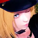
Those bottom panels… I tried to think of all kinds of zany things for these men to say about how hot Leather Ansïs is. The “DAMN DAMN DAMN!” actually comes from Billie Eilish’s brother Finneas, who commented that on his girlfriend Claudia’s thirst trap one time. Good shit! Hahaha. My roommate particularly loved “Losing it!!!” I also really like that like angle on the Agent’s face, which is kinda hard to get right sometimes. Drawing that crowd of guys was a pain in my ass, just because I want stuff to look readable and good ENOUGH. I think it looks nice and cartoony, tbh, but it could maybe look even MORE exaggerated.
Page 8 was another, like page 4, in which the drawing itself wasn’t that hard, but getting her face right WAS super hard. Honestly, I still don’t think I gave it the vibe I was actually looking for, but sometimes we just have to move on to get the work DONE! If I were to draw this page now, I can assure you she’d be WAY more felt-up, based on everything I have drawn of late lol
It was also that page where like… I just wanted to create some kind of thing that is both real and not at the same time. Like, where are these hands coming from? Why is the image outwardly fractured? Honestly, I don’t exactly know. That’s just how I always felt it needed to be, and I think the ideas still get across!!!
Page 9 is one that I feel mixed about. On the one hand, I think it builds very beautifully forward, but I was trying to do something almost Fellini-esque with that middle panel; because of my own lack of understanding of eye level and whether I think the Agent should be above or below hers… I just think it looks a bit awkward (not to mention that it’s not a particularly good or imposing drawing of him; really, when you do comics, it’s like… you want everything to be GOOD, but sometimes things just have to be good ENOUGH, you know???). I do really like the movement in those top panels, though. That’s something that is always so very, very important to me - comics as like a tonal building process. You need these gaps and beats for certain things to really HIT. I think her skirt could be drawn better, but ultimately it’s the motion itself and how it is broken up between the panels which is most important!