Good evening folks. Hope you're all having a great weekend.
As the suggestion of starting Team Fortress 2 was received positively, I decided to dive straight into editing for Random Team Fortress 2 Bullshittery (part 1) from last Monday.
Here's an update on progress so far:
I'm currently into editing day 5 of a probable 35 (a high ball estimate). And I've managed to cut the whole video end-to-end. This means all of the scenes are in place and it all flows relatively smoothly. To the point that I can watch it through. And I'm about to enter the text and animation phase. A process that normally takes about 1 day for every 60 seconds.
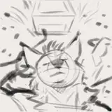
Here's a shot of the timeline:

So contrary to what it looks like here, it's actually the yellow segments that are the typical "1111" quick cuts I often mention in the overall balance. Being part of a collective montage of sneaky Spy moments, that gradually become longer and more comedically intense.
Whilst most of us had barely played Team Fortress 2, this wasn't the case for our Spy main players. Who became veritable predators among prey. Quebec in particular became a particularly amusing threat.
Therefore I've built the spine of the edit around scenes of reacting to spies. Starting soft, but eventually escalating to animalistic panic as we spray weapons in all directions. Hopefully it should be pretty funny.
Now there are two new things here to talk about: TF2 Font & Source Filmmaker.

As I've been discovering, the Team Fortress 2 font is actually pretty damn good. Having many of the qualities that make Dillenia UPC Bold (the bullshittery font) so appealing to me as an editor. The letters are thick and very easy to read. And the stroke (the outline around each letter) is pretty well done. Therefore I was thinking of using it for the entire series. Making the text seem part of Team Fortress 2.
The downside is that the lower case versions aren't as appealing. Meaning I run the risk of making it seem like everyone is yelling if I use only the upper case.
I'll experiment for a bit. And do the first few After Effects compositions with both fonts and then decide which looks superior. I'll also try to use the Red and Blu team colours depending on the speaker. Replacing the usual white and yellow that serve the same purpose.
The second notable thing is Source Filmmaker.

It would be a shame to make such a project without touching this classic animation tool. And I'm already used to having cutaway gags to emphasise particular jokes. Therefore I've been brushing up on my tutorials over the weekend to get back into the swing of it.
From an editing perspective, this also adds another dimension in the sense that there will be gaps in my timeline that I won't really be able to touch until the near end of the project.
What I'm going to do is place some temp animations - in the form of simple T-poses - where I plan to do a proper SFM animation set. And it's for this reason that the estimate is so bloated. The added complexity of these future animations.
I'll crack on with it and see how it goes later in the project. But for now, please know that the cutting phase is done. And the text animating begins.
In complete unrelated news, today I went for a ride on an 86 year old steam locomotive.

There's a train museum/preserved section of the old national rail line down here in the south of England. And my family had booked a carriage, bringing me along. It was rather cool. The staff were wearing period appropriate costumes and the train pulled into a prepared Santa's grotto thing for the kids.
My favourite moment was buying a bag of roasted chestnuts from 1900's themed vendor on the platform. And then offering one to my younger brother. Who then proceeds to bite into it - shell and all - whilst I stare at him like he's an idiot.
A good time out with the family :)