


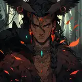
Here's the super rough draft. Similar to the most recent "Be Quiet!" episode, I am trying to use the background (in this case, the pillar) to emphasize our main character Duty Boy!
I want there to be many other customers looking at what's going on, but at the same time, don't want the attention to the focal point disturbed. So I applied a bit of repetitive rhythm on them, where the customers' head converge towards the focal point (Indicated by the green markings).
Because there are many straight lines going on in the scene that leads to the focal point, I want there to be some contrasting lines by having curves, so the way I introduced the semen collection cup is by making the arm hold the cup naturally in a way that creates this S curve!
While I wanted there to be another man sticking beside Duty Boy sniffing him, I don't want him taking up too much space, so I covered him up with a menu XD. It'll also be used to explain what "Cum Special" is (。•̀ᴗ-)✧
這是很草的草稿。和最新一part的「Be Quiet!」一樣,我試著用背景(這次是柱子)來框出我們的值日生!
我想讓周圍有很多客人好奇地圍觀,但同時又不想讓焦點被打亂。所以我運用了一點節奏在客人的頭上,讓客人的頭最終集中到焦點(以綠色標示)
由於場景已經有太多直線指往焦點了,我想要有一些曲線來做對比。所以我讓拿著接精液杯子的手自然形成了S曲線指向焦點!
雖然我想讓值日生旁邊黏著一位一直聞他的客人,我不想讓他佔太多的位子,所以就決定拿菜單把他蓋住了XD。菜單上會順便解釋「精液特調」的規則(。•̀ᴗ-)✧
I usually don't clean my lines this much since I am terrible at grasping volume accurately without shading, meaning I'll still have to do a lot of fixes and merge the lines once I add color. Nonetheless, practice makes perfect, so I once again attempted it xd.
我通常不喜歡把線整理到這麼乾淨,畢竟我是不上色就抓不太準體積,所以上色後基本上都還是要合併線稿來修。但凡事總要練習嘛,所以我又犯賤做了一次xd
Instead of using a flat color for the shadow layer, I am trying to introduce more color variation to suggest a more translucent and smooth skin. This is similar to how I used to color grayscale, starting from green and red base, but doing it this way is more efficient since it's only one layer. I personally quite like the result so far (*´ч ` *)
與其陰影圖層只用一個顏色,我這次嘗試帶入更多顏色變化來做出皮膚透光且柔軟的感覺。手法很像過往用灰階先上綠、紅底,不過這樣做更有效率一些,而且只用了一個圖層。我個人挺喜歡目前的結果的(*´ч ` *)
The skin feels even smoother after applying ambient occlusion shadows (*ฅ́˘ฅ̀*)♡
在上了閉塞陰影之後皮膚又更柔軟了呢(*ฅ́˘ฅ̀*)♡
I got too carried away with the skin and forgot his uniform XD. This time, I begin not with sketch lines, but with blocks of colors, trying to get the silhouette to look nice before introducing all sorts of details. A good silhouette should have good shape design and provide a clear read. This is something I'm quite weak at, so taking the chance to practice once again (ง ˘ω˘ )ว
太專注於他的皮膚結果忘了畫工作服XD。這次我不是從線條開始畫,而是直接用色塊來抓剪影的形狀之後才加上一些相關的細節。好的剪影除了要有好看的形狀,還要有很高的可讀性。造型算是我的弱點之一,所以也在趁機練習(ง ˘ω˘ )ว
Basically recycling the shadow layers from the body. This helps to hint the muscles beneath the shirts too 🤫
基本上就是重複使用身體的陰影圖層在衣物上。這有助於暗示衣物底下的肌肉線條🤫
I keep forgetting Duty Boy's watch xdddd
我一直忘記畫值日生的手表xdddd
I specifically chose the diamond design for the beer glass because it feels very rough and sharp, sharing a similar feeling to how tough the "Cum Special" challenge is. It is also a great contrast against Duty Boy's soft body (。・//ε//・。)
我刻意選擇這種菱形紋路的啤酒杯設計是因為它能給人一種很粗魯、銳利的感覺,與這次困難的「精液特調」挑戰挺搭配的。此外,與值日生柔軟的身體做出強烈的對比也挺不錯的(。・//ε//・。)
You might notice that I introduced a bit of lens flare coming from the top right corner, not only does it emphasize the direction of the lightsource, it also helps to provide more viewing direction for this piece
你可能會注意到我在右上角加了一點鏡頭眩光(Lens flare),除了強調光源的位置,更能讓讀者視線有明確的引導
This time @Draugnut said I did pretty good! ₍₍٩( ᐛ )۶₎₎
A few minor changes on the length of the upper arm and the collarbone structure, that's about it!
這次爪爪說畫得很棒!₍₍٩( ᐛ )۶₎₎
在上臂的長度與鎖骨的結構稍微有些小調整,基本上就這樣!
Sand Suna
2022-10-08 04:09:38 +0000 UTCShinji
2022-10-07 17:22:01 +0000 UTCSand Suna
2022-10-07 03:17:30 +0000 UTCShinji
2022-10-06 17:02:11 +0000 UTCSand Suna
2022-10-06 11:20:31 +0000 UTCLebenriss
2022-10-06 10:38:35 +0000 UTCSand Suna
2022-10-06 07:37:20 +0000 UTCSand Suna
2022-10-06 07:37:02 +0000 UTCSand Suna
2022-10-06 07:32:54 +0000 UTC犽連
2022-10-06 07:01:25 +0000 UTCVideogames121
2022-10-06 06:56:55 +0000 UTCsyo233215
2022-10-06 06:45:07 +0000 UTC


