SamSuka
Atypikk Mazenc
Atypikk Mazenc

patreon


Help me please !

Hey everyone,

First things first—don’t worry! There’s nothing serious going on. But I could really use your input on something that’s been on my mind lately. Your feedback will play a crucial role in the direction of my future asset creations.

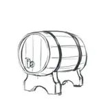
In the image of this post, I’ve included a sneak peek of a new asset that will be released in the coming days. With this piece, I experimented with a softer shading technique, using a slightly more sketch-like, penciled style. The reason behind this experiment is that I’ve been feeling that my usual shading might be a bit too harsh or solid. But maybe not? I’m really not sure, and that’s why I need your perspective.

Here’s where my uncertainty lies: I’ve noticed that when the shading is too hard or pronounced, assets become less readable, especially when scaled down for smaller maps. On the other hand, softer shading, like the one I used in the asset for this post, seems to maintain clarity at smaller scales. But again, I’m divided. I enjoy creating strong hatching and pronounced shadows, but I’m also growing fond of this softer, possibly clearer, shading style.

So, I need to know—what do you prefer? Do you like this softer shading style, or do you prefer the more defined and bold shading I’ve traditionally used? Your feedback would be incredibly valuable in guiding me towards one style or the other for my future assets.

Thank you so much for taking the time to share your thoughts. I really appreciate it!

Help me please !

Comments

honestly I love this shading so much better than other pieces (not that I don't love and am grateful for the other pieces) but the shading on this piece is just gorgeous

Kiera Gerety

Intuitively, I prefer the harder shading as it feel more 'stylized and distinctive' to me as well (citing Sea's comment). I do downscale a lot of your assets and never experienced any issues. Yet its ultimately whatever you prefer, independent of soft or hard shadows your art style won't change in essence. And that's what I am here for.

Fokes0815

I would say that both styles has some uses. Personally i prefer light shadow or no shadow at all even if its the shadow that comes with sunlight, the reason is because in my opinion it work bad with the mirror option (you cant mirror near to the same assets if it has the shadow because it move that too and it make it irrealistic) on the other hand some assets really shine with that extra dark color and specially on snow maps i like a lot the contrast, but this apply not for every piece. I think in the years you managed well the shadow affair, you started very heavy looking to your firsts works and now i think you are already adjusting it correctly depending on the theme of the asset (more gruesome more dark). If i may leave a tip i would suggest to amplify the work on the ground level of every assets, even some lines at the base of a building or some more texture at the bottom of everything will add a lot of "dimension" in the work and every assets will be much better grounded. You already have been done this kind of work but i will enphatize more because i have to add this "grounded" feel by adding trees, hills or some kind of ground texture for fill the blank spaces or for add some highness of the building (most castles are build on high ground ofc) and would be very cool if most of the assets had that into them letting me do some economy in my huge maps that already have reached the tree maximum number more then twice crashing the program xD Another thing that can be a small issue is the dpi level on some assets, aint noway that a small house take same space of a small castle, i must say that in this too you are the best on the market but for some specific pieces it is as i said a small issue (i remember the old camp and tents pack that has some dpi problems same the wells pack. At the smallest scal without touching the tool for make it even smaller a well of that pack is to much huge in comparison of everything, and always in my opinion its better to not use the tool because you lose a lot of details in the process of scaling all so its better to double care dpi

Darth andrea

I really like the detail of the softer shadows, but your harder, inky style is part of the reason I was drawn to your work in the first place, though I do like to make larger maps! I think that as long as there's consistency within the packs and it isn't too glaring when you put packs next to each other (I actually like to combine them) then do what brings you joy! Your older stuff was very shadow heavy and you do notice a difference with your newer work but change is good!

Samuel Skoog

Echoing some of the comments above, I love the soft shadows and agree that scalability it works better, but also just enjoy the work you put out either way.

Luke Taylor

Personally I prefer the harder shadows. This asset looks great, but I think the harder shadows are more stylized and distinctive. The harder shadows add more personality to the map if that makes sense. Ultimately I'd say your preference is most important though. It's important for you to enjoy your work and either way I really enjoy your art style!

Sea

I personally can't see much of a difference between the two styles without a direct comparison on the same asset.

Jade

I agree with John. Both have their use.

Alexandros

I just created this asset in that style;I didn't create a version with hard shadows.^^

Atypikk Mazenc

Would it be possible to compare this asset with the hard shading version? I think your main style makes your assets pretty unique, especially when working with colors. In this example, I think I like the transparent version but not that much the colored one, a bit too flat to my taste.

Moulk

I prefer the softer shading; it actually reads as more detailed

Dragolithic

I think the softer shadows and shading do allow for more readability(you’ve seen how big my map is), but I’ve never felt like any of the assets you’ve made have been unreadable either, even after being compressed on an 8k map they still come out looking like what you intended for them to be. I genuinely love your art style no matter which route you take with it, so I’d say, whichever style you feel like using for that asset/pack/theme works :) uniformity within the pack is always nice though.

Crusaderjak

Hey, I definitely like the softer shadows, as you said, they will be clearer when scaled down. I used most of your assets as guidelines for my map, like there will be a tower there, but when the players arrive, the tower is actually just a part of the ruins, castle or underground maze. I would say that not so clear assets give the vibe of uncertainty, like it looked somewhat like that, but now who knows. No idea if that even makes sense.

Loqe

I like both styles. I do tend to make enormous and over detailed maps, so shrinkability is good.

John Thompson


More Creators