


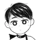
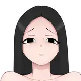
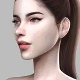
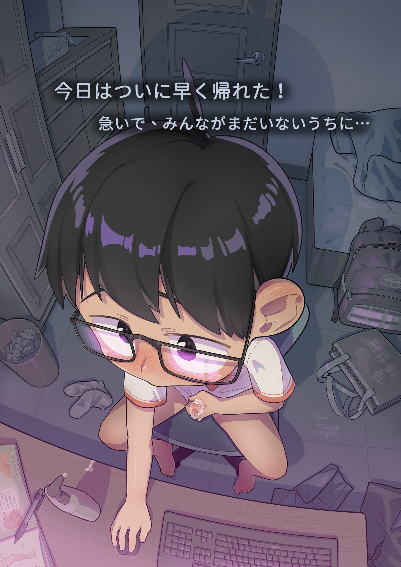
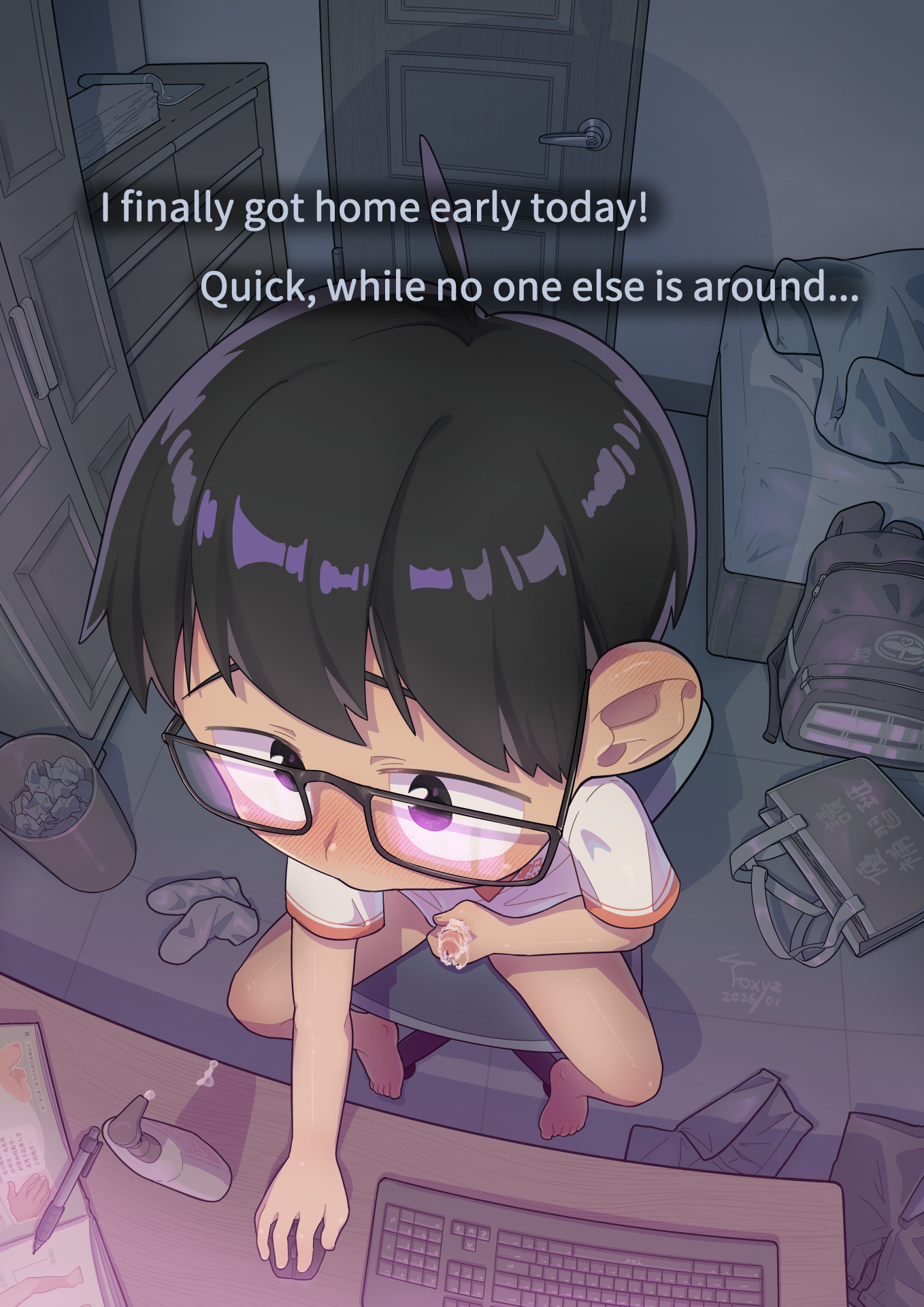
👓書凡くんは家に帰ったばかりで、
まだ他の人がいないうちに、こっそり遊んでいます。
---
👓Shufan sneaks in some fun while he’s just gotten home
and before anyone else is around.
---
👓書凡趁著剛回到家、還沒有其他人在的時候,偷偷玩樂!
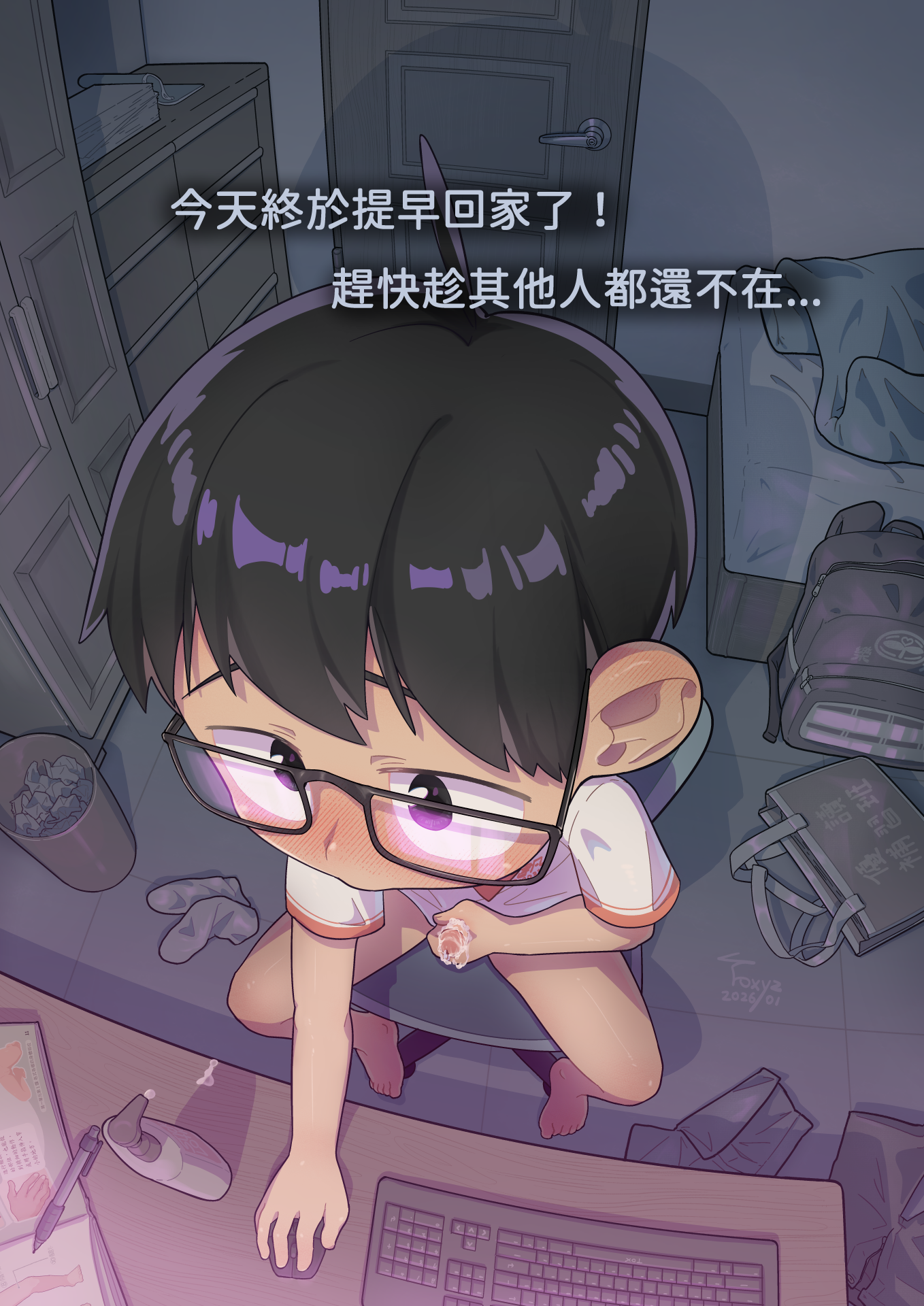
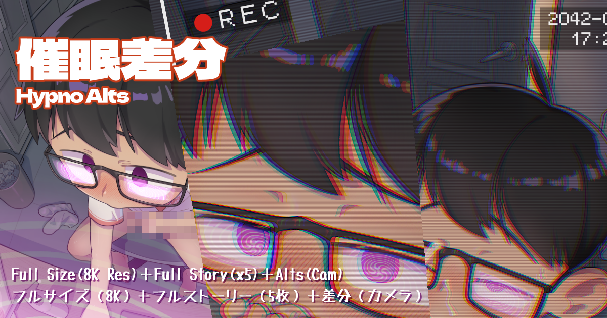
#️⃣フルサイズの25% #️⃣25% of full size #️⃣完整大小的25%
🌐日本語
🌐English
🌐中文
❣️
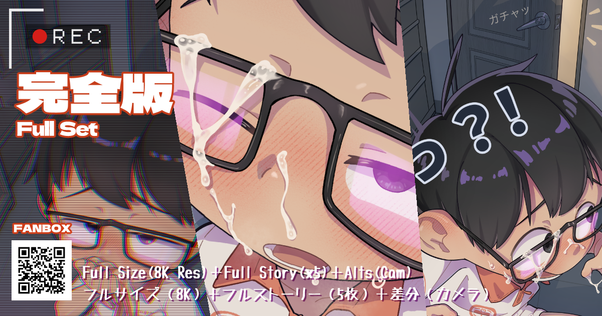
完全版の内容はすべて原寸大画像(5432×7680 px)で、
フルストーリー(5枚)、カメラ差分、文字なし差分、催眠差分も含まれ、
単一言語バージョンで合計 26 枚の画像!
ぜひサブスクで応援していただき、完全版をゲットしてくださいね!⬇️
❣️
The full version contains all images in the original size (5432×7680 px),
including the full story (x5 images), camera alts, no-text alts, hypno alts,
Each single-language version contains a total of 26 images!
Feel free to subscribe to support me and get access to the full set! ⬇️
❣️
完整版的內容皆為原尺寸大圖(5432×7680 px),
並包含完整故事(5張圖)、監視器差分、無文字差分、催眠差分,
單個語言版本內總共含有 26 張圖片!
歡迎訂閱支持我,以獲得完整版喔!⬇️
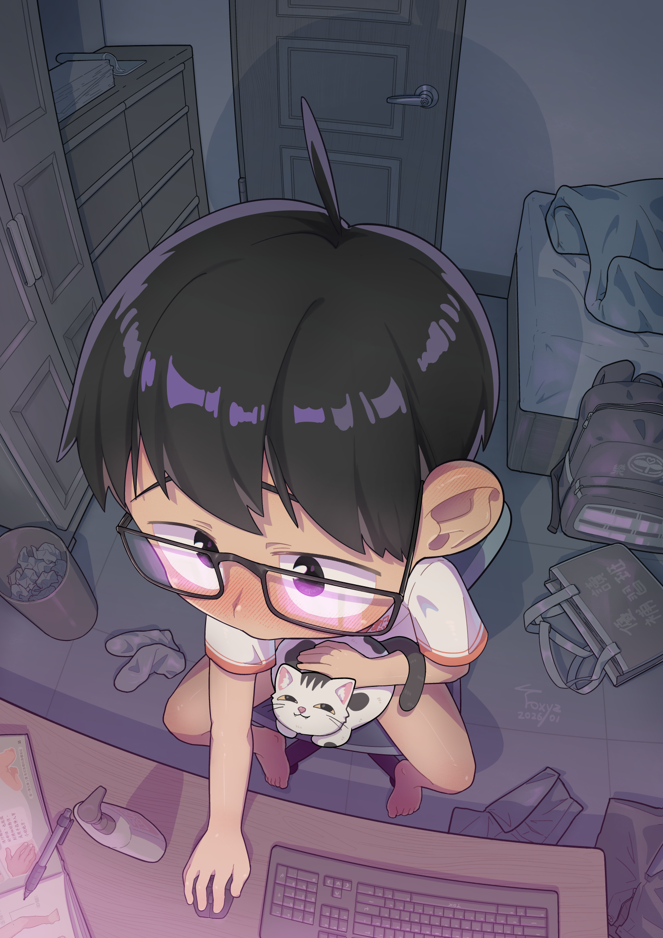
混乱を避けるため、催眠差分は別の投稿にしています!⬇️
To avoid too much confusion, the hypno alts are posted separately!⬇️
為了避免太混亂,所以有獨立的催眠差分貼文喔!⬇️
🌐日本語
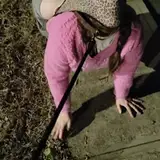
「いろいろな家庭生活スタイル」という設定紹介を最近考えていて、
最初に思い浮かんだのが、比較的保守的な書凡の家庭でした。
そこで、こっそり感のあるシチュエーションと、
見つかった瞬間の慌てた可愛さ☺️💖を表現した一枚を描いてみました。
この作品は、今後ほかの生活スタイルとあわせて、
シリーズストーリーの中に組み込んでいく予定です。
今回は「こそこそした感じ」と「見つかって慌てる」という
感情と緊張感を表現するために、
動作差分で物語を見せる方法を選びました。
最初からこの二つの感情の対比を描きたいと思っていたので、
画面には主人公と開いたドアを必ず入れたいと考えました。
そこからさらに、
暗めの色で雰囲気を作ること、
主人公とドアの色にコントラストをつけること、
画面の重心を重要な部分に置くこと、
文字を配置する余白を確保すること、
背景もしっかり描くこと……など、条件を整理していきました📝
その結果、この構図に決め、
魚眼パースを使うことで重心を強調しつつ、
空間の広がりも出せるようにしました。
左右で配色の対比をつけられるのも、ちょうどよかったです。
今回の練習を通して、魚眼パースの使い方が
前よりも理解できた気がします!
(とはいえ、物の比率を考えるのはやっぱり難しくて大変ですが……)
少し前に、友人の(塩さん)が
とても丁寧に描いた背景を見せてくれて、
それに刺激を受けて、自分も本気で背景を描いてみたくなりました。
制作途中の画像をシェアしたところ、
配色がきれいだと褒めてもらえて、とても嬉しかったです🥰
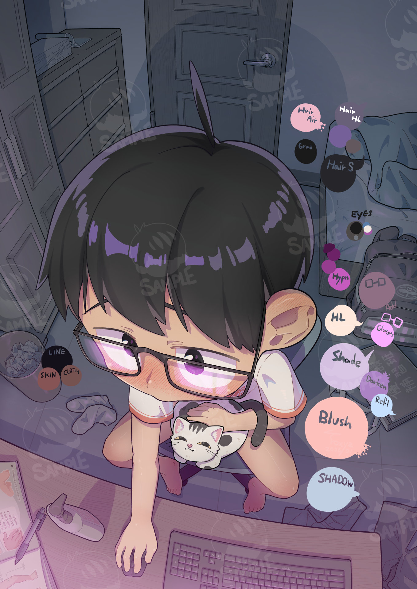
なので、今回使った色パレットも共有したいと思います(下の画像)。
※一部の色は、レイヤーの描画モードを使っています。
全体として、背景は寒色寄り、
キャラクターは暖色寄りにしてコントラストをつけました。
画面上部は暗めの青やグレー(青みの中の木の色)、
下部は光るようなスクリーンのピンクパープルです。
背景とキャラクターの対比、
そして画面全体としてのコントラストを意識しています。
正直、自分ではあまり自信がなかったのですが、
褒めてもらえて本当に嬉しかったので、皆さんにも共有したくなりました。
(ご意見やアドバイスも大歓迎です!)
🌐English
Recently, I’ve been working on a setting introduction themed around
“different styles of family life.”
The first one that came to mind was Shufan’s relatively conservative family.
So I drew a scene with a sneaky, secretive feeling,
along with his adorable, panicked expression when he gets caught ☺️💖
This piece will likely be incorporated into a series story later on,
presented together with other lifestyle settings.
To convey the sneaky mood and emotional tension this time,
I chose to tell the story through action variations.
From the start, I wanted to contrast two emotions:
“sneaking around” and “panicking when being caught.”
That’s why I wanted the composition
to include both the protagonist and an opening door.
From there, I clarified other requirements:
using darker colors to build atmosphere,
creating color contrast between the protagonist and the door,
placing the visual focus on key areas, leaving space for text,
and I want to work on the background 📝
With those points in mind, I settled on this composition,
using a fisheye perspective to emphasize the focal point
while also giving the scene a strong sense of space.
It also worked well for creating color contrast between the two sides of the image.
Through this practice, I feel like I’ve gained a better understanding
of how to use fisheye perspective!
(Though calculating object proportions is still very difficult and complicated…)
Some time ago, my friend (Sio) shared a background illustration
that he had drawn very carefully,
which inspired me to seriously try drawing backgrounds myself.
I shared some process images and received compliments
saying my color choices looked really good, which made me super happy 🥰
So I also wanted to share the color palette I used this time (shown below).
(Note: some colors require using layer blending modes.)
Overall, I aimed for a cool-toned background
with a warmer-toned character to create contrast.
The upper part of the image uses darker blues and grays
(wood tones under blue lighting),
while the lower part features a glowing, screen-like pinkish purple.
This creates contrast between the background and the character,
as well as contrast across the entire image.
I honestly wasn’t very confident about it,
but I was really happy to receive praise, so I wanted to share it with everyone.
(Feedback and suggestions are very welcome!)
🌐中文
最近想做一個「各種家庭生活風格」的設定介紹,
第一個想到的就是書凡他相較保守的家庭,
因此畫了一個帶有點偷偷摸摸感覺的畫面,
還有被發現時慌張的可愛樣貌☺️💖
之後應該會把這篇融進系列故事裡,跟不同的生活風格一起呈現。
這次的為了呈現偷偷摸摸的情緒及氛圍張力,
選擇了動作差分的方式說故事。
一開始就想著要畫「偷偷摸摸」以及「被發現了好慌張」兩種情緒對比,
所以希望畫面中能包含主角與被打開的門,
接著釐清其他需求:昏暗顏色營造氛圍、主角與門顏色要有對比、
畫面重心要是重要的部位、要有地方放文字、想認真畫背景...等等📝
因此決定了這樣的構圖,以及魚眼透視可以加強重心又很有空間感,
也剛好可以讓畫面兩邊的配色上有所對比。
而且藉由這次練習,我感覺自己有更了解怎麼使用魚眼透視了!
(雖然算物件比例還是好難好複雜...)
前陣子我的朋友(鹽)分享了他認真地畫的背景,
讓我也心血來潮想認真地畫背景圖,
我分享了製作過程圖,也收到了稱讚說我的配色很好看,超高興🥰
所以我也想分享一下這次上色用的色盤(如下圖)
(註:有些顏色是要開圖層混和模式的)
整體而言我希望背景是冷色的,但主角是偏暖色的來做對比,
且畫面上緣是較暗的藍色與灰色(在藍色下的木頭色),
畫面下緣則是發亮的螢幕粉紫色。
所以有背景與角色的對比,還有整個畫面的對比。
我其實也沒很有自信,但很高興能收到稱讚,所以想跟大家分享!
(也歡迎大家指教喔!)


