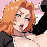
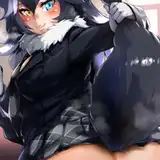
1. In Manga Studio, I start with a very rough sketch with big fat pencils. The fat pencils force me to keep the sketch loose without getting too caught up in the details.
2. Final sketch. Now I go back and do a more detailed sketch, working out the the body, clothing, hair, and props.
3. Inking. I use a variable-width inking brush for the characters and a constant-width brush for hard things (the buckles, etc) on vector layers. I use lots of different layers for different parts, which makes it easier to overdraw and erase as needed. For the rope, I used the rope brush I made from my own linework a while back. I also went ahead of inked the shape for the eyelashes because the brush stablization in Manga Studio makes it a lot easier than doing it in Photoshop later. I used a perspective ruler to map out the edges of the balcony posts. I exported the inks in four layers (characters, balcony, backdrop, foreground).
4. In Photoshop, I convert the imported lines to a folder with a mask and put a solid black layer in the folder. (CTRL-click RGB in the Channels tab, invert the selection, create a mask from the selection.) This will come in handy later when I color the linework. Then I create another folder and start creating the basic color blocking.
5. Form shading. I create a dark brown solid color layer (linear burn) and start painting in the basic form shading with a soft airbrush. Except for the hair, which gets its own dark brown layer but with linear burn blending for more richness. I also use a smudge tool on the hair and various creases in clothing and skin to create detail.
6. Backlight. A very desaturate pale blue, almost white, solid color layer (screen). When I combined it with the form shading, backlighting really makes the characters pop. I used both a soft brush (for the shiniest parts like the buckle and lips) and a soft airbrush (for everything else). I don't use any backlight on non-reflective objects like the flowers and border. When it's done right, it should look like real lighting from a different angle. And again, smudge the edge of creases and hairs.
7. Cast shadows. I make a new dark brown layer set to multiply and start painting in the cast shadows with soft brush, using a smaller brush in places where the object casting the shadow is closer to the thing the shadow is on.
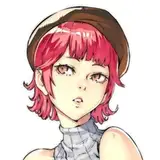
8. Put them together and it's looking good!
9. Sequin texture. I made a small black square (800x800) and applied the Add Noise filter then adjusted the curves to push the sparkle and set it to overlay and scaled it up to fit the dress. I also added a Levels adjustment layer with a mask to push the sparkle even more just in the highlighted areas.
10. Shiny. I used a solid white layer at for basic shine on lips, bows, and shoes, another solid white for shine in the eyes, and solid white set to overlay (which makes a richer shine) for the hair shine. Painting the hairshine, I use a variable width sharp brush, then go over it with an airbrush to give it a little glow. I also used overlay layers for the shine on the dress and hose.
11. For the blush, I add in a light red layer, airbrushing just on the same area as the skin for the joints and face. I use the same technique for the eyeshadow.
12. Colored linework. Going back to the linework folder, I started adding new solid color layers, using the mask to paint the color of the linework. Since the new layers are inside a folder with a mask defining the linework, I don't have to be very precise when coloring the lines. I always add new color layers below the ones I already did so that I can be sloppy in the areas that are already covered by colored linework. Everything soft gets colored linework. Hard objects in the foreground stay black.
13. Eyelashes are done with a folder containing a solid grey layer and a solid black layer. Using the lashes I made earlier with a variable width brush, I add a few thin streaks on the grey layer mask to add depth to the lashes and soften the look with a few strokes of a soft airbrush. For the drool, I used a white layer with the fill turned down just a little and add a layer effect with white inner glow set to 100%. Then I use a variable width brush in the mask to soften the edge where it touches skin. After, I add a new white layer to paint in the shiny highlights.
14. Sparkle. I used a sparkle stamp to drop in a few sparkles on the earrings and dress.
15. For the backdrop, I added a simple grunge texture for the wall and filled in the basic color blocking on the canvas.
16. For the starfield, I used the same noise method as the sequins but I pushed the curves further and then added a black grunge on top of it to create more variation. Then I stamped a few bright stars in and added some simple gradients.
17. I applied a very simple form shadow to the metal, then copied the shape of the backdrop to make a cast shadow on the wall, slightly scaled up. Then I added an overall shadow to suggest the backdrop is lit with three overhead lights by painting a some scalloped shape, blurring it heavily, then stretching it vertically.
18. Balcony. For the floor, I added a grunge texture and used distort to match the perspective of the floor. Then I added some form and cast shadows for the baclony posts. I also added a gradient cast shadow to the balcony to represent the focused movie lights. It looks weird without the characters and lights but it makes more sense in the final compostion.
19. I filled in the foreground silhouettes with black and put the characters back in. Finally, I used the outline of the characters to added cast shadows to the balcony.