1. In Manga Studio, I start with a very rough sketch with big fat pencils. The fat pencils force me to keep the sketch loose without getting too caught up in the details. I started with the pose and then sketched a dollhouse around it.
2. Final sketch. Now I go back and do a more detailed sketch, working out the the body, clothing, hair, and props. I used perspective rulers to draw the dollhouse and open panel. I cropped the composition tighter after I finished the sketch because it was easier to draw the house in perspective while being able to still see the whole thing.
3. Inking. I use a variable-width inking brush for the characters and a constant-width brush for hard things (the stocks and paddles, etc) on vector layers. I use lots of different layers for different parts, which makes it easier to overdraw and erase as needed. I also went ahead of inked the shape for the eyelashes because the brush stablization in Manga Studio makes it a lot easier than doing it in Photoshop later. I exported the background and foreground in separate layers.
4. In Photoshop, I convert the imported lines to a folder with a mask and put a solid black layer in the folder. (CTRL-click RGB in the Channels tab, invert the selection, create a mask from the selection.) This will come in handy later when I color the linework. Then I create another folder and start creating the basic color blocking.
5. Texture. I added some wallpaper, grunge, and wood textures to the walls, floor, and ceiling of the dollhouse. I created a greyscale flat image of each and then used distort to match it to the perspective of each surface, then set it to overlay and adjusted the opacity.
6. Form shading. I create a dark purple solid color layer (linear burn) and start painting in the basic form shading with a soft airbrush. Except for the hair, which gets its own dark purple layer but with linear burn blending for more richness. I also use a smudge tool on the hair and various creases in clothing and skin to create detail.
7. Backlight. A very desaturate pale red, solid color layer (screen). When I combined it with the form shading, backlighting really makes the characters pop. I used both a soft brush (for the shiniest parts like the buckle and lips) and a soft airbrush (for everything else). I don't use any backlight on non-reflective objects like the flowers and border. When it's done right, it should look like real lighting from a different angle. And again, smudge the edge of creases and hairs. I also created a pale yellow layer for light cast through the windows.
8. Cast shadows. I make a new desaturate dark purple layer set to multiply and start painting in the cast shadows with soft brush, using a smaller brush in places where the object casting the shadow is closer to the thing the shadow is on.
9. Put them together and it's looking good!
10. Deeper shadows. To make the shadows inside the dollhouse deeper, I created a folder with a mask and put a solid purple layer inside. Then I painted the mask with a soft brush. I set the purple layer to Color blend mode and lowered the opacity. I also added a Levels adjustment layer to make it a little bit darker but mostly it's just more purple.
11. Shiny. I used a solid white layer at for basic shine on lips, bows, and shoes, another solid white for shine in the eyes, and solid white set to overlay (which makes a richer shine) for the hair shine. Painting the hairshine, I use a variable width sharp brush, then go over it with an airbrush to give it a little glow. After painting all the shine, I use the cast shadow layer to make a selection and delete the shine from anywhere covered by shadow.
12. Colored linework. Going back to the linework folder, I started adding new solid color layers, using the mask to paint the color of the linework. Since the new layers are inside a folder with a mask defining the linework, I don't have to be very precise when coloring the lines. I always add new color layers below the ones I already did so that I can be sloppy in the areas that are already covered by colored linework. Everything soft gets colored linework. Hard objects in the foreground stay black. The entire backdrop gets dark grey lines to help if fade back a little.
13. In the backdrop, I added a soft glow effect to the windows and simple gradients to the whole space, one yellow for the light coming in and black for extra shadow.
14. Blur. I collapsed the backdrop and applied a gaussian blur to it to make the foreground pop forward.
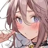
15. For the blush, I add in a light red layer, airbrushing just on the same area as the skin for the joints and face. I use the same technique for the eyeshadow and big red spots on the cheeks.
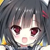
16. Eyelashes are done with a folder containing a solid grey layer and a solid black layer. Using the lashes I made earlier with a variable width brush, I add a few thin streaks on the grey layer mask to add depth to the lashes and soften the look with a few strokes of a soft airbrush. For the tears, I used a white layer with the fill turned down just a little and add a layer effect with white inner glow set to 100%. Then I use a variable width brush in the mask to soften the edge where it touches skin. After, I add a new white layer to paint in the shiny highlights.
17. Finally, I added a glow the chandelier but making some solid white shapes and added a glow layer effect.