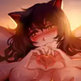
1. In Manga Studio, I start with a very rough sketch with big fat pencils. The fat pencils force me to keep the sketch loose without getting too caught up in the details
2. Final sketch. Now I go back and do a more detailed sketch, working out the the body, clothing, and hair. I used a perspective ruler to line up the bed, straps, and door.
3. Inking. I use a variable-width inking brush for the characters and a constant-width brush for hard things (the buckles) on vector layers. I use lots of different layers for different parts, which makes it easier to overdraw and erase as needed. I also went ahead of inked the shape for the eyelashes because the brush stablization in Manga Studio makes it a lot easier than doing it in Photoshop later. I exported the inks in multiple layers.
4. Color blocking. In Photoshop, I convert the imported lines to a folder with a mask and put a solid black layer in the folder. (CTRL-click RGB in the Channels tab, invert the selection, create a mask from the selection.) This will come in handy later when I color the linework. Then I create another folder and start creating the basic color blocking.
5. Cast shadows. Because the single-point lighting from the lamp is tricky, I started with the cast shadows. To help me line up the shadows, I added a new shape layer with a polygon set for a star shape with 100 points, centered on the lamp to show me the direction that a shadow would fall at different points. Then I make a new dark brown layer set to multiply and start painting in the cast shadows with soft brush, using a smaller brush in places where the object casting the shadow is closer to the thing the shadow is on. I start on the bedsheet, then the characters last, because it makes it easier to visualize where the shadows will land when starting with the simplest, furthest back objects.
6. Form shading. I create a dark brown solid color layer (linear burn) and start painting in the basic form shading with a soft airbrush. Except for the hair, which gets its own dark brown layer but with linear burn blending for more richness. I also use a smudge tool on the hair and various creases in clothing and skin to create detail.
7. Backlight. A very desaturate pale blue solid color layer (screen). When I combined it with the form shading, backlighting really makes the characters pop. I used both a soft brush (for the shiniest parts like the buckle and lips) and a soft airbrush (for everything else). I don't use any backlight on non-reflective objects. When it's done right, it should look like real lighting from a different angle. And again, smudge the edge of creases and hairs.
8. Shiny. I used a solid white layer at for basic shine on lips, nails, and shoes, and solid white set to overlay (which makes a richer shine) for the hair shine. Painting the hairshine, I use a variable width sharp brush, then go over it with an airbrush to give it a little glow. On the satin, I used a very soft airbrush for the shine. After painting all the shine, I use the cast shadow layer to make a selection and delete the shine from anywhere covered by shadow.
9. Skin effects. For the blush, I add in a light red layer, airbrushing just on the same area as the skin for the joints and face. I use the same technique for the eyeshadow. I also added in the blush lines in a reddish color similar to the skin tone.
10. Deeper shadows. To make the lighting more dramatic, I added a new folder with a mask and put in a levels adjustment layer (set to make the scene much darker) and a hue/saturation layer (set to colorize the layer with a blue hue and low saturation). Then I painted in the folder mask to give some areas deeper shadows.
11. Colored linework. Going back to the linework folder, I started adding new solid color layers, using the mask to paint the color of the linework. Since the new layers are inside a folder with a mask defining the linework, I don't have to be very precise when coloring the lines. I always add new color layers below the ones I already did so that I can be sloppy in the areas that are already covered by colored linework. Everything soft gets colored linework. Hard objects stay black.
12. Eyelashes. Eyelashes are done with a folder containing a solid grey layer and a solid black layer. Using the lashes I made earlier with a variable width brush, I add a few thin streaks on the grey layer mask to add depth to the lashes and soften the look with a few strokes of a soft airbrush.
13. Sweat. For the sweatbead, I used a white layer with the fill turned down just a little and add a layer effect with white inner glow set to 100%. Then I use the mask to hide where it is hidden by the hair. After, I add a new white layer to paint in the shiny highlights.
14. Lamp glow. I added a folder with a mask and put in a bright yellow layer with a single-point gradient. Then I painted the folder mask to match the opening in the bottom of the lampshade.
15. Vibration effect. I made a merge-copy of the "something" under the bedsheet and made several copies of that, distorted to various angles, then used a soft eraser for each copy to leave only the edge sticking out around it. Then I turned the transparency of each tilted version.