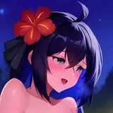
1. In Manga Studio, I start with a very rough thumbnail sketch with big fat pencils. The fat pencils force me to keep the sketch loose without getting too caught up in the details.
2. Final sketch. Now I go back and do a more detailed sketch, working out the the body, clothing, and props.
3. Inking. I use a variable-width inking brush for the characters and a constant-width brush for hard things on vector layers. I use lots of different layers for different parts, which makes it easier to overdraw and erase as needed. For the fur and chains, I used special brushes I made earlier, based on my own drawings. I also went ahead of inked the shape for the eyelashes, details on the lace, and the pattern of hearts on the hose because the brush stablization in Manga Studio makes it a lot easier than doing it in Photoshop later.
4. In Photoshop, I convert the imported lines to a folder with a mask and put a solid black layer in the folder. (CTRL-click RGB in the Channels tab, invert the selection, create a mask from the selection.) This will come in handy later when I color the linework. Then I create another folder and start creating the basic color blocking. I like to do all my color blocking by making a folder and then filling it with different solid color layers for each section of color, whch makes it easy to change a color later. This is a very fussy way to do it and it's probably much simpler to just fill a single raser layer with flat colors.
5. Form shading. I create a dark brown solid color layer (linear burn) and start painting in the basic form shading with a soft airbrush. For the hair, I used color burn for richer shading and I used a variable-width soft airbrush to smudge detail into the shadows, picking up the shape of the hairs. I also used the smudge brush to add detail to the shadowing on the fur.
6. Backlight. A very desaturate pale pink solid color layer (screen) painted with a soft airbrush. When I combine it with the form shading, backlighting really makes the characters pop. I don't use any backlight on non-reflective objects. More smudging on the hair and fur.
7. Cast shadows. I make a new dark brown layer set to multiply and start painting in the cast shadows with soft brush, using a smaller brush in places where the object casting the shadow is closer to the thing the shadow is on.
8. Shiny. I used a solid white layer for the primary shine and painted spots and streaks using a hard variable-width brush. After painting all the shine, I use the cast shadow layer to make a selection and delete the shine from anywhere covered by shadow. I also added some soft white glow to the eye shine and added one sparkle to each eye.
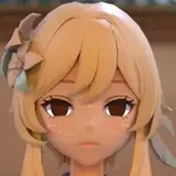
9. For the blush, I add in a light red layer, airbrushing just on the same area as the skin for the cheeks and other cheeks. I use the same method to add color for the eyeshadow, using black, blue, and white for an extravagant style.
10. Colored linework. Going back to the linework folder, I started adding new solid color layers, using the mask to paint the color of the linework. Since the new layers are inside a folder with a mask defining the linework, I don't have to be very precise when coloring the lines. I always add new color layers below the ones I already did so that I can be sloppy in the areas that are already covered by colored linework. By coloring with lines similar in color to the objects, I give those objects a softer, more organic feel, which contrasts strongly with the few hard objects that I keep in black linework.
11. Lace detail. I've been trying a new approach to lace detail. Instead of drawing every tiny part of the lace, I'm using a more impressionistic approach, drawing in vague bits of of detail all around and then applying them as a mask on a hue/saturation layer which I use to make parts of the lace somewhere between the surface color and the linework color.
12. Eyelashes are done with a folder containing a solid grey layer and a solid black layer. Using the lashes I made earlier with a variable width brush, I add a few thin streaks on the grey layer mask to add depth to the lashes and soften the look with a few strokes of a soft airbrush.
13. For the tears, I used a white layer with the fill turned down just a little and add a layer effect with white inner glow set to 100%. Then I use the mask to soften the edge where it touches the skin. After, I add a new white layer to paint in the shiny highlights. Fun fact: I think these the first tears of joy I have ever drawn for my patrons.
14. Jiggle. To create the jiggle, I merge copied small parts of the character, pasted them, then used a soft airbrush to erase around them until I had just a little bit left of each, less for each one further out.
15. Sparkle. I used my sparkle brushes to add one sparkly sparkle to the diamond and one cross sparkle each to the eyes for twinkle.
16. For the backdrop, I made a small black-to-white gradient layer then applied a halftone filter to it and scaled it up. Then I switched to the channels panel to select it by brightness and used that to make a mask for a pink/white layer. Then I dropped in some text, added some color gradient, a white stroke, and drop shadow.