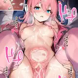
1. In Manga Studio, I start with a very rough sketch with big fat pencils. The fat pencils force me to keep the sketch loose without getting too caught up in the details.
2. Final sketch. Now I go back and do a more detailed sketch, working out the the body, clothing, and props. I used perspective rules to help me align everything and fix the perspective on the sketch. It was pretty close in the rough sketch but a few things needed to be adjusted to make more sense in perspective.
3. Inking. I use a variable-width inking brush for the characters and a constant-width brush for hard things on vector layers. I use lots of different layers for different parts, which makes it easier to overdraw and erase as needed. I also went ahead of inked the shape for the eyelashes because the brush stablization in Manga Studio makes it a lot easier than doing it in Photoshop later.
4. In Photoshop, I convert the imported lines to a folder with a mask and put a solid black layer in the folder. (CTRL-click RGB in the Channels tab, invert the selection, create a mask from the selection.) This will come in handy later when I color the linework. Then I create another folder and start creating the basic color blocking. I also imported the fence pattern because I'll need it from the beginning to know where the shadows will be.
5. Form shading. I create a dark blue solid color layer (linear burn) and start painting in the basic form shading with a soft airbrush. Except for the hair, which gets its own dark brown layer but with linear burn blending for more richness.
6. Backlight. A very desaturate pale purple solid color layer (screen). When I combined it with the form shading, backlighting really makes the characters pop. I used both a soft brush (for the shiniest parts like the buckle and lips) and a soft airbrush (for everything else). I don't use any backlight on non-reflective objects like the flowers and border. When it's done right, it should look like real lighting from a different angle. I also made a second white forelight to make the latex extra shiny.
7. Cast shadows. I make a new dark purple layer set to multiply and start painting in the cast shadows with soft brush, using a smaller brush in places where the object casting the shadow is closer to the thing the shadow is on.
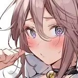
8. Put them together and it's looking good!
9. Shiny. I used a solid white layer and a variable-width hard brush to put the primary shine and a second purple layer for secondary shine on the latex for an extra slick look.
10. For the blush, I add in a light red layer, airbrushing just on the same area as the skin for the cheeks and other cheeks.
11. Colored linework. Going back to the linework folder, I started adding new solid color layers, using the mask to paint the color of the linework. Since the new layers are inside a folder with a mask defining the linework, I don't have to be very precise when coloring the lines. I always add new color layers below the ones I already did so that I can be sloppy in the areas that are already covered by colored linework.
12. Eyelashes are done with a folder containing a solid grey layer and a solid black layer. Using the lashes I made earlier with a variable width brush, I add a few thin streaks on the grey layer mask to add depth to the lashes and soften the look with a few strokes of a soft airbrush.
13. For the tears, I used a white layer with the fill turned down just a little and add a layer effect with white inner glow set to 100%. Then I use a variable width brush in the mask to soften the edge where it touches skin. After, I add a new white layer to paint in the shiny highlights.
14. Finally, I added a few abstract shapes and a gradient to the backdrop.