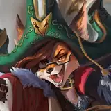
1. In Manga Studio, I start with a very rough sketch with big fat pencils. The fat pencils force me to keep the sketch loose without getting too caught up in the details.
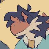
2. Final sketch. Now I go back and do a more detailed sketch, working out the the characters, clothing, and environment. I wound up flipping the dragon around for better compostion.
3. Inking. I use a variable-width inking brush for the characters and a constant-width brush for hard things on vector layers. I use lots of different layers for different parts, which makes it easier to overdraw and erase as needed.
4. In Photoshop, I convert the imported lines to a folder with a mask and put a solid black layer in the folder. (CTRL-click RGB in the Channels tab, invert the selection, create a mask from the selection.) This will come in handy later when I color the linework. Then I create another folder and start creating the basic color blocking. My usual method for color blocking is to make a folder and fill it with a different solid color layer for each flat color. To keep this one a little bit simple, I did use a seperate layer for each dress on the pile but just one color per dress. Then, on top of the dress colors, I added a couple of hue/saturation adjustment layers with masks for the crinoline, the collars, the trim, etc and used masks on those layers to affect different parts of all the dresses. That way each dress could have some differences in color but also be monochrome in palette, making it easier to distinguish them as dresses.
5. Scales. Before starting on the larger shading, I painted in some simple scales and ridges on the dragon. I made a dark blue solid color layer, set to multiply, and started with a mask filled to match just the red parts of the dragon. Then I used a small airbush to paint out small V-shapes for the edge of each scale. Next I used a larger airbush to fill in the rest of each scale, leaving it soft and dark where each scale disappears behind the scale above it.
6. Form shading. Since this scene is mostly in shadow, I created a hue/saturation layer set to colorize with a blue hue, low saturation, and low brightness, then added a mask and start painting in the basic form shading with a soft airbrush. For the hair, I create a dark blue color layer set to linear burn for more richness. I also use a smudge tool on the hair and various creases in clothing and skin to create detail. Both of these layers are placed below the scales layer.
7. Backlight. A very desaturate pale blue solid color layer (screen). When I combined it with the form shading, backlighting really makes things pop. I used a soft airbrush for almost everything. I used a second yellow layer for forelight on the scales. When it's done right, it should look like real lighting from a different angle. And again, smudge the edge of creases and hairs.
8. Cast shadows. I make a new dark blue layer set to multiply and start painting in the cast shadows with soft brush, using a smaller brush in places where the object casting the shadow is closer to the thing the shadow is on.
9. Put them together and it's looking good!
10. Shiny. I used a solid white layer at for basic shine on armor and a solid white set to overlay (which makes a richer shine) for the hair shine. Painting the hairshine, I use a variable width sharp brush, then go over it with an airbrush to give it a little glow. After painting all the shine, I use the cast shadow layer to make a selection and delete the shine from anywhere covered by shadow.
11. For the blush, I add in a light red layer, airbrushing just on the same area as the skin for the joints and face.
12. Deeper shadows. To give everything a look of being deeper shadows, I added a hue/saturation layer with lowered saturation and lightness. I applied it to the whole image and then just masked it out in the areas where the main light was brightest, mostly along the edges of things.
13. Colored linework. Going back to the linework folder, I started adding new solid color layers, using the mask to paint the color of the linework. Since the new layers are inside a folder with a mask defining the linework, I don't have to be very precise when coloring the lines. I always add new color layers below the ones I already did so that I can be sloppy in the areas that are already covered by colored linework. I just colored the linework on the knight/dolly, leaving the dragon in black linework so it would feel more imposing, and gave the piles of dresses dark grey linework so that they would fade into the background a little.
14. I added some grungy texture to the ground, using distort to match the perspective.
15. Finally, I added a bright white light in the background. I used a simple gradient, masked around the left side of the cave. Then I added some streaks by making a new image, filled with black, then adding some white vertical streaks at the top, then using the polar coordinate distortion filter to turn it into a huge lens flare which I then copied into my picture.