1. In Manga Studio, I start with a very rough thumbnail sketch with big fat pencils. The fat pencils force me to keep the sketch loose without getting too caught up in the details. To keep it symmetrical, I roughed in just one figure, then copied it and flipped it over. Then I shifted the angles on the legs around a little to add some variety.
2. Final sketch. Now I go back and do a more detailed sketch, working out the the body, clothing, and props.
3. Inking. I use a variable-width inking brush for the characters and a constant-width brush for hard things on vector layers. I use lots of different layers for different parts, which makes it easier to overdraw and erase as needed. I left out the laces and grommets since I planned to do those with a layer effect later.
4. In Photoshop, I convert the imported lines to a folder with a mask and put a solid black layer in the folder. (CTRL-click RGB in the Channels tab, invert the selection, create a mask from the selection.) This will come in handy later when I color the linework. Then I create another folder and start creating the basic color blocking. I like to do all my color blocking by making a folder and then filling it with different solid color layers for each section of color, whch makes it easy to change a color later. This is a very fussy way to do it and it's probably much simpler to just fill a single raser layer with flat colors.
5. Laces and grommets. I made yellow layer for the grommets and painted in some small circles, then applied some layer effects - an outer glow in black set to normal for a faint linework and some bevel to give it shade and backlight similar to what I have planned for the rest of the metalwork. The laces are simple pink layers with an outer glow and bevel as well.
6. Form shading. I create a dark brown solid color layer (linear burn) and start painting in the basic form shading with a soft airbrush. Except for the hair, which gets its own dark brown layer but with linear burn blending for more richness. I used an airbrush smudge tool to refine the shading on the hair. For the crinoline, I used a scallop shaped brush with scatter.
7. Backlight. A very desaturate blue solid color layer (screen). When I combined it with the form shading, backlighting really makes the characters pop. I used both a soft brush (for the shiniest parts) and a soft airbrush (for everything else). I don't use any backlight on non-reflective objects. On the hair, I use a smudge tool to streak the backlight so that it suggests strands of hair. When it's done right, it should look like real lighting from a different angle.
8. Cast shadows. I make a new dark brown layer set to multiply and start painting in the cast shadows with soft brush, using a smaller brush in places where the object casting the shadow is closer to the thing the shadow is on.
9. Shiny. I used a solid white layer at for basic shine on lips, eyes, and other basic shiny things and solid white set to overlay (which makes a richer shine) for the hair shine. Painting the hairshine, I use a variable width sharp brush, then go over it with an airbrush to give it a little glow. After painting all the shine, I use the cast shadow layer to make a selection and delete the shine from anywhere covered by shadow.
10. For the blush, I add in a light red layer, airbrushing just on the same area as the skin for the cheeks and other cheeks. I use the same method to add color for the eyeshadow.
11. Colored linework. Going back to the linework folder, I started adding new solid color layers, using the mask to paint the color of the linework. Since the new layers are inside a folder with a mask defining the linework, I don't have to be very precise when coloring the lines. I always add new color layers below the ones I already did so that I can be sloppy in the areas that are already covered by colored linework.
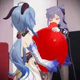
12. For the cum, I used a white layer with the fill turned down just a little and add a layer effect with white inner glow set to 100%. Then I use the mask to hide the edge where it touches skin or disappears behind the gag. After, I add a new white layer to paint in the shiny highlights.
13. Finally, I added a simple frame by making a white vector shape layer, set to subtraction, with an outline. By placing the frame behind the characters but above the background and background cast shadows, it nicely clips the background while letting the characters pop forward.