1. In Manga Studio, I start with a very rough thumbnail sketch with big fat pencils. The fat pencils force me to keep the sketch loose without getting too caught up in the details. This sketch was based on a suggestion during a sketch livestream.
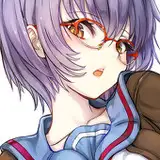
2. Final sketch. Now I go back and do a more detailed sketch, working out the the body, clothing, and props. This is the longest step in the process because it is when I research the outfits, try out different hairstyles and expressions, and fine tune every lock of hair and every pleat or ruffle. This is also when I fix the proportions, make sure the legs are the same length, and so on. I used perspective rulers to align the hallway and lines on the field.
3. Inking. I use a variable-width inking brush for the characters and a constant-width brush for hard things on vector layers. I use lots of different layers for different parts, which makes it easier to overdraw and erase as needed. I also went ahead of inked the shape for the eyelashes because the brush stablization in Manga Studio makes it a lot easier than doing it in Photoshop later. I exported the environment, characters, lace edge, and brocade in separate layers.
4. In Photoshop, I convert the imported lines to a folder with a mask and put a solid black layer in the folder. (CTRL-click RGB in the Channels tab, invert the selection, create a mask from the selection.) This will come in handy later when I color the linework. Then I create another folder and start creating the basic color blocking. I like to do all my color blocking by making a folder and then filling it with different solid color layers for each section of color, whch makes it easy to change a color later. This is a very fussy way to do it and it's probably much simpler to just fill a single raster layer with flat colors. I used the brocade layer to add detail to the dress which I filled with solid colors and then used a little airbeushing to add some variation in tone.
5. Cast shadows. I started with the cast shadows first since they tend to be simple but bold and can help me remember how the lights are supposed to fall when I work on the other parts of shading. I make a new dark brown layer (teal to match the background color) set to multiply and start painting in the cast shadows with soft brush, using a smaller brush in places where the object casting the shadow is closer to the thing the shadow is on. For the shadow cast onto the curtains, I just used the shortcut of copying the shape of the characters and then distorting them and blurring them.
6. Form shading. I create a dark brown solid color layer (linear burn) and start painting in the basic form shading with a soft airbrush. Except for the hair, which gets its own dark brown layer but with linear burn blending for more richness.
7. Backlight. I used two backlights, one light blue from the right and one light red from the left (screen). When I combine it with the form shading, backlighting really makes the characters pop. I used both a soft brush (for the shiniest parts like the lips) and a soft airbrush (for everything else). I don't use any backlight on non-reflective objects. On the hair, I use a smudge tool to streak the backlight so that it suggests strands of hair. When it's done right, it should look like real lighting from a different angle.
8. Shiny. I used a solid white layer at for basic shine on lips, eyes, and other basic shiny things and solid white set to overlay (which makes a richer shine) for the hair shine. Painting the hairshine, I use a variable width sharp brush, then go over it with an airbrush to give it a little glow. After painting all the shine, I use the cast shadow layer to make a selection and delete the shine from anywhere covered by shadow.
9. For the blush, I add in a light red layer, airbrushing just on the same area as the skin for the cheeks and other cheeks. I use the same method to add color for the eyeshadow and red dolly circles on the cheeks.
10. Colored linework. Going back to the linework folder, I started adding new solid color layers, using the mask to paint the color of the linework. Since the new layers are inside a folder with a mask defining the linework, I don't have to be very precise when coloring the lines. I always add new color layers below the ones I already did so that I can be sloppy in the areas that are already covered by colored linework.
11. For the crinoline, I set the lace edge layer to white and added a little bit of drop shadow effect. Then I added several layers of solid white with a little bit of transparency and just drew in a bunch of straight, solid shapes, of various widths, in the direction of the fabric, then erased the edge at different lengths for each layer.
12. Eyelashes are done with a folder containing a solid grey layer and a solid black layer. Using the lashes I made earlier with a variable width brush, I add a few thin streaks on the grey layer mask to add depth to the lashes and soften the look with a few strokes of a soft airbrush.
13. Finally, I added a solid black layer between the foreground and background and used an airbrush to deepen the shadows around the characters all the way to pure black. Then I stamped in a couple of white sparkles for a finishing touch.