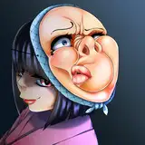
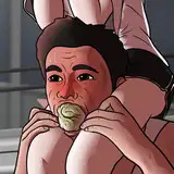
1. In Manga Studio, I start with a very rough thumbnail sketch with big fat pencils. The fat pencils force me to keep the sketch loose without getting too caught up in the details. This sketch came from an idea I had to try to draw the most explicit oral action I could without violating dA's rules.
2. Final sketch. Now I go back and do a more detailed sketch, working out the the body, clothing, and props. This is the longest step in the process because it is when I research the outfits, try out different hairstyles and expressions, and fine tune every lock of hair. This is also when I fix the proportions, make sure the legs are the same length, and so on.
3. Inking. I use a variable-width inking brush for the characters and a constant-width brush for hard things on vector layers. I use lots of different layers for different parts, which makes it easier to overdraw and erase as needed. I also went ahead of inked the shape for the eyelashes because the brush stablization in Manga Studio makes it a lot easier than doing it in Photoshop later.
4. In Photoshop, I convert the imported lines to a folder with a mask and put a solid black layer in the folder. (CTRL-click RGB in the Channels tab, invert the selection, create a mask from the selection.) This will come in handy later when I color the linework. Then I create another folder and start creating the basic color blocking. I like to do all my color blocking by making a folder and then filling it with different solid color layers for each section of color, whch makes it easy to change a color later. This is a very fussy way to do it and it's probably much simpler to just fill a single raster layer with flat colors.
5. Form shading. I create a blue solid color layer (linear burn) and start painting in the basic form shading with a soft airbrush. Except for the hair, which gets its own blue layer but with linear burn blending for more richness.
6. Cast shadows. I started with the cast shadows first since they tend to be simple but bold and can help me remember how the lights are supposed to fall when I work on the other parts of shading. I make a new dark gray layer set to multiply and start painting in the cast shadows with soft brush, using a smaller brush in places where the object casting the shadow is closer to the thing the shadow is on.
7. Backlight. I used a pale pruple layer for backlight, set to screen. When I combine it with the form shading, backlighting really makes the characters pop. I used both a soft brush (for the shiniest parts like the lips) and a soft airbrush (for everything else). I don't use any backlight on non-reflective objects. On the hair, I use a smudge tool to streak the backlight so that it suggests strands of hair. When it's done right, it should look like real lighting from a different angle.
8. Shiny. I used a solid white layer at for basic shine on lips, eyes, and other basic shiny things and solid white set to overlay (which makes a richer shine) for the hair shine. Painting the hairshine, I use a variable width sharp brush, then go over it with an airbrush to give it a little glow. After painting all the shine, I use the cast shadow layer to make a selection and delete the shine from anywhere covered by shadow.
9. Stitching. For the edges between joins, I used a color layer with fill set to zero and a bevel layer effect. For the stitches, I used another color layer with a different bevel and a little outer glow (black, set to multiply). Staples were the same as the stitches but with a sharp bevel.
10. Lace detail. For the lace, I used a color layer with fill set to zero and an outer glow effect (same color as the lace surface but a little darker, set to normal). Then I just doodled lacey patterns all over it.
11. Colored linework. Going back to the linework folder, I started adding new solid color layers, using the mask to paint the color of the linework. Since the new layers are inside a folder with a mask defining the linework, I don't have to be very precise when coloring the lines. I always add new color layers below the ones I already did so that I can be sloppy in the areas that are already covered by colored linework.
12. Eyelashes are done with a folder containing a solid grey layer and a solid black layer. Using the lashes I made earlier with a variable width brush, I add a few thin streaks on the grey layer mask to add depth to the lashes and soften the look with a few strokes of a soft airbrush.
13. For the drool, I used a white layer with the fill turned down just a little and add a layer effect with white inner glow set to 100%. Then I use the mask to soften where is touches the skin (or, in this case, where the invisible skin would be if you could see it). After, I add a new white layer to paint in the shiny highlights.
14. For the blush, I add in a light red layer, airbrushing just on the same area as the skin for the cheeks and other cheeks.
15. For the veil, I imported the linework separately and set it to light grey. Then I just added multiple transparent white color layers to fill the areas covered by the veil. Since I did all this above the other linework layers, the whiteness of the transparent veil lightens the linework where the veil covers it.
16. Finally, I added some abstract shapes and a gradient to the background.