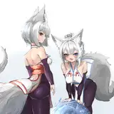
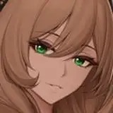
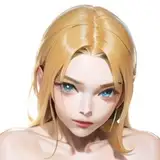
1. In Manga Studio, I start with a very rough thumbnail sketch with big fat pencils. The fat pencils force me to keep the sketch loose without getting too caught up in the details. Only after I work out the pose do I rough in some ideas for the clothing and props.
2. Final sketch. Now I go back and do a more detailed sketch, working out the the body, clothing, and props.
3. Inking. I use a variable-width inking brush for the characters and a constant-width brush for hard things on vector layers. I use lots of different layers for different parts, which makes it easier to overdraw and erase as needed. I exported the silhouetted foreground characters separately.
4. I convert the imported lines for the characters to a folder with a mask and put a solid black layer in the folder. (CTRL-click RGB in the Channels tab, invert the selection, create a mask from the selection.) This will come in handy later when I color the linework. Then I create another folder and start creating the basic color blocking. I like to do all my color blocking by making a folder and then filling it with different solid color layers for each section of color, whch makes it easy to change a color later. This is a very fussy way to do it and it's probably much simpler to just fill a single raster layer with flat colors.
5. Form shading. I create a dark brown solid color layer (linear burn) and start painting in the basic form shading with a soft airbrush. For the hair, I used color burn for richer shading and I used a variable-width soft airbrush to smudge detail into the shadows, picking up the shape of the hairs.
6. Cast shadows. I make a new dark brown layer set to multiply and start painting in the cast shadows with soft brush, using a smaller brush in places where the object casting the shadow is closer to the thing the shadow is on.
7. Backlight. I painted the backlighting with a soft airbrush, pressing harder on the shineist objects. Backlighting really makes the characters pop. I don't use any backlight on non-reflective objects. I used a gradient of blue to green for the color of the backlight to match the environment. I also painted a white backlight on the dominant side of the patent leather to make it extra glossy.
8. Shiny. I used a solid white layer at for basic shine on lips, nails, and shoes, and solid white set to overlay (which makes a richer shine) for the hair shine. Painting the hairshine, I use a variable width sharp brush, then go over it with an airbrush to give it a little glow. After painting all the shine, I use the cast shadow layer to make a selection and delete the shine from anywhere covered by shadow.
9. For the blush, I add in a light red layer, airbrushing just on the same area as the skin. The key is to focus on places where skin is closest to the bone because fattier areas tend to be less red.
10. Colored linework. Going back to the linework folder, I started adding new solid color layers, using the mask to paint the color of the linework. Since the new layers are inside a folder with a mask defining the linework, I don't have to be very precise when coloring the lines. I always add new color layers below the ones I already did so that I can be sloppy in the areas that are already covered by colored linework.
11. I added a couple of simpe gradients to give the backgroud some variation and I brought in the silhouettes, filled in black, with some gaussian blur to create depth.
12. I added small sparkles to each wedding band to draw attention to them.