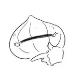
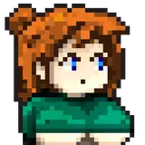
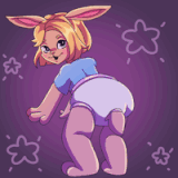
1. I started with a very rough thumbnail.
2. Following the general layout, with some changes, I go back and work out the proportions and perspective more accurately and toy with ideas for the outfit but without worrying about the detail yet.
3. Now I do a more detailed sketch, working out the the body, clothing, and props.
4. Inking. I use a variable-width inking brush for the characters and a constant-width brush for hard things on vector layers. I use lots of different layers for different parts, which makes it easier to overdraw and erase as needed. I also went ahead of inked the shape for the eyelashes because the brush stablization in Manga Studio makes it a lot easier than doing it in Photoshop later. I exported the inking for the character, scene, and the lashes on separate layers.
5. In Photoshop, I convert the imported lines to a folder with a mask and put a solid black layer in the folder. (CTRL-click RGB in the Channels tab, invert the selection, create a mask from the selection.) This will come in handy later when I color the linework. Then I create another folder and start creating the basic color blocking. I like to do all my color blocking by making a folder and then filling it with different solid color layers for each section of color, whch makes it easy to change a color later. This is a very fussy way to do it and it's probably much simpler to just fill a single raster layer with flat colors.
6. For the skyline, I created two rows of simple building silhouettes in colors the same hue as the sky but a little darker and less saturate. For the clouds, I used my simple cloud brush, which is just one little blob of cloud, that I sampled from a photo of clouds, with lots of angle jitter and scatter. I start by using the cloud brush to paint in the whole cloud shape using the darkest shade of the cloud. Then I lock the transparency of the layer (so that I can change the color of the pixels without affecting the shape) and switch to a medium color to paint the general form of the clouds. Then I switch to a brighter shade and add just a few brighter spots here and there.
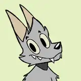
7. Form shading. I create a dark brown solid color layer (linear burn) and start painting in the basic form shading with a soft airbrush. For the hair, I used color burn for richer shading and I used a variable-width soft airbrush to smudge detail into the shadows, picking up the shape of the hairs. I use a similar approach with the fur but in a more freeform style.
8. Cast shadows. I make a new dark brown layer set to multiply and start painting in the cast shadows with soft brush, using a smaller brush in places where the object casting the shadow is closer to the thing the shadow is on.
9. Backlight. A very desaturate pale solid color layer (screen) painted with a soft airbrush. When I combine it with the form shading, backlighting really makes the characters pop. I don't use any backlight on non-reflective objects. For extra glossiness, I also added a white forelight to just the extra shiniest parts.
10. Shiny. I used a solid white layer for the primary shine and painted spots and streaks using a hard variable-width brush. After painting all the shine, I use the cast shadow layer to make a selection and delete the shine from anywhere covered by shadow.
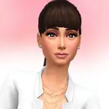
11. For the blush, I add in a light red layer, airbrushing just on the same area as the skin for the cheeks and other cheeks. I use the same method to add color for the eyeshadow.
12. Colored linework. Going back to the linework folder, I started adding new solid color layers, using the mask to paint the color of the linework. Since the new layers are inside a folder with a mask defining the linework, I don't have to be very precise when coloring the lines. I always add new color layers below the ones I already did so that I can be sloppy in the areas that are already covered by colored linework.
13. For the shadow from the leaves, I added a new shadow layer with lower opacity which I filled with a simple leaf brush (a silhouette of a leaf with lots of scatter, angle, and size jitter). blurred it slightly and masked it to just the character. I copied the layer and used distortion and more blurring and applied it to just the grass. On the grass, I used a little grass brush (a single blade of grass, faded out at the bottom) and used it at 50% opacity to add a grassy depth to the edges of the cast shadow on the ground. I also added a grungy texture to the grass, fading it out in the distance.
14. Eyelashes are done with a folder containing a solid grey layer and a solid black layer. Using the lashes I made earlier with a variable width brush, I add a few thin streaks on the grey layer mask to add depth to the lashes and soften the look with a few strokes of a soft airbrush. I drew this above all the other linework and then masked the lashes folder to clip out the part of the lashes that would be obscured by the bonnet.
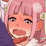
15. For the sweatbead, I used a white layer with the fill turned down just a little and add a layer effect with white inner glow set to 100%. Then I use the mask to soften the edge where it touches the tongue. After, I add a new white layer to paint in the shiny highlights.
Hina Yui
2017-05-01 21:34:57 +0000 UTC