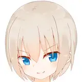
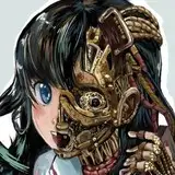
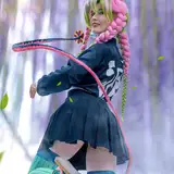
1. First I draw a loose sketch with a large sketching brush. Using a large brush helps me focus on the general shape and pose without getting drawn into the details too soon.
2. Next I do a more detailed sketch, working out the the body, clothing, and props.
3. Inking. I use a variable-width inking brush for the characters and a constant-width brush for hard things on vector layers. I use lots of different layers for different parts, which makes it easier to overdraw and erase as needed. I also went ahead of inked the shape for the eyelashes because the brush stablization in Manga Studio makes it a lot easier than doing it in Photoshop later. I exported the inking for the character, scene, and the lashes on separate layers.
4. In Photoshop, I convert the imported lines to a folder with a mask and put a solid black layer in the folder. (CTRL-click RGB in the Channels tab, invert the selection, create a mask from the selection.) This will come in handy later when I color the linework. Then I create another folder and start creating the basic color blocking. I like to do all my color blocking by making a folder and then filling it with different solid color layers for each section of color, whch makes it easy to change a color later. This is a very fussy way to do it and it's probably much simpler to just fill a single raster layer with flat colors.
5. I need to know where the shadows are going to fall on the backdrop so I painted the background first. For the bricks, I choose a light grey color and painted the lines for the mortar with a variable-width hard round brush, starting with the horizontal lines and then adding vertical lines to divide it into bricks. The trick is to keep the lines very shaky and inconsistent since imperfection is what makes things look more real. Next, I chose a three colors of alternate brick colors and used them to change the color of just a few bricks here and there. Next I picked a pale brick color and used it to add wear to the edges of some of the bricks. Next, I used a semi-transparent darker shade to add vertical streaks to some of the bricks. Finally, I added a gruny texture to the mortar and the ground, using distortion on the ground to give it perspective.
6. Form shading. I create a dark brown solid color layer (linear burn) and start painting in the basic form shading with a soft airbrush. For the hair, I used color burn for richer shading and I used a variable-width soft airbrush to smudge detail into the shadows, picking up the shape of the hairs.
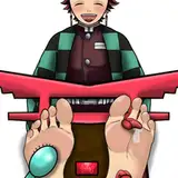
7. Cast shadows. I make a new dark brown layer set to multiply and start painting in the cast shadows with soft brush, using a smaller brush in places where the object casting the shadow is closer to the thing the shadow is on. For the character's shadow on the wall, I just copied the shape of the character and added some blur, then tweaked it where the shadow fell on the ground.
8. Backlight. A very desaturate pale solid color layer (screen) painted with a soft airbrush. When I combine it with the form shading, backlighting really makes the characters pop. I don't use any backlight on non-reflective objects.
9. Shiny. I used a solid white layer for the primary shine and painted spots and streaks using a hard variable-width brush and a soft brush for satiny highlights. For the shine on the hair, I used a variable-width brush to rough in the highlights, then used a smudge tool to streak the endpoints outward, then used an airbrush to add a general blurry glow to each group of highlights, then used an airbrush to soften then edges, then used a solid soft round brush to erase a streak or two from each section of shine. After painting all the shine, I use the cast shadow layer to make a selection and delete the shine from anywhere covered by shadow.
10. For the blush, I add in a light red layer, airbrushing just on the same area as the skin for the cheeks and other cheeks. I use the same method to add color for the eyeshadow.
11. Colored linework. Going back to the linework folder, I started adding new solid color layers, using the mask to paint the color of the linework. Since the new layers are inside a folder with a mask defining the linework, I don't have to be very precise when coloring the lines. I always add new color layers below the ones I already did so that I can be sloppy in the areas that are already covered by colored linework.
12. Eyelashes are done with a folder containing a solid grey layer and a solid black layer. Using the lashes I made earlier with a variable width brush, I add a few thin streaks on the grey layer mask to add depth to the lashes and soften the look with a few strokes of a soft airbrush. I drew this above all the other linework and then masked the lashes folder to clip out the part of the lashes that would be obscured by the bonnet.
13. For the drool, I used a white layer with the fill turned down just a little and add a layer effect with white inner glow set to 100%. Then I use the mask to soften the edge where it touches the skin. After, I add a new white layer to paint in the shiny highlights.
Hina Yui
2017-05-01 21:35:08 +0000 UTC