1. I started with a very rough thumbnail sketch, just to get the concept and general layout down.
2. Next I did a more formal sketch, working out the layout, poses, and proportions.
3. For the final sketch, I worked out all the details of the clothing, hair, and props.
4. Inking. I use a variable-width inking brush for the character and a constant-width brush for hard things on vector layers. I used my own ribbon brush for the fur. I use lots of different layers for different parts, which makes it easier to overdraw and erase as needed. I also went ahead of inked the shape for the eyelashes because the brush stablization in Manga Studio makes it a lot easier than doing it in Photoshop later. I exported the inking for the sissy, the snow, the house, the woman in the window, and eyelashes on separate layers.
5. In Photoshop, I convert the imported lines to a folder with a mask and put a solid black layer in the folder. (CTRL-click RGB in the Channels tab, invert the selection, create a mask from the selection.) This will come in handy later when I color the linework. Then I create another folder and start creating the basic color blocking. I like to do all my color blocking by making a folder and then filling it with different solid color layers for each section of color, whch makes it easy to change a color later. This is a very fussy way to do it and it's probably much simpler to just fill a single raster layer with flat colors.
6. Form shading. I create a dark blue solid color layer (linear burn) and start painting in the basic form shading with a soft airbrush. For the hair, I used color burn for richer shading and I used a variable-width soft airbrush to smudge detail into the shadows, picking up the shape of the hairs. For the fur, I blob in very rough, sketchy, soft shading with lots of variation in brighter parts, then use a smudge tool to create all the individual tufts, always drawn towards the outer edge, always working starting from the outer edge first so that tufts in the middle come last. For the woman in the window, I used a brown layer for the shading for warm indoor lighting.
7. Cast shadows. I make a new dark blue layer (brown inside the window) set to multiply and start painting in the cast shadows with soft brush, using a smaller brush in places where the object casting the shadow is closer to the thing the shadow is on.
8. Backlight. I used two desaturate solid color layers (screen blend mode) painted with a soft airbrush. When I combine it with the form shading, backlighting really makes the characters pop. I don't use any backlight on non-reflective objects.
9. Shiny. I used a solid white layer for the primary shine and painted spots and streaks using a hard variable-width brush. After painting all the shine, I use the cast shadow layer to make a selection and delete the shine from anywhere covered by shadow. For the shine on the hair, I started with thin strokes with a variable-width brush, then use a smude tool to add detail and softness to the tips, then use an airbrush to add a soft glow to groups of streaks, then use an airbrush to fade the tops and bottoms of streak groups, and finally use a soft round brush to erase a few streaks in the middle of each group. For the shine on the latex, I added a glow layer effect using a falloff with a wavy, rising path to create a second soft halo around the main shine.
10. I added some grey noise, scaled up, levels adjusted, and set to overlay, on top of the dress to make it velvety. I used a similar noise pattern as a mask when I backlight and forelight on the velvet.
11. For the blush, I add in a light red layer, airbrushing just on the same area as the skin for the cheeks and other cheeks. I use the same method to add color for the eyeshadow.
12. Colored linework. Going back to the linework folder, I started adding new solid color layers, using the mask to paint the color of the linework. Since the new layers are inside a folder with a mask defining the linework, I don't have to be very precise when coloring the lines. I always add new color layers below the ones I already did so that I can be sloppy in the areas that are already covered by colored linework. I like to keep using black lines (or very close to black) on the hardest objects to give it a contrast with softer objects.
13. Eyelashes are done with a folder containing a solid grey layer and a solid black layer. Using the lashes I made earlier with a variable width brush, I add a few thin streaks on the grey layer mask to add depth to the lashes and soften the look with a few strokes of a soft airbrush.
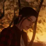
14. For the steaming breath, I added a new white layer and gently brushed some steam with my cloud brush. For the woman in the window, I carefully erased the steam from in front of the mug to make it clear that it was just the steam rising from that cup of hot cocoa.
15. For the house interior, I made simple color blocked shapes and gradients to rough out the walls, used my evergreen tree branch brush to sketch out the tree, added some soft blobs for the lights, and painted in the fire using red, orange, and white.
16. The interior doesn't need to be fully detailed because I then applied a heavy gaussian blur to create distance.
17. Above the woman in the window and below the house exterior, I added a semi-transparent flat white layer with some simple streaks for the surface of the glass. I added a second white layer and used my frost brush to add frost to the window around the edges.
18. I added a white gradient to the snow layer, above the linework, to fade the lighting on the snow closer to pure white in the distance, creating more separation between the foreground character and the house. I also lightened the house exterior itself. To give the snow a little crystal sparkle, I used a fleck scatter brush, mixing white and the blue backlight color around the edges.
19. I added a white vector layer with a stroke layer effect to draw the word balloon and added some simple text.