1. I started with a rough thumbnail idea.
2. Next, I drew a more refined sketch, getting the poses and proportions closer to the final version and using perspective rulers to work out the buildings in the background.
3. Then I did the final sketch, getting the figures finalized, working out all the clothing and hair, and refining the background.
4. Inking. I use a variable-width inking brush for the character and a constant-width brush for hard things on vector layers. I used my own chain brush the chains. I use lots of different layers for different parts, which makes it easier to overdraw and erase as needed. I also went ahead of inked the shape for the eyelashes because the brush stablization in Manga Studio makes it a lot easier than doing it in Photoshop later. I exported the inking for the characters, wheels, wings, background, and lashes on separate layers.
5. In Photoshop, I convert the imported lines to a folder with a mask and put a solid black layer in the folder. (CTRL-click RGB in the Channels tab, invert the selection, create a mask from the selection.) This will come in handy later when I color the linework. Then I create another folder and start creating the basic color blocking. I like to do all my color blocking by making a folder and then filling it with different solid color layers for each section of color, whch makes it easy to change a color later. This is a very fussy way to do it and it's probably much simpler to just fill a single raster layer with flat colors.
6. Form shading. I create a dark brown solid color layer (linear burn) and start painting in the basic form shading with a soft airbrush. For the hair, I used color burn for richer shading and I used a variable-width soft airbrush to smudge detail into the shadows, picking up the shape of the hairs. For the fur, I blob in very rough, sketchy, soft shading with lots of variation in brighter parts, then use a smudge tool to create all the individual tufts, always drawn towards the outer edge, always working starting from the outer edge first so that tufts in the middle come last.
7. Cast shadows. I make a new brown blue layer set to multiply and start painting in the cast shadows with soft brush, using a smaller brush in places where the object casting the shadow is closer to the thing the shadow is on.
8. Backlight. I used a desaturate solid color layer (screen blend mode) painted with a soft airbrush. When I combine it with the form shading, backlighting really makes the characters pop. I don't use any backlight on non-reflective objects.
9. Shiny. I used a solid white layer for the primary shine and painted spots and streaks using a hard variable-width brush. After painting all the shine, I use the cast shadow layer to make a selection and delete the shine from anywhere covered by shadow. For the shine on the hair, I started with thin strokes with a variable-width brush, then use a smude tool to add detail and softness to the tips, then use an airbrush to add a soft glow to groups of streaks, then use an airbrush to fade the tops and bottoms of streak groups, and finally use a soft round brush to erase a few streaks in the middle of each group.
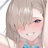
10. For the blush, I add in a light red layer, airbrushing just on the same area as the skin for the cheeks and other cheeks. I use the same method to add color for the eyeshadow.
11. Eyelashes are done with a folder containing a solid grey layer and a solid black layer. Using the lashes I made earlier with a variable width brush, I add a few thin streaks on the grey layer mask to add depth to the lashes and soften the look with a few strokes of a soft airbrush.
12. For the tears, I used a white layer with the fill turned down just a little and add a layer effect with white inner glow set to 100%. Then I use the mask to soften the edge where it touches the skin. After, I add a new white layer to paint in the shiny highlights.
13. For the eyeglasses, I added semi-transparent solid white with some wobbly shiny streaks.
14. Colored linework. Going back to the linework folder, I started adding new solid color layers, using the mask to paint the color of the linework. Since the new layers are inside a folder with a mask defining the linework, I don't have to be very precise when coloring the lines. I always add new color layers below the ones I already did so that I can be sloppy in the areas that are already covered by colored linework. I like to keep using black lines on the hardest objects to give it a contrast with softer objects.
15. I used my cloud brush to add some kicked-up dust behind the wheels, to suggest motion. I started with a darker brown layer, then switched to a brighter shade to add some highlight.
16. To make the fairy godmother more magical, I added a soft golden glow around her by adding a solid layer behind her, matching her shape, then added an outer glow layer effect. Next I used a couple of sparkle and cinder brushes to scatter some sparkles around her.
17. For the wings, I added a softly painted semi-transparent white for one wing, then copied it and used distortion to place it at an angle and turned down the transparency just a little bit to create contrast between the wings.
18. I added a grunge texture for the cobblestones by creating a full-page grunge layer and then distorting it to match the perspective of the ground and setting it to overlay.
19. To enhance the nighttime look in the backdrop, I added a hue/saturation layer to make the scene more violet (matching the sky) and a level adjustment layer to darken it, then I added a mas to keep the blueing effect to just the houses in the middle distance, leaving the street and castle full bright. I also masked out Cinderella in the window.
20. I added a soft glow to the windows by copying the shape of the windowpanes to create a yellow layer, adding an outer glow effect, and then putting it inside a folder with a mask to clip off the effect from breaching the edges of overhanging areas.
21. For a whimsical look, I created a five-pointed star brush and used it to scatter yellow fairytale stars across the sky.