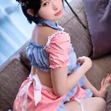
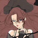
1. I started with a rough thumbnail idea.
2. Then I refined the character, getting the final shape for the bodies and drawing the characters, clothing, and hair in more detail.
3. Inking. I use a variable-width inking brush for the character and a constant-width brush for hard things on vector layers. I used my own chain brush the chains. I use lots of different layers for different parts, which makes it easier to overdraw and erase as needed. I also went ahead of inked the shape for the eyelashes because the brush stablization in Manga Studio makes it a lot easier than doing it in Photoshop later. I exported the inking for the characters, background, and lashes on separate layers.
4. In Photoshop, I convert the imported lines to a folder with a mask and put a solid black layer in the folder. (CTRL-click RGB in the Channels tab, invert the selection, create a mask from the selection.) This will come in handy later when I color the linework. Then I create another folder and start creating the basic color blocking. I like to do all my color blocking by making a folder and then filling it with different solid color layers for each section of color, whch makes it easy to change a color later. This is a very fussy way to do it and it's probably much simpler to just fill a single raster layer with flat colors.
5. Form shading. I create a dark brown solid color layer (linear burn) and start painting in the basic form shading with a soft airbrush. For the hair, I used color burn for richer shading and I used a variable-width soft airbrush to smudge detail into the shadows, picking up the shape of the hairs.
6. Cast shadows. I make a new dark brown layer set to multiply and start painting in the cast shadows with soft brush, using a smaller brush in places where the object casting the shadow is closer to the thing the shadow is on.
7. Backlight. I used a desaturate solid color layer (screen blend mode) painted with a soft airbrush. When I combine it with the form shading, backlighting really makes the characters pop. I don't use any backlight on non-reflective objects.
8. Shiny. I used a solid white layer for the primary shine and painted spots and streaks using a hard variable-width brush. After painting all the shine, I use the cast shadow layer to make a selection and delete the shine from anywhere covered by shadow. For the shine on the hair, I started with thin strokes with a variable-width brush, then use a smude tool to add detail and softness to the tips, then use an airbrush to add a soft glow to groups of streaks, then use an airbrush to fade the tops and bottoms of streak groups, and finally use a soft round brush to erase a few streaks in the middle of each group.
9. For the blush, I add in a light red layer, airbrushing just on the same area as the skin for the cheeks and places where bone is near the surface of the skin. I use the same approach for the make-up.
10. Colored linework. Going back to the linework folder, I started adding new solid color layers, using the mask to paint the color of the linework. Since the new layers are inside a folder with a mask defining the linework, I don't have to be very precise when coloring the lines. I always add new color layers below the ones I already did so that I can be sloppy in the areas that are already covered by colored linework. I like to keep using black lines on the hardest objects to give it a contrast with softer objects.
11. Eyelashes are done with a folder containing a solid grey layer and a solid black layer. Using the lashes I made earlier with a variable width brush, I add a few thin streaks on the grey layer mask to add depth to the lashes and soften the look with a few strokes of a soft airbrush.
12. I added a simple solid transparent layer for the sunglasses lenses, adding a little bit of backlight shine along the edge.
13. For the sweatbeads, I used a white layer with the fill turned down just a little and add a layer effect with white inner glow set to 100%, a bevel effect set so that the highlight as on the bottom, and a subtle drop shadow. Then I use the mask to soften the edge where it touches the skin. After, I add a new white layer to paint in the shiny highlights.
15. To really make it look like sand, I added some speckling to the color of the sand. I used a simple speckling brush, three small, irregular dots with scattering and opacity variation. I set my foreground color to a brighter shade of the sand color and my background color to a darker, more saturate shade with a little more red to it, then set the brush to randomly shift between the foreground/background colors. I brushed the speckling softly over the whole scene, going heavier in both shadows and highlights.
14. The sea was finished in two steps. First I added foam on a new layer by scribbling some white lines along the shoreline, thicker closest the shore. Then added a new layer where I added a row of soft white dots in random sizes and opacity. I applied vertical motion blur to that row to stretch it out just a little, then used level adjustment to make it fade more smoothly. I used transform distortion to match it to the perspective, then used and eraser airbrush to softly remove the streaks where it meets the foam.
15. For the suface of the water, I made a new layer, added the built-in "wrinkles" pattern to it, then set it to vivid light, applied transform distortion to match it to the perspective, linked it to blue of the water, and added a mask with a gradient so it faded out in the distance.
16. For the clouds, I used my simple cloud brush, which is just one little blob of cloud, that I sampled from a photo of clouds, with lots of angle jitter and scatter. I start by using the cloud brush to paint in the whole cloud shape using the darkest shade of the cloud. Then I lock the transparency of the layer (so that I can change the color of the pixels without affecting the shape) and switch to a medium color to paint the general form of the clouds. Then I switch to a brighter shade and add just a few brighter spots here and there. I also used a soft smudge brush to stretch out the edges of a few clouds in the distance.
17. Finally, I added some simple palm fronds in the foreground, using a solid dark green, locking the transparency, then airbrushing in lighter green to give it shape.