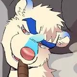
1. In Clip Studio, I start with a thumbnail to get the basic concept down on a canvas 1050 x 1680 using a large pencil. This is a thumbnail so I'm not too worried about precise details, just more about getting ideas in place.
2. Next, a more formal sketch to work out the layout, pose, and proportions. I start getting some of the details roughed out. I made a lot of use of the perspective ruler to set this scene up. It took several attempts to find the right angle and positions to line things up just right.
3. Final sketch. I scale the canvas up to four times the size and sketch the fine detail for the characters.
4. Inking. I use a variable-width inking brush for the character and a constant-width brush for hard things on vector layers. I use lots of different layers for different parts, which makes it easier to overdraw and erase as needed.
This is my second picture done entirely in Clip Studio so this is still a learning process. The following steps are more about what I tried this time than what I recommend.
5. Color blocking. I set the folder containing all the different inked vector layers as the reference layer. Then I made new raster layers underneath and started filling in the flat colors. Sometimes I used a round pen, sometimes the collor fill bucket, usually with the fill set to follow only the reference layer, stopping at the middle of a vector. I organized the different raster layers by using one for each character and one each for different layers of the boxes (the outside, the inside, the latches).
6. Rough Form shading. I create a fill layer with dark brown (set to linear burn) and use variable width hard brush and start painting in the basic form shading in the mask. At this point, all of the shading is very hard-edged, like high-contrast cel shading.
7. Form shading blending. Now I use the blur tool to smooth out the shading in key places, making it softer where I want more roundness. I also use the fingertip tool in places where I need to emphasize a crease. In a few places, I used an airbrush to deepen or lighten shading.
8. Cast shadows. I make a fill layer with a similar less saturate brown (set to multiply) and use a soft brown brush to paint the cast shadows in the mask, using a smaller brush in places where the object casting the shadow is closer to the thing the shadow is on.
9. Backlight. On a new fill layer set to screen, I used a desaturate solid color painted with a soft airbrush in the mask. When I combine it with the form shading, backlighting really makes the characters pop. I don't use any backlight on non-reflective objects. For some objects, I only use a backlight on shadowed side. For the most reflective objects, I add a forelight on the primary light side as well. On the hair, I used the fingertip tool to streak in the shape of the hairs.
10. Shiny. I used fill layers of white (set to screen) and paint spots and streaks using a hard variable-width brush. For the satin, I also added a layer set to overlay and airbrush in white to add colorful glistening highlights. For hair shine, I used another raster layer set to overlay and painted thin strokes with a variable-width brush, then use an airbrush to add a soft glow to groups of streaks, then use a clear airbrush to fade the tops and bottoms of streak groups, and finally use a soft round brush to erase a few streaks in the middle of each group. After painting all the shine, I use the cast shadow layer to make a selection and delete the shine from anywhere covered by shadow.
11. For the natural blush, I add in a raster layer and airbrush red just on the skin for the cheeks and places where bone is near the surface of the skin. I use the same approach for the make-up.
12. Colored linework. Since the linework is still all vectors in Clip Studio, I simply selected the vectors and changed their color to whatever colored linework I needed, sampling from each section and then shifting the color to be more saturate and dark, more or less depending on how hard or soft I want each thing to feel. The hardest things I keep black. Then I collapsed all of the linework into a single raster layer, locked the pixel transparency, and used a round pen to fix up any places where different color linework crossed over each other.
13. Eyelashes are done with a simple raster layer painted with a black variable-width pen. Then I lock the pixel transparency for that layer and use a soft pen to paint in grey streaks for texture and then soften the look with a few strokes of a black soft airbrush. In places where the lashes fall behind the hair, I recolor them to be the same color as the linework for the hair.
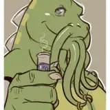
14. For the drool, I made a new raster layer, painted some solid white blobs, then used a clear airbrush to softly erase the center of the blobs and soften the edges where they touch the skin. Then I added a few brighter white spots for shiny highlights.
15. Finally, I added a couple of simple gradients to the backdrop to create a sense of floor and space.