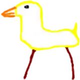
1. In Clip Studio, I draw rough thumbnail to get the basic concept down.
2. Rough sketch. I make a more formal sketch to work out the layout, pose, and proportions. I start getting some of the details roughed out. As you can see, I decided to push the girliness of the run a little further and I changed the ponytail to swing in a more dynamic S-shape for more sense of motion.
3. Final sketch. I sketch the fine details for the character. I use separate layers in multiple folders for the various props and the character which makes it easier to plan, especially when so many of the parts overlap. If you look closely, you can see that I draw some parts that I know will be completely hidden behind others, particularly the basic body shape, to make sure it will all make sense together. Keeping them on separate layers also makes it easier to shift the positions of individual features when final details on foreground features might change the layout needs. The backdrop is only very roughly sketched since it won't need any linework.
4. Inking. I scale the canvas up to four times the size and use a variable-width inking brush for the character and a constant-width brush for hard things on vector layers. I use lots of different layers for different parts, which makes it easier to overdraw and erase as needed. Planning for the line coloring later, I try to use a different vector layer for each part that would be differently colored as linework such as one each for the character's skin, one for everything that will have black linework, etc.
5. For the backdrop, I started with a simple blue/white gradient for the sky. I added a second gradient of grey to light grey in a block from the horizon down, then airbrushed some darker variation. I added an asphalt texture, distorted it to match the perspective, blurred if heavily into the distance, then set it to overlay on the grey. I sampled four colors of green from a photo of grass and used a light running ink brush to sketch in the grass, starting by filling the whole grassy area with one color, then locking the pixel transparency, then painting in varaitions with all four grass colors. I also sampled four colors for the trees, then used a round brush to block in large areas with the second darkest color since I want it to be totally solid in some places. I also brushed in a few thin tree trunks and branches. Then I switched to a tree branch brush I made and brushed in random foliage. Then I locked the pixel transparency and used the tree branch brush to add variations using the other three colors. Finally, I applied a heavy gaussian blur to give it distance.
6. Color blocking. I set the folder containing all the different inked vector layers as the reference layer. Then I made new raster layers underneath and started filling in the flat colors. Sometimes I used a round pen, sometimes the collor fill bucket, usually with the fill set to follow only the reference layer, stopping at the middle of a vector. I also used a rough India ink brush to sketch in a simple backdrop.
7. Form shading. I create a dark brown solid color layer (linear burn) and start painting in the basic form shading with a soft airbrush. I always start with shading at full and then use the airbush set to clear to paint away the shading, painting with light. For the hair, I used color burn for richer shading and start with a general, soft airbrush for the overall shape, then used a variable-width soft airbrush to smudge detail into the shadows, picking up the shape of the hairs. I also added a pale yellow layer set to screen to airbrush in some soft highlights in key places.
8. Cast shadows. I make a new brown layer set to multiply and start painting in the cast shadows with soft brush, using a smaller brush in places where the object casting the shadow is closer to the thing the shadow is on.
9. Backlight. For the secondary lights, I used medium saturate blue (for backlight) and yellow (for forelight). Then I paint with a soft airbrush on opposite sides of shiny objects. When I combine it with the form shading, backlighting really makes the characters pop. I don't use any backlight on non-reflective objects. Usually, I only use the backlight on real skin but, since I'm planning for this sissy to be sweaty, I added a forelight to the skin for shininess. On the hair, I used the fingertip tool to streak in the shape of the hairs in the backlight.
10. Shiny. I used a solid white layer for the primary shine and painted spots and streaks using a hard variable-width brush. For the sweat-slick skin, I also added a white layer, set to overlay, to add colorful glistening highlights and a softer highlight to one side of the specular highlight, using a smudge tool to streak the highlights along creases. For the shine on the hair, I started with thin strokes with a variable-width brush, then use a smude tool to add detail and softness to the tips, then use an airbrush to add a soft glow to groups of streaks, then use an airbrush to fade the tops and bottoms of streak groups, and finally use a soft round brush to erase a few streaks in the middle of each group. After painting all the shine, I use the cast shadow layer to make a selection and delete the shine from anywhere covered by shadow.
11. I added a sequin and glitter texture to parts of the shoes, placing them above the shading layers, set to overlay to keep the contrast of the texture high. I also added a semi-transparent fishnet pattern to the lace on the shorts.
12. For the natural blush (and fake blush on the skinsuit), I add in a raster layer and airbrush red just on the skin for the cheeks and places where bone is near the surface of the skin. I used the same approach for make-up.
13. For the wet t-shirt, I actually painted the skin (and nipple) as they would appear if there were no shirt at all. Then I made the white for the shirt in a layer above the blush layer and used a mask to airbrush the shirt away where I wanted the skin to show through. The trick is to remember that a wet t-shirt is only transparent where it directly touches the skin, fading out very quickly wherever it does not touch the skin. I also added some more opaque strokes for wrinkles in the fabric.
14. Colored linework. Since the linework is still all vectors in Clip Studio, I simply selected the vectors and changed their color to whatever colored linework I needed, sampling from each section and then shifting the color to be more saturate and dark, more or less depending on how hard or soft I want each thing to feel. The hardest things I keep black. Then I collapsed all of the linework into raster layers, locked the pixel transparency, and used an eraser to fix up any places where different color linework crossed over each other or a multiply brush where the shadows were deep enough to require darker linework.
15. Eyelashes are done with a simple raster layer painted with a black variable-width pen. Then I lock the pixel transparency for that layer and use a soft pen to paint in grey streaks for texture and then soften the look with a few strokes of a black soft airbrush. I also added a little pink to the tips of the sissy's eyelashes to make them extra feminine.
16. I added a few effect lines for the butt slap and jiggle, using a pink color, set to linear light so that it blends with the scene while still being very readable. To keep them visible, I tried to keep the effect lines mostly in place of high contrast, such as shadowed areas or places where the backdrop is darkest.
17. For the sweatbeads, I switched over the Photoshop and I used a white layer with the fill turned down just a little and add a layer effect with white inner glow set to 100%, a bevel effect set so that the highlight as on the bottom, and a subtle drop shadow. Then I use the mask to soften the edge where it touches the skin. After, I add a new white layer to paint in the shiny highlights.