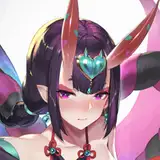
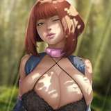
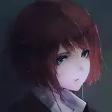
1. Thumbnail. I started with a very basic thumbnail sketch to try out the concept.
2. Rough sketch. I sketch out the final layout and poses. I used Clip Studio's 3D models and perspective rulers as references and roughed in the general shapes for the clothing and props. I also developed some new 3D models for a sidewalk corner, a street post, and a couple of small downtown businesses.
3. Final sketch. I use separate layers in multiple folders for the various props and the character which makes it easier to plan, especially when so many of the parts overlap. If you look closely, you can see that I draw some parts that I know will be completely hidden behind others, particularly the basic body shape, to make sure it will all make sense together. Keeping them on separate layers also makes it easier to shift the positions of individual features when final details on foreground features might change the layout needs.
4. Inking. I scale the canvas up to four times the size and use a variable-width inking brush for the character and a constant-width brush for hard things on vector layers. I use lots of different layers for different parts, which makes it easier to overdraw and erase as needed. Planning for the line coloring later, I try to use a different vector layer for each part that would be differently colored as linework such as one for the character's skin, one for everything that will have black linework, etc. For the buildings, I just let Clip Studio generate the linework from my models.
5. Color blocking. I set the folder containing all the different inked vector layers as the reference layer. Then I made new raster layers underneath and started filling in the flat colors. Sometimes I used a round pen, sometimes the color fill bucket, usually with the fill set to follow only the reference layer, stopping at the middle of a vector. I also added in some text and graffitti, distorted to match the shapes of the buildings and added dollar signs to bra cups, using mesh distortion to match the curves.
6. Form shading. I create a desaturate blue solid color layer (linear burn) and start painting in the basic form shading. For a painterly look on the clothing, I roughed in a very loose sense of form with an airbrush then added all the shading detail using only a watercolor brush. For the more chiseled parts, I used a different shading technique - starting with a hard brush to make something like cel shading, then using watercolor brushes to add midtones, then using the blur tool to smooth the shading out where appropriate and go back to the watercolor brush where I want sharper details. I also added a pale yellow layer set to screen to airbrush in some soft highlights in key places. For the hair, I used color burn for richer shading and start with a general, soft watercolor brush to get lay in some stronger hairs for a sense of texture, then use an airbrush to establish the overall form, then use a fingertip smudge or watercolor brushes to add some extra detail. For the backdrop form shading, I just rendered out my building models using Clip Studio's lighting.
7. Cast shadows. I make another blue solid color layer set to linear burn and start painting in the cast shadows with soft brush, using a smaller brush in places where the object casting the shadow is closer to the thing the shadow is on.
8. Before I can add the backlight, I need to put in the secondary light sources so I will know where to paint the backlight. I made some simple neon sign shapes, using vectors in Clip Studio, distorted to match the perspective, then exporting them to Photoshop so I can create the neon using some simple layer effects (bevel, outer glow, and border). Then I brought them back into Clip Studio and airbrushed a pink glow around the neon onto the surfaces of the storefront.
9. Backlight. For the secondary lights, I used a pale desaturate color layer away from the light source (screen blend), a white layer toward the light source (normal blend), and a neon pink layer along edges that neighbor the neon in the backdrop. Then I paint with a soft airbrush or a watercolor brush (when I want it to be more textured) on opposite sides of shiny objects. The forelight is used only on the shiniest parts, mainly the decorations. When I combine it with the form shading, backlighting really makes the characters pop. I don't use any backlight on non-reflective objects. On the hair, I used the watercolor brush to streak in the shape of the hairs and then used an airbrush, selection-masked to the shading, to add softer backlight.
10. Shiny. For the glossiest parts, I used light watercolor brushes to paint reflections for both primary and reflected light sources, then I used a strong watercolor brush for the specular highlights (or a variable round hard brush when I want the highlight extra strong), using a thumb tool to smudge for detail. For the shine on the hair, I started with thin strokes with a soft watercolor brush, then use an airbrush to add a soft glow to groups of streaks, and finally use a soft round brush to erase a few streaks in the middle of each group. After painting all the shine, I use the cast shadow layer to make a selection and delete the shine from anywhere covered by shadow.
11. For the natural blush, I add in a raster layer and airbrush red just on the skin for the cheeks and places where bone is near the surface of the skin. I used the same method for the make-up. Then I add a color map of red, yellow, and cyan to the face, set to a very low opacity in color blend mode, to give the face a more realistic range of hues.
12. I also added glittery textures to the eyeshadow, bra cups, and chocker, placed above the shading and set to overlay, so that they enhance the shading, giving the appearance of a rougher surface. I also added some concrete and grunge textures to the street post, placed below the shading for a smoother look.
13. Colored linework. Since the linework is still all vectors in Clip Studio, I simply selected the vectors and changed their color to whatever colored linework I needed, sampling from each section and then shifting the color to be more saturate and dark, more or less depending on how hard or soft I want each thing to feel. The hardest things I keep black. Then I collapsed all of the linework into raster layers, locked the pixel transparency, and used an eraser to fix up any places where different color linework crossed over each other. By using the same blending mode for both form and cast shading, I wind up with darker linework but I can avoid having to hand-shade the linework which is a big time-saver.
14. Eyelashes are done with a simple raster layer painted with a black variable-width pen. Then I lock the pixel transparency for that layer and use a soft pen to paint in grey streaks for texture and then soften the look with a few strokes of a black soft airbrush. I also added some color to the tips of the lashes for extra flair.
15. Going back to the backdrop, I added brickwork, concrete, and grunge textures at many different sizes and perspectives. Most of the grunge was airbrushed in the mask so that the filth would be thicker in the corners.
16. To change the scene from day to night, I added adjustment layers to shift the backdrop to color balance heavily to blue while reducing saturation and brightness. I masked the adjustment layers so that the effect would be stronger on distant parts of the backdrop. I applied the same adjustments to the street pole, fading to be strong at the top.
17. I made a copy of the backdrop and applied a strong gaussian blur, masking it over the unblurred backdrop so that distant parts are more blurry.
18. I stamped in some white sparkles all around the outfit. And added some extra pink neon (set to add glow) over the characters including the linework, to enhance the effect of the neon.
19. I copied parts of the whole scene to make the photo on the phone and the distorted reflections on the sunglasses.
20. I added word balloons for context. I prefer drawing my own curve balloon so it has fewer points and is easier to edit.
Hina Yui
2021-11-01 21:18:53 +0000 UTC