Enamel Pin Ponderings
Added 2019-12-26 04:48:06 +0000 UTCDear Insane Children
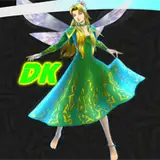
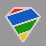
Font Lord here, ready to excite your Christmas/Boxing Day/Festive Celebrations with actual images of real pins being made :)
Take a look at the pic and see which of these 3 samples tickles your fancy the most and sound off in the comments below.

* Over on the left, we have 'Silver Metal with Black Enamel'.
* In the middle we have 'Black Nickel and Silver Filling'. (yes, it really does have that kinda 3D look on the symbols)
*And on the right, we have 'Black Nickel with White Enamel'.
Me and American have our own ideas about which style to go for, but without letting you know which way we're leaning, we wanted to hear from you.
So, say LEFT, RIGHT or MIDDLE in the comments and then we'll see if all our ideas line up and we can tell the factory to pull the trigger on getting it all made :)
- Cheers and a Merry Christmas to all
Comments
Right
2020-02-03 06:06:46 +0000 UTCRight
2020-01-26 19:16:15 +0000 UTCMiddle :D
2020-01-16 13:08:09 +0000 UTCRight~
2020-01-08 20:42:42 +0000 UTCMiddle
2020-01-08 14:14:22 +0000 UTCLeft :)
NecromancerforLife
2020-01-08 13:56:59 +0000 UTCLeft or Right. I don't care for the center one.
2020-01-07 20:59:38 +0000 UTCThe right one!
2020-01-06 17:19:13 +0000 UTCI want the left one tbh
2020-01-06 05:57:30 +0000 UTCRight!
2020-01-05 03:31:26 +0000 UTCI think the one on the right looks best. I like the 3D aspect of the center one but it looks too cloudy...
Christ Why
2020-01-02 17:58:35 +0000 UTCMiddle
2020-01-02 15:10:05 +0000 UTCRight! :)
2020-01-02 08:21:56 +0000 UTCRIGHT
2020-01-01 19:01:02 +0000 UTCMiddle
2020-01-01 18:59:45 +0000 UTCLEFT
2020-01-01 15:06:35 +0000 UTCMiddle or right
2020-01-01 14:10:02 +0000 UTCMiddle! Love the design!!
2020-01-01 03:29:30 +0000 UTCRight
2019-12-31 07:13:29 +0000 UTCMiddle
2019-12-31 05:46:13 +0000 UTCGoing right, it’s clearest & makes me Cheshire grin
2019-12-31 05:35:24 +0000 UTCRight. The left one looks too bright like it is unfinished and the middle one looks wrong
2019-12-31 04:36:03 +0000 UTCI like the middle, but I don't know if it will work with all of them. I think my official vote with be the right.
Drucilla Shultz
2019-12-31 02:59:25 +0000 UTCMiddle <------ 100%!!!!! *cheeto dab* *cheeto dab* EDIT: While I appreciate the highly scientific method of Patreon comments, perhaps you could put up an actual survey? Unless, the goal is plausible deniability so you can make an executive decision to go with the one you like, in which case all is proceeding according to plan and again, thank you for choosing the middle one which is obviously superior in every way. The public will never even know. :D
truth_decay
2019-12-30 18:12:07 +0000 UTCThey're all gorgeous but, middle! (= Merry Christmas and happy holidays to you all!! <3
2019-12-30 00:49:55 +0000 UTCMiddle
James Allvord
2019-12-29 21:00:22 +0000 UTCI like right and middle
2019-12-29 17:02:12 +0000 UTCRight looks best, middle close behind tho
Hahnt9009
2019-12-29 08:45:40 +0000 UTCPersonally, leaning towards middle, I like that aesthetic
eman5112
2019-12-29 01:36:29 +0000 UTCBlack and white!
2019-12-28 22:52:28 +0000 UTCright!!
2019-12-28 21:39:35 +0000 UTCRight
2019-12-28 21:13:11 +0000 UTCRight!!! :)
2019-12-28 19:19:24 +0000 UTCRight
2019-12-28 19:05:13 +0000 UTCRight :D
2019-12-28 14:37:16 +0000 UTCRight
2019-12-28 08:03:10 +0000 UTCMiddle
2019-12-28 03:27:58 +0000 UTCRight !
2019-12-27 19:51:36 +0000 UTCRight, really like the middle one but the one in the right is much clearer.
2019-12-27 19:16:43 +0000 UTC3
Masha Gazizova
2019-12-27 19:07:57 +0000 UTCThe one on the right. The one in the middle looks too thick on the black and looks blurry.
2019-12-27 17:56:19 +0000 UTCMiddle!
2019-12-27 17:01:30 +0000 UTCMiddle!! That looks sick as hell!!
2019-12-27 16:57:42 +0000 UTCBlack Nickel and White Filling I like the 3D effect of #2, but it has a dim darkened look. It does seem to ‘pop’. And I like how #3 ‘pops’, the contrast is extremely striking. A mix would turn heads. And the 3D would help protect the coloring. P.S. Be cool if the Patreon exclusive pin was [Black Nickel and Rustic Gold Filling].
2019-12-27 14:57:09 +0000 UTCRight first, then middle
2019-12-27 13:13:29 +0000 UTCRight then left. The right is the clearest, but I sort of like the white on the left.
2019-12-27 10:19:28 +0000 UTCRight!
2019-12-27 09:10:44 +0000 UTCI'd go for the Middle, even if the photo is a bit blurry, but Right is a close second
2019-12-27 08:53:56 +0000 UTCI like the one on the right.
2019-12-27 08:50:10 +0000 UTCThe one on the right.
Phil Swabo
2019-12-27 07:04:17 +0000 UTCMiddle!
2019-12-27 05:26:33 +0000 UTCRight is the best out of them all, the middle falls second only because it looks a bit blurry with the way the clear coating on top reflects. The silver in the left just blends everything together and not as eye catching or clear as the others.
2019-12-27 02:40:00 +0000 UTCRight one as first choice. Middle is second.
2019-12-27 02:09:37 +0000 UTCMiddle!
2019-12-27 01:58:31 +0000 UTCI like the right best!
2019-12-27 01:37:22 +0000 UTCMiddle
ReaperNX
2019-12-27 01:22:24 +0000 UTCRight, then middle.
2019-12-27 00:49:05 +0000 UTCRight! (or middle as my second choice).
2019-12-27 00:11:52 +0000 UTCRight
2019-12-26 23:53:45 +0000 UTCThe one on the right!
Definitely not Adam Driver
2019-12-26 23:37:22 +0000 UTCme and the insane husband vote middle.
2019-12-26 23:13:16 +0000 UTCMiddle
2019-12-26 22:59:44 +0000 UTCMiddle
2019-12-26 22:51:56 +0000 UTCFirst choice would be right, 2nd would be middle.
Ray Weatherford
2019-12-26 22:48:08 +0000 UTCEither of Middle or Right
Jaded Entity
2019-12-26 22:26:53 +0000 UTCRight
Erin Flower
2019-12-26 22:12:06 +0000 UTCIf I have to pick, I'd say: middle. But truthfully I don't like any of them! I would like to see them in grey/silver not the black and white ones. Is it a pin you can wear? Cause now it looks like a fridge magnet! Sorry, just not really liking them
2019-12-26 22:06:54 +0000 UTCRight
Stardust
2019-12-26 21:46:06 +0000 UTCLEFT or RIGHT (I like the minimalist look of the left, but the right is also really good looking)
That SPY
2019-12-26 20:55:24 +0000 UTCMan it's a toss up between the middle and right for me, I would be happy with which ever of those two wins.
2019-12-26 19:48:08 +0000 UTCRight
Sarah McKeegan
2019-12-26 19:18:37 +0000 UTCRight.
2019-12-26 19:04:21 +0000 UTCRight.
MeBonnieLass
2019-12-26 18:59:50 +0000 UTCMiddle!🎩
2019-12-26 18:52:30 +0000 UTCRight. Middle looks fuzzy (unless that's what we're going for)
2019-12-26 17:51:55 +0000 UTCRight
Abelwyn Connelly
2019-12-26 17:47:24 +0000 UTCMiddle or right
2019-12-26 17:21:23 +0000 UTCRight ☺️
2019-12-26 17:01:59 +0000 UTCRight. Happy holidays everyone
2019-12-26 16:18:13 +0000 UTCRight
2019-12-26 15:56:00 +0000 UTCRight
mckenic
2019-12-26 15:26:00 +0000 UTCMiddle
missa8u
2019-12-26 15:10:45 +0000 UTCMiddle
2019-12-26 15:07:37 +0000 UTCRight!!!!!!!
Angel Ellis
2019-12-26 15:03:36 +0000 UTCMiddle, definitely
2019-12-26 14:22:23 +0000 UTCMiddle!!
Nao Stryker
2019-12-26 14:11:04 +0000 UTCRight
Katherine Shearer
2019-12-26 14:03:33 +0000 UTCRight
2019-12-26 13:35:10 +0000 UTCRight
2019-12-26 13:32:52 +0000 UTCMiddle.
2019-12-26 13:29:35 +0000 UTCRight 😎
2019-12-26 13:28:07 +0000 UTCMiddle
2019-12-26 13:20:22 +0000 UTCRight
2019-12-26 13:19:03 +0000 UTCRight!
2019-12-26 13:09:20 +0000 UTCRight
2019-12-26 12:56:22 +0000 UTCOn the pics, right is the cleanest but you know, from pictures to reality...
2019-12-26 12:50:23 +0000 UTCRight
2019-12-26 12:49:13 +0000 UTCRight
2019-12-26 12:39:18 +0000 UTCRight
Davinellulinvega
2019-12-26 12:38:22 +0000 UTCRight
2019-12-26 12:37:16 +0000 UTCMiddle
Daniel Linsley
2019-12-26 12:36:45 +0000 UTCMiddle
2019-12-26 12:29:09 +0000 UTCMiddle
2019-12-26 12:14:02 +0000 UTCRight
2019-12-26 12:12:44 +0000 UTCRight
2019-12-26 12:12:43 +0000 UTCRight
Tequila JoJo
2019-12-26 11:25:30 +0000 UTCRight
2019-12-26 11:21:57 +0000 UTCRight
Kizu
2019-12-26 11:16:55 +0000 UTCRight
2019-12-26 11:07:17 +0000 UTCRight
Laura Fowler
2019-12-26 11:00:34 +0000 UTCRight
2019-12-26 10:58:14 +0000 UTCRight
2019-12-26 10:32:57 +0000 UTCRight
2019-12-26 10:27:02 +0000 UTCRight
2019-12-26 10:22:52 +0000 UTCRight 🖤
WitchDoll
2019-12-26 10:22:03 +0000 UTCRight
2019-12-26 10:11:46 +0000 UTCThe right one...
2019-12-26 09:43:55 +0000 UTCRight
2019-12-26 09:38:49 +0000 UTCRight
2019-12-26 09:26:28 +0000 UTCMiddle
2019-12-26 09:15:43 +0000 UTCMiddle or Right, the right one is more clear, the middle has something. :)
2019-12-26 09:14:02 +0000 UTCRight
2019-12-26 09:10:11 +0000 UTCRight
Henrike
2019-12-26 08:49:35 +0000 UTCIn reason of the color Design... right
2019-12-26 08:44:28 +0000 UTCRight!
2019-12-26 08:33:14 +0000 UTCRight ! It's better than the others.
2019-12-26 08:30:36 +0000 UTCRight looks cleanest
2019-12-26 08:15:29 +0000 UTCRight and Middle. Left looks like a factory defect but might change my mind if I see other pins with the left style.
2019-12-26 08:03:26 +0000 UTCRight please
2019-12-26 07:57:59 +0000 UTCpretty sure "Silver metal" is still nickel, but I could be wrong
Catheryn Alice North
2019-12-26 07:51:41 +0000 UTCright
Catheryn Alice North
2019-12-26 07:50:45 +0000 UTCRight
2019-12-26 07:45:52 +0000 UTCMiddle
2019-12-26 07:37:08 +0000 UTCRight
Lady Charon
2019-12-26 07:35:42 +0000 UTCI like the colors on the right one the most, but I'm allergic to nickel so just because of that I vote left 🙈
2019-12-26 07:34:38 +0000 UTCWhat about left, but inverted? Like black on silver?
Wendy Jaa
2019-12-26 07:20:33 +0000 UTCRight
Gregor Hähnel
2019-12-26 07:09:28 +0000 UTCRight
2019-12-26 07:05:20 +0000 UTCRight
2019-12-26 06:59:28 +0000 UTCright
MithrilRathalos
2019-12-26 06:54:23 +0000 UTCRight. It's so much cleaner and easier to read
HaywireFool
2019-12-26 06:36:48 +0000 UTCRight
2019-12-26 06:23:54 +0000 UTCRight
2019-12-26 06:23:28 +0000 UTCMiddle is my favorite, but Right would be my second choice.
Summer Hinch
2019-12-26 06:21:47 +0000 UTCI like the right one a lot!
Designated Red
2019-12-26 06:19:39 +0000 UTCMiddle for sure looks more to the theme
2019-12-26 06:10:31 +0000 UTCRight for me. It looks more like Hatters hat in my opinion
2019-12-26 06:10:14 +0000 UTCRight
2019-12-26 06:01:11 +0000 UTCright
2019-12-26 06:00:20 +0000 UTCMiddle is my first choice, right is my second. Left has too much silver on it.
ImprudentBean35
2019-12-26 06:00:09 +0000 UTCMiddle
2019-12-26 06:00:05 +0000 UTCRight, but I'd also be pretty happy with Middle as a second best.
Rosuav
2019-12-26 05:58:05 +0000 UTCMiddle
2019-12-26 05:51:58 +0000 UTCMiddle
2019-12-26 05:49:13 +0000 UTCThey all look pretty good honestly! But I have to go with- Right!
2019-12-26 05:47:27 +0000 UTCRight
2019-12-26 05:46:36 +0000 UTCMiddle - very much prefer the more ...analog (?) look of it as opposed to the other two, which have a clarity that doesn't seem to fit.
2019-12-26 05:44:43 +0000 UTCMiddle
2019-12-26 05:41:28 +0000 UTCRight. The middle does look cool with the 3D effect, but the right is much more cleaner as an enamel pin.
2019-12-26 05:40:18 +0000 UTCMiddle
Tika
2019-12-26 05:35:52 +0000 UTCRight
2019-12-26 05:29:39 +0000 UTCRight
2019-12-26 05:26:43 +0000 UTCRight
2019-12-26 05:24:43 +0000 UTCMiddle!!!!
2019-12-26 05:23:55 +0000 UTCMiddle for sure! I rather like the 3D effect it has
2019-12-26 05:22:54 +0000 UTCRight
2019-12-26 05:22:34 +0000 UTCMiddle! Definitely middle! The 3d aspect makes it different and what else screams Alice than different and unique??
2019-12-26 05:17:13 +0000 UTCMiddle
2019-12-26 05:13:24 +0000 UTCMiddle
2019-12-26 05:11:07 +0000 UTCRight, the sharpest of the three 👌
Vladimir Ruthven
2019-12-26 05:09:36 +0000 UTCRight
Hookboy
2019-12-26 05:07:22 +0000 UTCRight
2019-12-26 05:04:54 +0000 UTCMiddle.
Katelyn
2019-12-26 05:04:47 +0000 UTCRight
2019-12-26 05:03:21 +0000 UTCMiddle!
2019-12-26 05:02:34 +0000 UTCRight
2019-12-26 04:59:53 +0000 UTCRight
2019-12-26 04:59:52 +0000 UTCMIDDLE!!!!
2019-12-26 04:58:47 +0000 UTCRight
RainbowViper
2019-12-26 04:57:39 +0000 UTCRight for sure
2019-12-26 04:57:24 +0000 UTCRight
2019-12-26 04:57:02 +0000 UTCMerry Christmas to my fellow insane brothers and sisters🤗and to your family...Right one. Definitely!!
Tal'Ki
2019-12-26 04:55:58 +0000 UTCRight :)
GoldenSonic115
2019-12-26 04:54:12 +0000 UTCright
2019-12-26 04:53:58 +0000 UTCright
Ashley Lopez
2019-12-26 04:53:39 +0000 UTCRight
2019-12-26 04:53:18 +0000 UTCRight
2019-12-26 04:53:00 +0000 UTCRight! :)
2019-12-26 04:52:49 +0000 UTCRight based on visibility and how immediately recognizable it is.
2019-12-26 04:52:09 +0000 UTCI like them all but Right appeals to me the most.
2019-12-26 04:51:49 +0000 UTCRight 100%
2019-12-26 04:51:38 +0000 UTCMiddle or right.
2019-12-26 04:51:36 +0000 UTCRight!
2019-12-26 04:51:32 +0000 UTCRight
2019-12-26 04:51:25 +0000 UTCRight
2019-12-26 04:51:13 +0000 UTCI'd have to say right is best looking IMO
2019-12-26 04:51:09 +0000 UTCI love the Middle one, expessally the 3D look of if. I feel the one on the left is too washed out and the on on the right has less definition than ths middle one.
2019-12-26 04:50:38 +0000 UTCRight, then middle. Left just doesnt have that pop to it.
2019-12-26 04:50:38 +0000 UTCRight. 100%
2019-12-26 04:50:37 +0000 UTCRight
2019-12-26 04:50:31 +0000 UTCThe middle and right ones are better; the left one doesn't really stand out in my opinion
Veronica Martinez
2019-12-26 04:50:22 +0000 UTCRight
2019-12-26 04:50:08 +0000 UTCRight, by a large margin.
Tenori
2019-12-26 04:49:59 +0000 UTCMiddle
2019-12-26 04:49:50 +0000 UTCRight.
2019-12-26 04:49:47 +0000 UTCI like the middle and right ones.
DitzyBat
2019-12-26 04:49:41 +0000 UTC