Hysteria V1.0
Added 2020-12-22 05:15:00 +0000 UTC
Dear Insane Children,
Font Lord here with... well... whatever this is :D
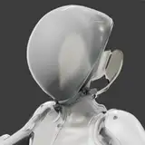
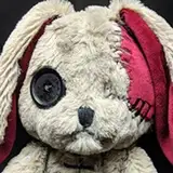
As you can see, we have received the V1.0 prototype of the Hysteria Rabbit from the factory, and let's just say that it needs a little work.

If we compare it to the original design, we can clearly see that it's missing stitching, black feet and the face shape is kinda wrong too.

What other changes (if any) do you think need to be made for V2.0 ?
We also have some designs for the bag that will come with the Rabbit and we'd certainly appreciate your feedback about this in the poll below.
Which of these do you think we should go with? Or maybe we need to see more attempts?


As usual, sound off in the comments with your thoughts, ideas, suggestions and ponderings on both the rabbit and bag :)
- Cheers, from an increasingly chilly Shanghai.
Comments
I like bag "B" but I also like the deep red of bag "A"
2020-12-26 16:42:38 +0000 UTCWish there was a combination of the 2... I like symbol and colors of bag A but the design of bag B.
2020-12-24 22:26:33 +0000 UTCI like the colors of the Bag A but the design of bag B ❤️
Janina
2020-12-24 15:36:16 +0000 UTCThe design of B but with the color scheme of A
2020-12-24 02:01:43 +0000 UTCi like bag B design more, but i do prefer the line work of bag A
2020-12-23 10:34:52 +0000 UTCI also think the color scheme on bag A would be better on bag B
2020-12-23 07:39:32 +0000 UTCI love the color of the blood on A but I would definitely go with B, that Mysterious logo dripping with blood looks so cool to me.
2020-12-23 05:43:21 +0000 UTCColor scheme of A on B
Hawk Owsley
2020-12-23 02:25:30 +0000 UTCForgot to add about the bag. I prefer the darker red to go with hysteria and blood. I'm not in love with the alchemy symbols but I do like A better but I would love to show off the mystery shop logo too in B. I'm proud to show my product from you guys.
2020-12-23 02:11:51 +0000 UTCFor the bunny I feel that the art didn't translate well to plush. The eyes just look silly in physical form in comparison to the photo. It might be the face shape messing with the eyes though. I feel the red would look more like blood if it were darker? Cause I think someone said it looked more like a design instead of tear ls. I also heard someone say something about making it more stubby. That might help with this rabbit.
2020-12-23 02:10:26 +0000 UTCDefinitely A! That design is so awesome, I'd be very happy with just buying the bag ♡ Would prefer it in black with white though, but still, I'm in love with the overall design + the red on this, is way better than the red on design B.
2020-12-22 23:33:42 +0000 UTCI feel the bag needs to be more simplified. I like the brighter red of the second one but the thinner streaks of the first. Have the alchemical symbol on one side and the Mysterious logo on the other. I think that would look much nicer and be cheaper to produce.
Ray Weatherford
2020-12-22 18:45:05 +0000 UTCFor the rabbit, the thing that jumped out at me the most was the eye blood. It looks more like an intentional red design rather than dripping blood. As for the bags, I like the concept of them both, but I don't like either one 100%. I like the hysteria symbol being in the middle of the alchemical table (A), but I like the the way the blood drips down the table (B). I also like the more realistic blood look (A) but I like the mysterious logo and the way it's covered in blood too (B).
Drucilla Shultz
2020-12-22 18:22:01 +0000 UTCAgreeing with most others to put the Mysterious logo from B onto the back of A. That said, I don't love the alchemy designs from either A or B. I like the red hysteria symbol from bag A but maybe over the alchemy circle from bag B? I'd want the color of the bag handle to match whatever blood design you went with.
Anna Lepper
2020-12-22 16:47:15 +0000 UTCI like the cover of Bag A but like the logo addition of bag B
2020-12-22 16:25:03 +0000 UTCI like bag A but add the logo to the back like bag B. The bunny definitely needs the fixes you suggested in the post. With those fixes I think it'll be in business. Would it be possible that in addition to the bunnies we could start a plushie design for another character? I know from a previous post you mentioned the bunnies are the big seller on the Mysterious store but it would be nice to have another character from the game to start working on and add to the collection.
2020-12-22 15:59:09 +0000 UTCI like bag B better but would prefer the darker red used in A!
Eleven
2020-12-22 15:39:13 +0000 UTCI would go with bad A but the other side with the mysterious logo like bag B
Jessie States
2020-12-22 15:11:22 +0000 UTCI agree that the face and hands needs fixing but I'd like to focus on the body and the legs. When I was a kid I had two Snoopy stuffed animals - one was small and had stubby legs and the other looked like the above bunny. Needless to say the elongated one was relegated to the closet and the stubby (cute) one stayed on the bed. To match the picture better - the above design needs to compact the body and shorten the legs. Stuffed animals are cute because they are small and not elongated (at least this line of bunnies is cute because of that). These are my opinions so take what you want with them.
2020-12-22 14:27:42 +0000 UTCI'm not in need of a bat, but I think aspects need to be combined. the logo should be on the flip side. I like the symbol placement on a, but the red other symbols on b, and it DEFINITELY needs the darker blood of A (red can fade with time and b already looks too pink) but the blood spill pattern of b is better. I also like how the blood on b bleeds onto the symbols (it could do that more)
2020-12-22 13:27:52 +0000 UTCHysteria bunny look like he ate all the Monsters. Definitley needs slimming. Eyes a bit smaller and lower. Nose is a bit long. Blood looks like lines not really blood driPping. As for the bag....Bag B but with A blood (Maybe a bit brighter but still have the ombre effect) would look nice I think.
2020-12-22 11:32:55 +0000 UTCI would absolutely say bag 2 to come with the Hysteria Rabbit but as for the Hysteria Rabbit it definitely isn't like what you guys designed he definitely needs the black feet and proper stitching that has been missed also I would've said he needs to look more smaller but stuffed more🤔 definitely need a chubby face shaped liked the design and possibly the ears not as long basically I would say the Hysteria rabbit needs to look more like the distressed white rabbit but obviously Hysteria style/design💚🧡
2020-12-22 11:27:32 +0000 UTCI feel like I expected hysteria to look a little more... scruffy? For some reason Tweek from South Park comes to mind. Just fur all over the place and messy. As for the bags, neither at this point. I would prefer a plain (minimalistic) bag that is easier to combine with different styles. Or no bag at all. Im here for the rabbit, the bag is just part of the package for me.
Dewi Sri
2020-12-22 09:52:41 +0000 UTCI want everything on bag A but add the logo from B to bag A and then it would be better. That’s my suggestion.
2020-12-22 08:13:33 +0000 UTCI dont like to wear trademark, so I prefer the bag A.
2020-12-22 08:08:59 +0000 UTCThe blood on B is better, A looks like paint dripping, but the design of the front from A I prefer. I like the Mysterious butterfly on the bag too. So kind of an amalgamation
2020-12-22 07:19:27 +0000 UTCBag A definitely looks better with the painted Hysteria (?) symbol placement and overall color scheme (the darker reds and greyer lines/text). And I do rather like the chart's appearance from Bag A. But at the same time the opposite side is pretty lacking. Even though the butterfly is good. I wonder if some kind of visual Tarot element would look good on the blank/mysterious butterfly side?
RedBreloom
2020-12-22 06:40:37 +0000 UTCCommenting on the bags, I really like Bag A, but if the reverse had the Mysterious Logo it would be better, IMO
That SPY
2020-12-22 06:30:25 +0000 UTCThe rabbit eyes are alittle close together and bigger then art. But the idea so far look super good.
2020-12-22 05:49:02 +0000 UTCThe eyes for the bunny are too high compared to the concept art. I think bringing the eyes down and give her/him a bigger forehead would help.
2020-12-22 05:48:19 +0000 UTCI like bag A with the bag B back. I think the rabbit looks great in the drawing, no need to mess with perfection!
RainbowViper
2020-12-22 05:42:09 +0000 UTCBag B with blood from A would look rad. For sure the rabbit needs work. Honestly if you know who Terriermon is, I imagine the end design of the body shape/ear proportion would be similar?
Saucentric
2020-12-22 05:39:29 +0000 UTCI feel like bag B has too much going on, bag A is more simple and clean, and I like that.
Karolina Belomestnova
2020-12-22 05:39:16 +0000 UTCI think Bag A's desin is the best, but I would love to see the Mysterious butterfly on the back of Bag A as well. The deep red and shading makes the blood look more realistic and symbol placement on the front is much better. Having it in the center at the forefront of everything looks really good! Also Rabbit needs some help still lol. The original drawing looks perfect to me. Maybe I would add a bit more scars/stitching throughout the plush, but that's about it.
2020-12-22 05:31:45 +0000 UTCI like the blood on bag a, but I like mysterious on bag b.
2020-12-22 05:29:08 +0000 UTCI'm feeling the same as Melanie, somewhere along bag B, but with the blood from bag A.
2020-12-22 05:29:05 +0000 UTCAnd the symbol placement on the A bag looks the most “Alice” like to me. If I saw someone carrying it without knowing on the street, I would immediately think of Madness Returns and ask if it was Alice merch. The B bag is neat too, but harder to see the symbol. They’re both great, hard to choose!! I love the A bag.
2020-12-22 05:23:37 +0000 UTCWhat about bag b with the blood from bag a?
Mellerz
2020-12-22 05:22:31 +0000 UTCI’m feeling Bag B mostly because of the color of the blood. That red is really nice and seems perfect for this merchandise.
Nicholas Brokaw
2020-12-22 05:21:19 +0000 UTC