SamSuka
americanmcgee
americanmcgee

patreon


DARKNESS CUTS DEEP

Hello again everyone, Alex here with some updates from the shadows.
(And a word from Font Lord at the end)

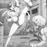
It’s crowd design time. We’re opening up some old wounds here with a new weapon concept.

1. Umbral Scythe - Initial Weapon Concept

I won’t go into too much detail here regarding the weapon lore to avoid serious spoilers.

However, if you do want to travel down to Spoiler Town read the Narrative Outline here. (Pages 128-133 specifically).

There comes a point in Asylum where this new weapon, the Umbral Scythe makes its horrible debut. Forged of darkness, this is a weapon wielded by Alice’s Shadow Half.

American had requested the Scythe feature some form of “tentacle” motif, and I’ve tried to work this in visually so that it doesn’t override the main function of being a Scythe-based melee weapon. It can also be thrown as a spinning death wheel, boomerang style.

The narrative outline details a few other nasty tricks up its sleeve, but for now, we’re asking the question of aesthetic.

Currently, Umbral Scythes come in four tasty flavors.

A) Chaos
B) Dark Vorpal
C) Embering Ruin
D) Ruin


The choice is; which is the right design in your opinion?

Which version best suits the character of Shadow Alice as the default weapon skin?
Where do we take the design from here?

Or does a concept here nail it?

Sound off in the comments below.   


When I designed this weapon concept, I felt it depends really on what we want to primarily communicate visually in Shadow Alice through her weapon choice.

I’ve got my favorite, but I’m interested to see yours.

For easy reference, here is the current collection of concept art from the character development of Shadow Alice. Created by Omri, Joey and Myself.  


2. Carpenter and Walrus // Chaos Consumed

Next up, the original designer of Alice’s iconic look from over 20 years ago, Norman Felchle has been working on concept art for the boss encounters for the Carpenter and the Walrus in Asylum. They’re crazy good and we feel they hit that right balance of macabre and fantastical.


Appearing at the end of the “Cataclysm” level, Omri and I are playing around with showing destructible environments in this particular boss combat arena.

The current idea of this particular boss fight is to have both Carpenter and Walrus become GIGANTIC, and not to have Alice face these foes directly in combat.

Rather, Alice uses their own attacks to destroy the floating islands in the level, and against one another, thus sending both the chaos-infected Carpenter and Walrus tumbling into the abyss. Expect some cool concept artwork from Omri soon.

----

Lots more artwork coming in hot from the team. Expect some big narrative updates, business dev stuff and Mysterious news shortly!
Stay tuned, plenty more madness to come.

Take care of yourselves and each other out there. <3

- Alex

----------------------------

And now a word from your friendly neighborhood Font Lord.

October is almost upon us, so that means here is your (slightly late) warning about what the next art print is.
For September Patrons. charged in October.

The super creepy BIRTH OF JABBERWOCK

Apologies for the late alert, but you still have about a day to change your tier if you really really want this print    :)

- Cheers

DARKNESS CUTS DEEP

Comments

B and C - both looks awesome but I think C fits better with Alice and her style

C

C

Based on the story and themes I think C the emerging ruin fits shadow Alice best.

Rick Crow

My personal fave is B but I think D works best for the game

Overwhelming. I go with Ruin. Alice is already well-dressed. If we add too much to the game then nothing will be special. Simple is better.

Saleh Abu-Rashid

Here’s is my ranking: A is my favorite - but would need smoke to match shadow Alice. C would be my next push. While I love B at large, it doesn’t look like it would do much damage &amp; is too clean for a shadow Alice maybe it if wasn’t hallow/see through esque? But the metal was embellishments over a solid thin blade?. And D seems to be missing something. So A woth smoke, C, B, then d.

I've been waiting for a scythe weapon...

SycrosD4

I'd go for C, or maybe D with smoke. Nevertheless all of them are super cool :D

C - is perfect!

my favourites are A and C, though I'm leaning more towards C because it is less complex and I feel would better suit Alice's shadow self

Ghostie Simmer

C and D are my favorites!

i think it depends on the context but i think c/d or maybe b depending on the context but a looks like it's from a different game

Dank Memer

C. for the base design. The use of smoke and tentacles hints at the chaos that lies underneath. A. could be used as her second form?

I really think C. I really like the designs on B but it feels very flimsy for a heavy weapon like a scythe

Non

A

Whiles I'll say that D mostly fit her design the smoke effect on C appeals to me deeply.

In order of Favourite to least: C &gt; A &gt; D &gt; B I just love how C looks as if chaos energy is running through to all ends of her weapon originating from within herself

A&gt;B/C&gt;D

C and D are my favourite, probably C the most though. I love the smokey details!

C .

Sophie Louise archer

B or D

Had everyone heard about that new game lost in random??? EA published that game. Lol they better get on making this deal for Alice XD

Personally, I prefer C. It matches the overall design of Shadow Alice, also fits in a great temp with the graphic of how wonderland characters are taken by them. To me, the metal feel and the unstable smokes perfectly suit the image of Shadow Alive, and the small piece of tentacles is just as much as in the perfect way -- it's showing the relationship between them and Alice, but does not occupy the main scythes. Also for the other choices, I feel A is good as an updated, or evolution version, B is a little off with "chaos", but will be a gorgeous design for skin (personally it's my very favorite up on design only). C&amp;D it's kinda similar to each other, which I think C shows more power and the feeling of "destroy", as for the weapon of Shadow Alice.

Hmm...I'd say C. It matches Shadow Alice's overall look but there's something about A and B that catch my eye. A looks busy on its own and B seems very generic-looking but combining the designs might have something work? I'm not sure. Hmmmmm...I like the patterns on B. I want the weapon to have the Vorpal patterns but they can look more rigid and brittle looking somehow? Also, the tentacles from A. Gotta have those. Maybe they can be a thing where Shadow Alice is handling her weapon, the tentacles can look like they're wrapping around her hands and arms and they're wrapping and loosening their grip on her just for aesthetic? There's so much to think about! :D

A!

Jen

A and C are my favourites, and I adore the look of shadow Alice!

I like c or d!

Sarah McKeegan

A or B and number III I think would look good

Jonathan demoisey

The rising smoke on C is beautiful and thus my favorite

Personally C is my favorite, but I think A would be easier to see during darker lit parts of the game, for mechanic and playability purposes. I also LOVE the Carpenter and The Walrus corrupted art, they look very “Storybook Gone Wrong”. Reminds me of the beginning of AMR during the 2D animation at the beginning where Alice discovers that Wonderland is “In Ruins”

A

For the Umbral Scythe, I'd go with A. Love the idea of Shadow Alice's look changing over time. She starts out shrouded in darkness, her face nearly hidden, and as time passes, more and more details come to light until she is easily recognizable as Alice's dark side.

Greyson Kehm

C!!

C is definitely my favorite one, it doesn’t feel to visually overloaded and I think it fits the shadow/tentacle-ish theme really well

Ocemyt

C's my preference. It's as sleek as a shadow, with funky artefacts

C and D are my favourites. I love how they are a little reminiscent of a ravens head in shape. D with smoke would be perfect for me

C and D are my favourites. Some mystery, some air, some calm light and we can make a perfect combination.

A is probably my favorite design wise. C is also a close runner up.

I would go between c and D love D but need a bit more details. Maybe some smoke like c? Love the fact that D could be an extension of Alice like if the weapon and herself looks merged together. They come from the same place.

Jessie States

I really love B. But A is also very very good, from the other both i don't get any vibe :)

C, embering ruin

Yesid Camacho

I love A. It's so bold and threatening in just the right way. I would accept C, but it doesn't have the same impact as A to me.

Vote for B, While it looks the least practical of all, it has more style. Althoug, is it necessary to limited to 1, and f.e. through later dlc not the other (or even different) skins?

I vote C. The perfect balance I think &lt;3 Though I love A, I feel like it's a bit overdetailed for the game (it would be more suitable for a tattoo :) )

A

Death of Ink

I really like the look of B, but probably not best for the story. Trying to not give any spoilers, I like A as a “kill” weapon (128 line 21), but C with the dark smoke rising off of it helps with other elements (128 line 26). In my mind the line 26 could be smoke, which makes C a good choice. Maybe an A/C hybrid? The slenderness of C also helps with the idea that it can boomerang around.

C catches my eye 👍

I vote B. It has the tentacle feel and the elegance of a scythe without being too busy.

I like B and C! The smokey effect is really cool

I love B just add some smoke and it'll be perfect 🥰

Leah

I LOVE the upside-down skull from A, LOVE the blade and tentacle handle from B, and LOVE the smoke from C. I think it’d be interesting to see a combination of this, specially since most of the comments agree with the smokiness of C but would prefer other options instead of C’s design… they’re all great tho!

I like the B blade design but add the smoke from C.

I'm loving ruin personally

I like the blade of B the handle on A and the smoke on C. Because everything is connected to fire. Fire is a thread in Alice's head her family was taken by fire and from what I understand there is be a fire that is trying to consume Alice as well. Smoke would be part of the dark Alice and fire. Which I like in the red highlights almost like burning embers. You can also play on the old phrase magicians use of smoke and mirrors.

Same.

Alex Crowley

C is my pick. It's not overdetailed like A, which I also like, but it has a bit more presence than D

Heya Greg, this is great feedback concerning visual language. This is something that’s been brewing on our plate to discuss and confirm from an art direction perspective in Asylum. There’s merit to establishing clear rules for each of the “factions” in Asylum visually, and then applying them consistently. Factions being; 1. Queen of Hearts 2. Ruin 3. Chaos/Shadow All of which appear in Asylum, and all kind of blend and overlap in the visual language of the shadow currently. Unsure how the rest of the team feel, but personally I’m 100% on board with the feedback, so we’ll float this, American and I will chat about it next time we speak, and I’m certain we’ll strike that right balance in the final product. Thanks for weighing in, stay tuned!

Alex Crowley

I LOVE SCYTHES!!! XD

A or C

My favorite scythe is C because I love the smoky shadow Alice the most. I also have iffy feelings on tentacles in general, but if that's the look you're going for, scythe A would make a fine choice.

Wendy Jaa

Alright, everything about this post is awesome! For the scythe, I think C fits best. I love all the concept art and the battle against Walrus and Carpenter is going to be amazing! Good job everyone!

Dark Vorpal is just amazing ! But for Shadow Alice Ruin ( with smoke ) is much better 🖤

I like C the best as fire has such an important role in her trauma. The smoldering effect is amazing! I do also love the open look of B in the design and the staff of A is my favorite. I love the small details in each one. The stafg of A has that spike ring I love, the smoldering effect of C. And the general sharpness of the weapon oozes with B. Lovely all around! Such talented work!!!

Karma Chameleon

Embering Ruin, without a doubt. It just feels “shadowy”. The tentacle part needs a little tweaking, though. Right now they look kinda tacked on in that design. I think that instead of flailing out at the top, the tentacles should be reaching downward towards the hilt and wrapping around it all over. Combine C’s aesthetics with A’s tentacles.

Karolina Belomestnova

I like the blade of "B" (reinforces the link to the existing Vorpal Blade), the staff of "D", and the smoking effect of "C". I strongly dislike the tentacles on A, B, and C; and really feel like they shouldn't be a part of Shadow Alice's design language. We've had two games in a row where the red tentacles were the Queen's motif and I feel like the Shadow needs its own unique thing rather than poaching prior design language. Tentacles made of chains or smoke or glass fractals, really anything other than either red tentacles or black ooze.

Embering ruin or chaos

Moussey

Such a hard choice, I love all the designs. But going off the look of Shadow Alice, D -Ruin seems to be the best match, but with the addition of the smoke detail and slight tentacles from C- Embering Ruin. Though would love to see a way to use the others as skin choices or bonus looks.

MeBonnieLass

I like Dark Vorpal, maybe with the tentacle motif at the bottom end as a pommel. I can see how the tentacles could sway as the scythe moves

Virtus Draco

I like the Dark Vorpal or the Chaos ❤️

I'm definitely feeling either A or C I really love the detail of the first one but I also love the simplicity of the 3rd one. But if I had to choose just one I'd go with A. I also think somehow everyone should find a way to combine there versions of shadow Alice to create a final version of her. I like the different versions you guys have created so it's hard to choose lol but I think a collaboration would be a great way to finish her character design out

I think that choice D for the scythes fits the art of Alice way too well.

Dark Vorpal and Nailed it!

However I feel C and D fit Shadow Alice better so I'm back to square 1 and I don't know 😂

The Tide Pod Queen

I like C but it might just be the Smoke it’s wrapped in. I think it really fits the effect having that smoke there.

I think Ruin is the best fit, but add the wisps from Embering Ruin to really sell it.

C would be my first choice. , with A for my second

A and B are my top favorites! This is looking so amazing!!!

I love all the scythe designs, I wish you could use them all but I think A or B if I had to choose

The Tide Pod Queen

Personally like C, with D as second. I like that it has the tentacles there as per the prompt, but also that it looks similar to shadow Alice, sleek and sort of smokey top. I could imagine the smoke trails being left as she swings it around A and B have nice aesthetics, but they seem too big to really use

Daniel Lee

C is my top choice but D is a close second. I think as far as the cosplay aspect goes D is much more feasible than the others 🤔

The fourth version of the scythe with the crow is sooooo symbolic of death and shadow. I'm pushing for that one. I know thematically, the story calls for tentacles, so I'll put design 3 as my second choice. But number one is definitely number four. Either way, you guys are the most inspiring artists in the world. Keep at it. But let me whisper the number four into your ear one more time. Ok, good day!

Embering Ruin

Richard

All of this looks gorgeous!! I personally like the first version of the scythe the best, but they’re all beautiful 🖤


More Creators