okay gamers what do we think of this? better or worse?
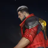
I made the background overall darker and fixed the gradient. moved the chat up and made my model smaller, as well as moved the logo up there. changed the location of the x's as well as the sub/follow/dono bars so that the negative space on top and bottom is more even. and changed the outline of the gameplay area to be thinner and more cohesive with the rest of it.
lemme know ur thoughts!!