Lets get things rolling ( Download here):
https://drive.google.com/drive/folders/1-8PrzEUGOlHVuETHYrPz7K9jNkA-jlbU
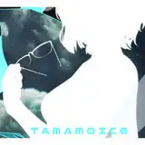
So this, was the concept piece for the wallpaper of the month. I will add a few more just add a few additional options. I’m hoping the colors are something you all are into typical as neutral/muted colors and tones. I wanted to focus on a highlight Color from the characters and kind a keep things cute and retro.

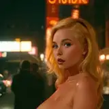
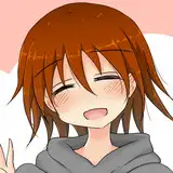
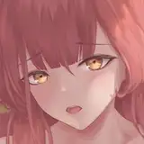
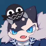
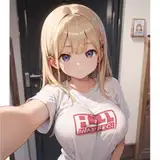
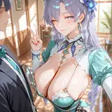
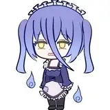
Using the first chibi image as reference, I started with Omeya. I like the rendering of Her more here. I think this why I stuck with the soft type of direction For the wallpaper.

At this point, I was in love with how bubbly she become. I felt the hair tied this characters look together. The look that was given kind of feels 3D‘ish like. Also I got a request for this month’s Art breakdown. I do want to give an apology in advance, because teaching things like heads are a bit more complex for me and in General ( because I don’t want to assume the level of anatomy knowledge). So the art Breakdown will be more focused on how to create simple guides to draw heads, and how they should be used. Im hoping this isn’t but knowing me this will be a bit more of a visual type of explanation when published— I have Hyperphantasia and a Malaptive daydreaming. So I tend to use my Brain in a way to help me visualize my next moves but, not every one has those traits. However, When the time comes Please feel free to leave feedback. I would probably focus on more Elaborate tutorial’s a bit later in the year. With that in mind, These tutorials will be more about how to create guides, train your brain to see and manipulate images with basic guides.

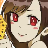
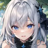
Okay now, I didn’t document to much of the other characters process because I was making making content else where and wanted to release the wallpaper a but more earlier— lI’ve stopped by and beat me up a bit but, shes here’s.

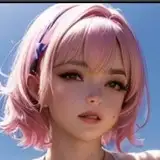
These colors were chosen based off the characters color pallet. My favorite Color for this images would be the base color for the characters. That mucky off white is giving retro newpaper. Beautiful tints of green and Warm tones really wrap this up. But I cleaned the base up a bit more and wanted to focus on how to make the project stand out. Im hoping the little details ( the flowers, peaches and I don’t know what to call that design where the time would be displayed, but that thingie ) — I was going for soft, 70’s peach Blossom look and feel.
So below is how the wallpaper looks on my ipad— and before this is posted, an updated version should be available for phones— I just tested it out on my Iphone (SE-2020) and It doesn’t really line up like it should. So bare with me if its not up there when this is published ( Ill be prepping for the schedule — bc my monday was taking from me but made for a good work day and catch up.

I hope you enjoyed todays post and ill update this post once the files hit the link for those that need design (A) for their phones. Also if you aren’t aware of this weeks posting schedule— check out todays other post, and catch a first look of the first piece from this month, 3 days before my other social.
UPDATE - Phone version has been uploaded.


![College Toes [4K]](https://samsuka.com/istorage/39829.jpg)