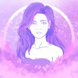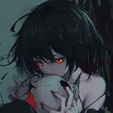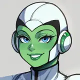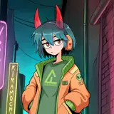
What do you think?
Added 2018-02-11 15:17:51 +0000 UTC
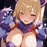
It's something I was playing with tonight, kind of a "final form" for the character creation menus. Animated and everything. It'll need some tweaking and layout work, but it seems pretty decent so far to my tired eyes.
This is full-screen, btw, the UI bars are hidden "beneath" these elements.
Comments
i think it looks pretty awesome. the ui as it is now is a bit cluttered, but it's still nice to have all that information.
nick
2018-02-12 09:46:07 +0000 UTCThe tabs on the left are buttons, so you can click whichever you want and go directly to that section. The only non-clickable button is for the section you're currently viewing, because you're already viewing it, lol. Those filler gt signs will need to be replaced with some proper arrow indicators to go forward and backward.
ThaumX
2018-02-11 23:38:33 +0000 UTCGlad you like the improvement. It takes more work to do the above vs simple tables, so usually I start out with something ugly and revisit to improve usability and aesthetics. I mostly do design work in my "spare time" though, like Sunday, so it takes a while to see improvement. (I also want to be sure that the functional elements are near-finished before working on a "final" design.)
ThaumX
2018-02-11 23:34:33 +0000 UTCDo you plan to allow us getting back and forth between each step or is the right menu just a visual guide were we are in the character creation process?
schetefan
2018-02-11 20:01:36 +0000 UTCIt's clean and easy to use. That's great.
Odriew
2018-02-11 18:16:26 +0000 UTCLooks a lot more slick and user friendly. I (like everyone else, I assume) like UI's where you immediately see what's going on as opposed to having to work your way through everything and "get used to it".
Chris Dahl
2018-02-11 16:46:00 +0000 UTC