i was thinking ...
Added 2020-07-12 07:14:41 +0000 UTCDo you guys think the animations on the ABC fit? I mean the whole idea was to make something consistent but now I think about it; it wouldn't be too consistent to have static pics and animations mixed together, even if they're a few.
This is just a late night thought, what do you guys think? Should I re-do all those letters and exclude the animations? Leave them as something separated or keep things like that?
I'm pretty sure I'm re-doing letters "D" and "R" because I'm not comfortable how they look, they have many flaws.
Comments
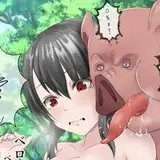
https://media.discordapp.net/attachments/521249671952334860/731986188969312322/lewds_are_lewds.jpg?width=756&height=473
Leprekubek
2020-07-12 21:33:17 +0000 UTCGuess I'm trying to be too perfectionist or just overthinking haha. Thank you for the feedback, guys :D
llMiXll
2020-07-12 21:30:26 +0000 UTCThe mix made sense as certain actions are hard to really illustrate in a single image. However, you have shown your ability to adapt and rise to the occasion. I trust in your decision.
Patrick Miller
2020-07-12 16:35:29 +0000 UTCwhatevs. just keep the lewds coming :3
cyrus
2020-07-12 08:35:21 +0000 UTCI'd say keep the mix of both honestly.
PhysicsWolf
2020-07-12 08:02:14 +0000 UTCI dig the animations the most
Mr._Zurkon
2020-07-12 07:55:18 +0000 UTCI'm honestly very happy with the outcome and the animations are like Easter eggs in the files, as for ones you feel are lower quality thats your choice as I'm fairly sure everyone is pleased.
Special K
2020-07-12 07:29:22 +0000 UTC