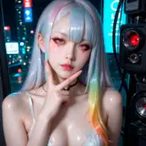
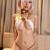
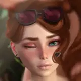
This is a trial, so it's open to the public. I am currently studying how to insert text, fonts, and design.
Since this is my first time, I ended up putting in too much text. Would it be better to put in a few less? I look forward to your opinions and requests.
お試しなので全体公開です 文字の入れ方、フォント、デザイン、勉強中です
初めてなので文字入れすぎましたね もう少し少ない方がいいかな? ご意見、ご要望お待ちしてます


![VAM_Erup[VR]](https://samsuka.com/istorage/28584.jpg)