I GOT SOME NEW LOGO’S MADE!!
Added 2023-08-01 21:11:29 +0000 UTC
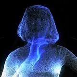
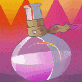
Thanks to all of your wonderful donations and support (My gratitude can not be understated by the way! 😭) I’ve been able to invest more into my channel and I thought I’d start off with getting some awesome logos made to stick on the beginning of my videos and what not!! Which one is your favourite!!?? Truthfully I like them all!! 😳💜
You’re the first to see these by the way! I love you all so much! 🙈💜
I like the green one. The one with the green background. It has the most ocean-like feel to me.
AutumnOmbre
2023-08-07 00:20:08 +0000 UTC
Green ones for sure! 🤍
SarahDeedz
2023-08-02 04:54:56 +0000 UTC
Fancy is best way put that one!!! I had trouble thinking of the right way cal it!! Lol
Akira Ghost Fox
2023-08-02 02:33:44 +0000 UTC
Lol boy ya make it a hard decision for someone like me !!! Lol I'm playing mostly here btw :3 but I donno why butni like the bottom two...especially second one best some reason =._.= my libra side is having issue between two since whole dang balance between two issue I deal with on decisions at least of two over all things to say I like or whatever XDD (it sux by far trust me rofl)
Akira Ghost Fox
2023-08-02 02:33:05 +0000 UTC
I like the green HK best, but there all really nice
Becca
2023-08-02 00:51:13 +0000 UTC
I like the use them all type so like maybe first simple one for wholesome, The second more intricate but still not quite complicated for the little more spicy but still mostly safe for work, and the intricate one for NSFW, that way we know if it's adorable, adorable but better get headphones, or by all the heavens where did I put that towel and is anyone else around.
Collector of dead tree corpses
2023-08-01 23:58:49 +0000 UTC
Sometimes the simplest designs are the most rememberable aren’t they!! 🤔💜
HydroKingVA
2023-08-01 23:09:53 +0000 UTC
I’m really feeling that one as well Samm! I love the idea of using the O in my name as the eye of the anchor, I think that’s super cool! 💜
HydroKingVA
2023-08-01 23:09:02 +0000 UTC
Thank you so much for you input Grey! I like how you called that one the fancy one, that’s gonna be what I refer to it as from now on!! 😂💜
HydroKingVA
2023-08-01 23:07:27 +0000 UTC
That’s a really good idea actually!! You’re so right, there’s no reason why I can’t use them all! Thank you so much for your input!! 💜
HydroKingVA
2023-08-01 23:05:54 +0000 UTC
I prefer the second design. It's less elaborate but still very classy and iconic!
Dazzling Wreck
2023-08-01 22:45:04 +0000 UTC
I'm personally a fan of the first one. The colors match really well and its simple, yet detailed enough to look well-crafted.
SparklySquares
2023-08-01 21:57:11 +0000 UTC
I'm a fan of the last (fanciest) one, although I personally might've skewed more blue-green.
grey roses
2023-08-01 21:44:56 +0000 UTC
I, personally, gravitate towards the first design, although they’re all awesome!!! I think it’d be cool to use different logos for different things, e.g. using a different logo for platonic, romantic, and spicy, or using some of them for merch designs in the future like stickers.
Kehaulani Kreitler
2023-08-01 21:27:46 +0000 UTC