SamSuka
silverjow
silverjow

patreon


Draw this again!

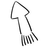
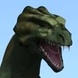
Drawing on the left is one of my earlier work back in 2014. And back then I don't know how to protect my work and I don't really understand the ecosystem of the internet. I saw it being used like a stock photo, on advertisement, on tv show, in the gym and etc. 

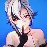
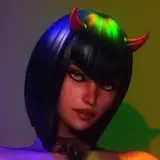
So... I make a updated version last year. I think I improved.

Hope you'll like it!

Draw this again! Draw this again!

Comments

Skin tones are much more realistic on the 2018 art, as is the shadowing technique used throughout the body. The additional muscle and tone of the arms particularly better suit the 2018 male. Totally agree that your subtle nuances/suggestion of what the swimwear might contain is more realistic to the overall physique of this smirking male, as he subtly suggests some coaxing might reveal all.

Neil Ryder

I like both but the new is more polished!

Thomas Polk

The original one is more cartoonish, but I still like it. I think they represent different art style and both good.

Steinzeit Leo

Better and better....like the good wine with the years jeje

FHG

Yes, I too love the way your character has a far more realistic aesthetic. The casting of light to shade left to right is very convincing. The shadowing to create the erotic bulge in his swim shorts i like a lot. Also the foreground interest with his feet in the sand, and the study of the slowly washing tide with its texture and movement I like also. Only the horizon line treatment seems less convincing in the newer drawing. The earlier sky has greater depth and interest. The longer shadow in the later piece with the sun in a lower position is a good choice also.

Steve Hare

Wow !!! I love both !!! Especially 2014 hairiness !! 😜

Yul_nt

Great to see the progression of your work!

Trevor

Oh yeah. The original is good, but has a more comic-book aesthetic, while the new version is more realistic with cleaner lines and smooth textures. Fantastic work, as always!

Jon Thomas 71


More Creators