SamSuka
AfterShowReactions
AfterShowReactions

patreon


Feedback for new schedule

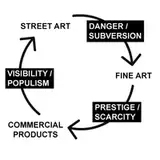
I got an attack of photoshop inspiration today.

I came up with a new schedule idea and would like some opinions on it.

Listed here are two new schedules, make sure to look at both and the current version.

One is for YouTube and the other is for Patreon. 


I'd really like feedback.

New or Current schedule?


UPDATED: A Gif version of the schedule.

Feedback for new schedule Feedback for new schedule Feedback for new schedule Feedback for new schedule

Comments

old one. call me crazy but to read the gif I have to wait for it to switch back and then I have to focus and then it switches again. to much IMO

Nicole Christie

New one with the gif is amazing

Emma goldsbrough

The new one is nice, but i still like the old one better. It's simpler.

Lidius

New one with the gif is so freaking good

Kevin Tran

Straight fire lol. Can’t wait for daredevil s2. Amazing series. Thanks

Jonathan Giles

I like the new one, but prefer the old one.

Christian Liechti

Whatever is easier for you. I like both.

Jon

Very nice, I don't have to zoom way in to read.

Patrick - Excelsior

Shan, I prefer the original version, where you can see both schedules in one glance. Why take the extra time to prepare two schedule formats when “time” generally seems to not be on your side most of the time. And with the animated gif it’s really difficult to make a comparison between the two schedules. OTOH in the original it’s difficult to read the text because of the dark marbled background. The text doesn’t stand out very well. Why not clean that up a bit by making the background pink? I suspect you will adopt the new style, but I still prefer the old. Thanks for asking.

Dick Berg

If you take a look at the last picture, i turned it into a gif which shows both youtube and patreon :)

After Show Reactions

I do like what you have created, It looks very nice. The schedule gives a nice overview and the pink background works nicely. But as Bryan Merino already noted: The new schedule denies your Youtube subscribers the opportunity to see what Patreon can offer them. The current schedule provides a complete overview of both and is in my opinion easier to read. However, I like both schedules equally and I support what ever choice you do make.

MovingFortress

I think this is important to keep in mind.

Zach Hershman

I like the new ones. It gives a nice visual.

Mycatisajoker

The new schedules look pretty but I like the current one a little better. I will admit the pink is more you.

Tom Tattershall

I would also say that I like the new version, but I am just fine with the current version if the new version causes far too much labour to create. You have a great deal of work to as it is, and I don't want you to be overworked.

Timotey Kuhn

I prefer the classic schedule myself but it appears i may be in the minority. However I think at the end of the day you should pick what ever one you prefer because it is your page.

Jake Hodgson

The new ones are much easier to quickly scan and glean the information one is looking for

It looks great butwith the old schedule people who are not on your Patreon can see what they can get access to if they were.

Bryan Merino

I usually just read the notes so whatever is easier is what I'd go with. New schedule does look good though.

Zach Hershman

The new one is really easy to read. Also then you don't have to keep figuring out new colours to use for shows

Jbears

I love the the new version it easy to read

Jason Short

WHAT IF I COULD MAKE THE YOUTUBE AND PATREON SCHDULES INTO ONE PICTURE BY MAKING IT A GIF. I MUST TEST THIS

After Show Reactions

The new version is not only gorgeous, it's easier to quickly read!

Artemis Nix

I'm not actually sure it will be a ton more work. I've set it all up to be on different layers and all I'd really need to do is unmask them and change the episode number... I think. But I'd need to do that for 2 schedules, one for youtube and one for patreon since i tried very hard to have them in one picture but the picture ended up being too high resolution :(

After Show Reactions

I like the new version but not if it is gonna be a ton more work for you to make each week

Wyatt

Like the new version!! 😍💕

Ceara Abrahamsz


More Creators