The Allure of Wanton Cove Art Breakdown
Added 2018-04-17 03:59:59 +0000 UTCGot another art breakdown for all of you wonderful people! This one is a little involved, so lets jump right in.
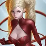
This first image is the first sketch for another dream scene. The third night to be exact. This image includes a female version of the protagonist.

Now, the artist took a bit of artistic liberty here, some of which I liked, some of which I didn't. The pose looked good, so I didn't want anything changed there. The couch I didn't care for and asked to have it removed, I had imagined the room to be filled with pillows, not couches. The curtains, while not something I had originally pictured, were prefect for the scene. The moment I saw them, even if I hadn't asked for them, I knew they were going to stay.
Now, the second image here is a revision of the sketch above with some of the changes we had discussed, plus some artistic liberties again. ;)

Unlike the first image, I really liked the changes the artist took upon himself. Swapping out the couch for the rug, adding some more pillows, and the incense and wine were all very nice touches. They also added a little detail work to the curtains that I was really happy with.
With the sketches approved, I green lit the coloring. I asked them to focus on reds for the scene.

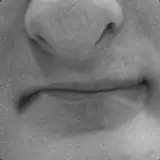
Overall, I was very happy with this. I thought that the reds and golds gave the scene a warm seductive feel. The artist added a slight fade to black effect to the image around the edges, but I wanted the image to fit the same style as the other dreams, so I asked them to try a fog effect like in previous dream images. I also thought the mouth looked a little off, I think I phrased it as "Less smirk, more seduction".
They decided with the reds in the image that the fog effect should have a red tinge as well. While I understand and agree with the logic, I wasn't real happy with how it turned out. The changes to the mouth however looked really good.

I asked the artist to revise the fog, bringing it back toward white. We discussed at length whether the white would look right against the red and gold background, eventually I just told him to humor me and we'd see how it would look. Neither one of us was quite sure how it was going to turn out.
The result was a pleasant surprise.

I thought that allowing a little bit of bleed through to the white fog, it looked really good. It still had a hint of that red effect the artist was originally going for, but at the same time it felt much more like the earlier images even though it wasn't as "dark" in its presentation.
With that done, I asked the artist to finalize the image and send me the completed piece:

This image is obviously much warmer in tone than much of the art within the game, but I think the image is one of the better ones the artist has created to date.
Hope you all enjoyed another art breakdown!
Anyone interested in seeing more of this artist's work can find it here: http://www.hentai-foundry.com/user/Silverjile/profile