So, yeahp, I have another short story looming in the near future that I'll be both writing and drawing, this time a Harley Quinn dealie for DC Comics. I decided that I'd best start messing around with character design sketches to work out a viable look for ol' Harley, as opposed to the "ehh, just wing it" approach I've been using for the previous HQ cover illos and random sketches of her.
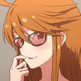
The first file above isn't a proper chara design sheet as such, but rather a life drawing set from cosplay photoref, as I get some practice in re: an older costume I might wing up drawing sooner or later:

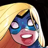
The next set of random design scribbles is another Clip Studio Paint sketch set drawn, however haltingly, via the ever-challenging Cintiq:

That "black fading out" area at upper left was me trying to imitate a background riff I spotted in a panel from the manga How Do We Relationship?, an emulation which worked out semi-decently.
Anyhoo, I'm trying out a varied series of different Harley approaches, as seen in this analog, hand-drawn set:

The experimentation continued with the next penciled set, which I apparently forgot to crop properly, as seen at far left:

With that main face at lower left (the only sketch that worked out even semi-decently), I'm contemplating going larger with Harley's eye size, which is something I've not done in some time, save maaaaaybe with Dirty Pair or Rose & Lily sketches. Haven't drawn a truly big-eyed character since Stem Cell in 2004's Livewires, as the designs for Empowered's leading ladies remain in a middling, 1/4-of-the-lower-face proportion range.
(In fact, shockingly enough, Emp and Ninjette don't have fixed character designs as such, which no doubt helps feed not-ungrounded accusations of "sameface.")
With the next set, back to CSP, but this time via my beloved iPad version of the app, which I'm still much more comfortable working in than the problematic PC iteration:

This set was based on assorted artist images lurking on the iPad's camera roll.
Aaaaand one more analog pencil set, with a few takes that might be useful down the road:

Anyhoo, I'll keep on scribblin' with Harley takes, as I'm nowhere near establishing a fixed design for her as yet. (While I'm at it, I'd like to work up some fixed chara designs for the Hushed Half-Elf's future appearances in The Last Party...)
NEXT TIME ON THIS HERE PATREON: Dunno at the moment, but something should be going up in the next M/W/F slot, never fear.
UPDATE: In fact, Friday's post will be another installment of Failed-Project Friday. Woo hoo!
Adam Warren
2022-10-13 18:26:53 +0000 UTCThe Silver Socialist
2022-10-13 06:52:10 +0000 UTCBurninator
2022-10-12 18:52:36 +0000 UTCFrank Innes
2022-10-12 18:10:03 +0000 UTCWill_K
2022-10-12 16:03:10 +0000 UTCT.Geist
2022-10-12 13:09:10 +0000 UTCOtaku Twenty-Four Seven
2022-10-12 13:02:41 +0000 UTC