SamSuka
AgentRedGirl
AgentRedGirl

patreon


AML3 "Cover" Art Redo

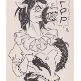
The differences are subtle but, is this better?

I was toying around with the idea below too but I kinda like the one above better. I like Bella hugging Mary and standing between her and Maggie a lot.


AML3 "Cover" Art Redo

Comments

Finally, A Little "Throne Of Authority"---Love It!--Especially The Horsey Style:)

Sgt Mac

I like the left eyes better on the light one, but prefer the darker one overall.

Kelly Harris

Definitely prefer Anna's face In this one, but Mary's expression from the first, smile in this looks a bit nervous. I'm being nit picky though, they both look awesome. Loving Anna's abs too, but that a fetish of mine!

Darth Pax

Yeah, 2nd one

tbh the second one is better just because of maggie's facial expression.

The Second one, Hands Down.

First one is way better.

I just have to say I absolutely "LOVE" how there moods match not only their stance and facial expression but by there dicks as well. Cant wait to see how it will all play out!!! Forgive my honesty; keep up the epic work!

Supplier

Yes, it's a little better. I can see that Maggie feels left out. I'm eager to see her get everything she wants, from Bella and from Mary.

CXGKjP

Perfect, Maggie looks way more expressive and dynamic, she no longer looks like shes just there to be there. The pose and the expression look natural to Maggie's character. You've done an amazing job relaying each of the characters personalities through appearance alone. Damn fine work for a cover

Joe Kickass

nice idea

yes, better... that other pic HAHA LOVE IT!!! not for cover, but for style ;)

sKorpion

Yes. That redo is better. 😀

Johnny Rotten

The redo is better IMHO especially the expression on Maggie's face. And you could run a thought bubble competition - just what is each of them thinking?

Futanari Fan

Definitely the first one

William Cramer

Oh my, that was fast! 😄 Well starting off, yes, I like this redo a lot more. You've kept the same idea for Maggie and that separation with the characters, but managed to make her more dynamic in subtle ways, more of an arch to her back and a curve to her bum, with her legs parted. I also like the changes to her expression and shoulders, they further sell the idea that she's not happy right now and feeling a little resentful. As for the other poster idea that you had, I do also like it a lot. The poses for Bella and Maggie are fun and do show that separation between Maggie and Bella as well as the resentment that she feels. The poses are also very sexy too with the shapes of Mary's breasts, Bella laying against Mary's cock as her own points upward as poor Maggie is stuck on her hands and knees. Having said all of that, I overall prefer the poster that you like more too. The way Bella and Mary are so intimately embracing with that loving gaze in Bella's eyes really show us exactly what it is that makes Maggie so jealous. That and the hugging between the two is just so sweet and cute and I enjoy that a lot 😄. Great work on this tweaked poster, I have no criticisms of it now and it's a marvellous teaser for the final video 😄

Ciarán M

above is better

Xicor

I like the top one as well. Well done on the cover

Erica

Little bit of competition doesn’t hurt

seraph12


More Creators