Characters are the beating heart of my stories. They’re the people whose lives we follow, whose pasts we see passing impressions of and whose futures are ultimately tied up in one anothers’ hands. In addition to being the narrative focus they also serve as a visual anchor, guiding the story and the reader’s focus from panel to panel. And since characters are so important to the comic as a whole it goes to show that they receive a greater deal of artistic attention to help model them and flesh them out than any other aspect of the comic- while an entire background can be done in a day or so modeling the characters can easily take the bulk of the working time between updates.
This week I’d like to break down how I go about painting my characters and how I build my world-famous three-dimensional sculpted look. It’s a process which has evolved over the years but hasn’t undergone many major metamorphoses in the way the comic’s inking has; the modeling has largely been a refinement of the same one process, expanding and going deeper and softer into lights and shadows.
The earliest pages of Dead Winter used a very simple modeling technique. I worked with a plain white background, I laid down my inks and then I took a semi-transparent black paintbrush and blotched in fields of tone very watercolor-like. A simple hard-round brush in Photoshop was all I needed to darken the color of a shirt, for example, and then darken the parts of it in shadow to create a sense of shape. I made copious use of Photoshop’s smudge tool in the early comics, treating it like a wet watercolor brush and manipulating the tones I’d already laid down to blend them together or tease them into the shapes I wanted. I used this technique a lot to experiment with clothing wrinkles and lighting effects, but it was a little sloppy, and it was during one of my color page sequences (pp.47-54) that I discovered a better way to work.
While the old pages were toned like watercolors, the new technique worked like acrylics. Rather than toning onto a blank white background I started laying flat tones on their own layer of all the parts of the figures and from there I would add lights and shadows. I had about six or eight shades of grey I’d use as midtones (I will post my old palette as a separate entry alongside this one) to separate my shapes and from there I could add shadows and highlights to build a sense of depth and space. This has been the general process from then to now with a couple refinements along the way, namely just learning to lay my lights and shadows smarter and eventually abandoning the individual midtones and working from one uniform silhouette of grey. The idea behind ditching giving every shape its own midtoned flat tone was that working from one solid neutral grey would let me construct my lights and shadows more organically and in a way that better captures a uniform sense of light- under the old method if someone had lighter pants and their lower half was in darker lighting than their face then I had to do a lot of darkening to keep those pants from drawing the eye, so in this way that method was counter-productive. The current method feels more like working in oils than anything else, so with that bit of developmental history out of the way let’s break down how the figures in a comic page are actually constructed!
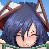
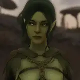
The image at the top of this article is a step-by-step process detailing how a figure is painted from start to finish. There is a .gif version attached to this post as well if you’d like to download it and see the versions layered on top of each other so you can see what actually changed from phase to phase. It’s a bit more straightforward than painting a background because the depth isn’t a giant concave space filled with objects in perspective, all casting shadows on other objects; a figure is a solid convex entity which casts shadows on itself and the environment around it. Figures are much more contained, but they’re also usually made of much fewer flat surfaces so modeling their shape takes a bit more effort, but either way: here’s my modeling process!
1) The first step of my process is to “kill the white” with a flat grey midtone (see Art Journal 004: Backgrounds). On a separate layer between my background and my inks I’ll paint in the silhouettes of my figures with a slightly-lighter midtone color to help my figures pop slightly from the background. The reason these go on their own layer is so I can Ctrl+Click the layer with all my figures in my layers window in Photoshop and auto-select my silhouettes so if I want to paint with a big brush nothing will be painted outside of my working space. This is a simple quality-of-life feature for me so I don’t have to worry so much about staying inside the lines, so to speak, since I just make it so I can use a big brush and paint wherever I want and it will never show up where I don’t want it to. I also keep my solid reds on their own layer as well so I don’t have to worry about painting over them and can paint underneath them freely. Not having to worry about either of these things lets me focus entirely on my grey tones.
Another important early step is a thing I like to call The Light Orb. These are red circles I put in every panel on their own layer and then go through with a white brush to very roughly give the circles a highlight point, turning them into orbs. Before I commit to any painting I want to establish where my light sources are coming from in each panel so I can try to keep the lighting consistent while the camera and the characters themselves turn and move within the scene’s space. This lets me know before I start making a mess of my paints where the light is coming from and where my shadows go, which leads me to the next step…
2) The first thing I’ll to to turn the flat shape of a figure’s silhouette into some semblance of a three- dimensional form is to block in my shadows. With respect to my light source I’ll take a slightly darker tone and begin picking out all the areas which would be bathed in shadow. In the example above Lizzie’s back is largely bathed in shadow because of the way her shoulders are turned towards the light, and the shape of her shoulders in relation to the sleeve of her arm are established. There’s a bit of her hip which isn’t in shadow to show some dimension in the space of her middle back. A sliver of shadow is placed under her bangs to show that her hair has its own depth and form and isn’t just a differently-colored part of her forehead and the shadow around her neck helps define her jawline. The hand holding the check pad casts a shadow across her forearm and the right arm with the torn check is mostly cast in shadow by her head and torso, which lets the spot of midtone on her forearm give it a sense of depth in space- it feels like her arm is further away from us since its not cast completely in light. Her hood is given a bit of shadow to show that it’s not a rigid mass but rather a floppy hollow thing that folds in on itself just slightly enough to cast unique shapes in light and shadow. Hoods are very fun to paint and this is secretly part of the reason why they’re fairly commonplace in the comic (they’re also pretty weather- and bite-resistant, but most importantly of all they’re fun to draw)
3) After establishing my shadows, and by extension my lights, I’ll next go into the midtones and carefully describe some highlights into them. This step is a bit more delicate because if you get overzealous establishing highlights then you lose all of your midtones, so I try to make sure to only pick out areas that help emphasize the shapes I’m looking for. The rim of highlight around Lizzie’s check-holding shirt cuff helps give the form a more defined plane to catch light on and describes a sense of thickness. The zigzag on her opposite sleeve plots out roughly where I want the sleeve to wrinkle and indicate a point of articulation where the cloth would most likely bunch up, and the spots in her hair give her head a rounder shape, subdividing the midtones into multifaceted shapes that catch the light at different angles. Her face gets a splash of highlight because it’s meant to guide the reader’s eye- in this panel Lizzie is tearing a check off her notepad so I want to draw the reader’s eye to her notepad first, then up to her face, following the line of action to the second instance of her hand with the torn check. The highlight being at the top left means that the eye will naturally draw to the area with the most brightness- her “before” hands and her facial expression- and the line of action will guide it into the shadow area where her other highlighted hand is holding the “after” image without the “after” phase being strong enough to draw the eye before the “before” has been read. If you followed me through that sentence, congratulations!
4) This phase is where things begin to get a little messy. What I do after I establish my shadows, midtones and highlights is begin to apply the native values of different articles to their respective shapes and forms. For example, Lizzie’s work shirt is a darker shade of brown than her peachy-orange hoodie so its native values are going to be darker, and the contrast between its shadows and midtones will lean towards darker values than the sleeves of her hoodie. I’ll also start to “pull out” my shadows and highlights in other regions, adding slightly lighter and slightly darker details to my existing lights and shadows, further emphasizing the shapes I want to describe. I’ll use this opportunity to begin really fleshing out how I want the shapes to turn and fold, treating my paints like I’m cutting and molding with clay. I’ll add a bit more shadows in places where I want to create more defined facets and I’ll start sharpening highlights in areas I want to describe overall shapes in, as well as defining which points of those highlight fields are closest to the light source. I feel like I can be a bit more generous with my shadows but I want to be conservative with my highlights- too much highlight washes everything out completely. The strength of the modeling comes from contrast between values so I want to control my value contrast very carefully.
5) More refinement, more modeling towards the shapes I want to achieve. I don’t want to get too far ahead of myself, I’m expanding from my base midtone out towards blacks and whites at a steady pace. I’ll make some corrections along the way- I feel like Lizzie’s hip under her shirt wouldn’t catch that much more light compared to the shadow so I mute it a whole bunch so it blends in as part of the same body. I’ll start sculpting the shape and form of her hands and soften the highlights of her hair- while I want to give things a sense of being multifaceted I don’t want something like hair to feel angular and geometric so I’ll soften the transitions away from the highlight points, describing a gentler shape than I might find in an article of clothing, for example. I also decided I didn’t like the way I was modeling Lizzie’s cheekbones so I started to soften out the roundness of her face. Flesh has a degree of translucency to it so I try to make it a little warmer and smoother than clothing fabric, to try and differentiate the two in just black & white. The contrasts in flesh will be softer and gentler than in other surfaces and capturing this difference is important in distinguishing one texture from another. I’ll add littler details as I go, and this and the last big phase are where I start adding the smaller bits of texture and detail so I can do it on top of a finished light and shadow contrast, rather than putting in all my little details and then having to paint light and shadow around them.
6) The last phase is a lot of general refinements but here I am also introducing the reflected light. When light radiates from the light source it will bounce off of your subject and enter your eye, which is how we see highlights, but it will also bounce off of the environment, bounce into the backs of your characters (usually in the shadow planes) and bounce from there into the viewer’s eye. This is called “reflected light” and is a product of your character’s environment shining a small amount of light back at them in the same way the moon reflects the sun’s light down on our planet’s night side. Reflected light is rarely as intense as the primary light; a gentle application can make all the difference in helping your figures appear lively and three-dimensional. I like to try and keep my darkest darks in between the midtone and the reflected light so a hypothetical Light Orb sphere would go from Highlight to Midtone to Shadow to Reflected Light on the far side. You can see this effect in the shadow across Lizzie’s shoulderblades and the sleeves of her workshirt, where the pure shadow plane exists between the midtones and the reflected light. Also in this phase I refined Lizzie’s face to be a bit smoother, since I didn’t imagine there would be an actual seam around her facial facets under the lighting I was going for. I still wanted to define her jawline and the underside of her chin but I wanted the transitions from light to midtone to shadow to be gentle and smooth in contrast to the harsher shifts in value in her clothing. Lately I’ve been putting my sharpest highlight points at the edges of my midtones and shadows where the local contrast (the difference in value between my highlights and the area immediately around it) is sharpest, giving the lights a poppier look.
This is my method as best as I can describe it. Sometimes I’ll cheat and I won’t follow exact methods but I generally try to paint everything at once, together. I don’t like to paint just the head, then just the torso and just an arm and so on; the figure is one holistic entity, more than the sum of its parts, so I paint it all together accordingly. I don’t draw just a collection of parts, I’m painting a complete person. If a comic takes a long time it’s usually because I’m doing this part of the process on a lot of figures at once, or there’s a particularly tricky light source that I’m having a hard time hashing out (as a rule any frame with legs is going to be trickier than a frame where no one’s legs are visible thanks to the upside-down shadow-casting nature of legs.) I’ve been refining this process over about seven years and I’m still learning something new every day, but I am pretty confident in how my work comes out lately.
Thanks for reading!