As anyone who has followed the development of my art over the past seven years can tell, lighting is one of my absolute favorite parts of painting. Light and shadow have such an incredible power to affect depth, space, perspective, reader attention, mood and every artistic element under the sun, and it’s a big reason why I’ve pushed my comic’s aesthetic further into painterly tones than otherwise. Lighting is a tremendous presence in our everyday lives, as well as the enabling force behind our entire sense of sight, so it’s easy to take it for granted as an element in comics. You don’t really -need- to flesh it out to make a comic work, you can get by with just a couple dabs of a mid-tone value to create the illusion of shape, but the other side of that coin is where you can control and exaggerate the mechanics of how light works to create really dramatic effects and if you ask me I’d tell you the latter side is the fun side.
The way light works in our world is fairly obvious, it radiates outward from its source, bounces off of things and into our eyeballs, where our eyes flip it around and send it to our brains to decode. When light hits a surface its color may absorb some or all of the light, sending what it reflects back to us as color. Something which is black absorbs the full spectrum of color and reflects none of it back to us, something white reflects it all and something which absorbs most of the spectrum will send a particular wavelength back into our eyes, which we read as a color. Different colors represent different wavelengths of the electromagnetic spectrum, with red being on the long-wave end of the visual spectrum and purple sitting at the short-wave end, and each color has its own level of intensity which, when translated into greyscale, don’t become equal values for equal intensities of color. For example: a pure intense yellow, when taken in greyscale, appears as a fairly light grey; whereas pure intense red- the most intense color of the spectrum- will become a deep, rich charcoal grey. In general the more intense colors are the ones on the far ends of the visual spectrum (which goes Red, Orange, Yellow, Green, Blue, Indigo, Violet) whereas the less intense ones tend to fall towards the center.
So to sum up the previous paragraph, light is a force that bounces around, sticks us in the eyes and makes us see things. Light comes from primary and secondary sources. A primary source is something like the sun or a lightbulb or a fire, something that’s painful to look directly into. Your secondary sources are all the surfaces light bounces off of before it reflects back onto us, which can be a wall, a mirror, the ground, a chair, a curtain, the ocean or another person behind you, all at once! Primary light sources are always going to be the strongest, while secondary lights lose a bit of their intensity as they bounce off of things to hit you in the back or wherever they land. When I imagine light I think of it as a fluid, something that flows from its source like a wellspring, moves outward to fill a space and ripples back off of things it hits. It’s an invisible force which can flood a space, even when it comes from a small, controlled source, whose presence is seen not by the space it fills but by the fingerprints it leaves on everything in its reach.
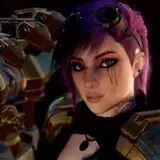
When I approach a comic page I try to keep my lighting consistent from panel to panel so I’ll start out by determining where my lights are actually coming from within a given scene. If it’s an exterior shot the primary lightsource is obviously the sun, but I’ll work out whether the scene is taking place in the morning or in the evening so I know whether the sun is high or low in the sky and whether it’s coming from east or west. This normally wasn’t a big deal in the wandering-the-streets arcs of the comic but on-location scenes like the Omnimart or Tombstone are static enough with plenty of consistent landmarks where I can keep the cast shadows consistent given the time of day. I’ll still fudge an occasional outside shot, though- from a reader’s perspective lighting coming from the upper left of the camera is the most “attractive” due to the way the Anglophone eye reads from top left to bottom right, putting all the highlights at the top left feels more natural. Interior shots tend to be more interesting because the light sources are more dramatic. It could be a single overhead light, an open window or just a candle, but interior shots tend to provide specific light sources which cast light on different sides of adjacent figures rather than being one gigantic star lighting everyone the exact same way, so I like to paint them a whole lot more.
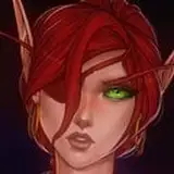
As shown in some of my previous journal posts, I like to start my painting from a neutral mid-tone and work towards lights and darks. I like to think of the figure in terms of “facets”, like a die or a low-poly 3D model, to break the figure up into planes and figure out which planes are facing which angle in relation to my light source. I’ll place a red dot in my page and give it a white accent to indicate where the light would be hitting that sphere if it existed in the comic, and then use that as a base reference for all my other figures to help keep the light direction consistent. I’ll angle my shots to try to keep highlighted figures in front of darker-lit background elements or vice-versa; this is actually an old oil painting technique for doing portraits, where the background on the shadow side of a face will be light and on the highlight side of the face it will be darker. This creates contrast that helps the figure pop and pages where I can compose shots like that are some of my strongest. Contrast is the beating heart of all great art and lighting is the blood that powers it.
Once I’ve established my lightsources and my figures’ highlights, I’ll work on their secondary light sources, which is usually as simple as “just lighten up the far end of the shadow plane so the darkest part is between the highlights and the reflected lights”. It might not seem like much but just adding a bit of brightness in the far side of your shadows- not a lot, it’s still shadow after all- does a tremendous amount of work towards making your shapes feel more rounded and three-dimensional. Towards the end of my figure painting I’ll add what’s called an edge light, or a thin rim of highlight along the silhouette of the figure where the light would be hitting it from the opposite side. I actually learned this trick from Team Fortress 2, when I started playing it a long long time ago I went through all of the developer’s commentary and absorbed everything about their artistic choices and one of those choices was edge lighting making figures pop. Since my comic launched about nine months before TF2 came out the edge lights have been a presence for almost the entire comic. Lately I’ve been controlling my values a bit more, making sure nothing gets too white or too bright (like eyeballs, for example) so I can reserve pure white for the sharpest of highlights, and by ensuring there’s no other pure white on the table the use of those highlights has a strong effect on directional lighting and making figures look illuminated. It’s all the little spots of extra highlight that make all the difference.
Cast shadows are one of my favorite effects of lighting, that’s whenever light hits a subject and then they cast a them-shaped field of darkness on the ground or wall behind them. I love cast shadows because they not only give a strong indication of light direction, they create a sense of space (a walking foot off the ground) and shape as well. Shadows creep along the ground and up the walls, they get in all the cracks, they shift and break with changes in elevation. They show how close or far away you are from a wall as well- when you’re closest to a wall the contrast between highlight on the wall around it and your own shadow is strongest, but the further away from the source you move the softer the contrast gets (due to the secondary light having more room to bounce in and lighten it up again). A cast shadow is also a great tool for breaking up a stretch of somewhat-empty wall space, making it more visually interesting almost immediately.
Lighting is my favorite part of making comics, and it’s part of why updates take as long as they do (busy schedules account for most of the other reasons). For reference to some of the tricks or elements I wrote about here, a few really prominent examples in my own body of work can be found on pp. 386-393, 431-435, 518 & 519. It’s prominent throughout the entire comic but those pages have some of the more concentrated light sources so they better illustrate the way I like to think of light in comics.
Thanks for reading!