For this week’s art journal I’d like to do something a little different from normal. Over the past few weeks I’ve been very busy working on things I wasn’t allowed to share- which makes it terrible journal material- so I’ve been digging into lesson-style conceptual breakdowns with big sheets of drawn references to keep things bright and meaningful here on the Patreon journal blog. I’m happy to report, however, that I’ve gotten a break from work I can’t show you so I can work on my actual comic, which I -CAN- show you, so I’d like to write about my process and how I’m developing this page. I shared thumbnails of this page and the ones surrounding it in Art Journal 018, so my process here will be how I went from a planned thumbnail to a full sketched page!
The first thing I do whenever I block in a page is lay out my panels. The panels are malleable, and sometimes I’ll deviate from thumbs if I get a better idea for pacing issues, but mostly a page’s panels follow a few basic rules. When I lay out my panels I’ll always start with my horizontal dividers. However I break up a set of panels with vertical dividers the horizontal ones- running from side to side- are my borders which control the pace of a comic. A reader’s eye scans top to bottom, left to right, but if it encounters an even divide the reader will know to read this block of panels as a “line” before moving onto the next one, so the panel flow can be set up in a way that makes sense. Panels read top to bottom, left to right, which seems backwards, but the inside of a panel is read left to right which then scans into top to bottom so in the broader sense it actually makes sense. Sometimes I’ll have a layout where four panels are arranged in a square, like so: [+]. With a strong horizontal line in the middle a reader wouldn’t be sure whether to move to the right or the bottom after they read the top left panel, so to help guide their eyes down I’ll use a trick where I shift the divider lines on either column of panels, so its lower on the left and higher on the right. This way when a reader’s eye gets to the bottom right corner of the top left panel the next nearest panel is the bottom left panel, since the top right panel’s bottom border sits higher above the bottom right corner of the top left panel than the top of the bottom left panel. The vertical divider is seamless so we know, okay before I cross this larger line my eyes skip across this smaller one first. It’s leaving little hints and clues like breadcrumbs in a forest to make sure my readers know where to go.
When I’m plotting a page I’ll start by breaking it into three or four segments- thirds is for when a page has a lot of dialogue (so I have sufficient space in each panel for both words and art) and quarters is when a page is very action-oriented (and I can squeeze more action panels into the space the blah blah blah would go). Once I have my major sections of page, I’ll then begin subdividing them into smaller panels to maintain the overall structure and keep the rhythm of the page clear and readable. This page is a talky page but I split into four sections, breaking the rule I just established, but I have a pretty good reason for it! The top half of the page is a continuation of the back-and-forth banter between the Mayor and the Sheriff of Tombstone. The eye reads the top half as a continuing moment across lines one and two, but then line three happens and it’s a narrow full-screen shot cutting across the page. Wide panels are a great way to emphasize an interruption since they themselves interrupt the rhythm of the panel layout, so when the eye scans and it comes to this cutoff, boom! Impactful panel design! I gave the bottom panel plenty of breathing room because I wanted to establish a lot of stuff in that panel. But those are my panel rules, you can find them consistently implemented throughout the comic.
In my thumbnails I’ll sometimes scribble little dialogue notes next to my panels to give myself a reminder of what I want the theme of those panels to be. My comics are always art-first affairs; I hate when speech bubbles overlap and cover parts of the important characters or details in a comic so when I’m drawing I’ll have an idea of how much of what I want to say in each panel and when it comes time to write dialogue in I’ll just pick synonyms and wordings that fit within the space provided. This is probably an obsessive compulsion on my part but I absolutely do not like speech bubbles obscuring acting important characters so this is my way of not only making sure text flows rhythmically and fits the art of a page but also ensures I won’t be overlapping any of the good parts of the comic.
So anyways, in my thumbnails I scribbled some lettering words, but for this middle page I only annotated one panel, the first one, and the text I scratched in was Mayor Richardson telling his boys at the poker table in the background to relax. I didn’t realize when I scratched these out that that was how the first panel of the previous page works so I can’t do that again, that’d be stupid! All isn’t lost, however, because my writing style is to come into pages with broad themes and work towards specific dialogue from there (sort of like how I block in my panels, incidentally), so there’s no lost work here, I know what I’m doing.
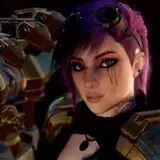
On this page I wanted to continue the argument between the Mayor and Sheriff- two pages back focused on the Sheriff’s accusations and threats, then the previous page was the Mayor’s retort and reversal, and this page was going to be a clash of those two tones with a hint of dissent within the Sheriff’s deputies. So since the previous page ended with a Mayoral riposte the first panel of this page would start with Deputy Staggs proposing that maybe the Mayor has a point, a point the Sheriff didn’t really go to this trouble to entertain. The Sheriff clashes with the Mayor, things come to a head and the panels tighten across their eyes- in panel four I wanted a close cropped shot but I also needed room for words so I’m experimenting with a tight shot and putting my words outside of the contact area so it looks more intense and I don’t have to put word bubbles on anyone’s face.
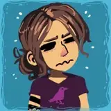
Then, at the climax of the confrontation, our heroic waitress comes over to interrupt and see if the three new diners know what they’d like to order, seeing as they came in and they sat down at a table. A mix of curiosity, ingrained dutifulness and a bit of haplessness, Lizzie popping up at the table of a heated discussion in the social hub of Tombstone starts to establish the grander purpose of her being a waitress yet again: she’s constantly milling around the booths, she has an ear open in the place people come to talk. Why do people come here, specifically, to talk? It’s the one place in town you can eat, and food makes conversation easier. They could have a private meeting in the echoing silence of outdoors, or they could talk in plain sight, in the din of the diner’s other patrons’ conversation. People talk, especially when there’s food, and while all her friends seemed to capture more important jobs the lowly waitress happens onto the great benefit of working in the central social hub of an entire isolated little town. She can glean very useful information about the social goings-on of the town, and establishing that is one of the key purposes for the whole getting-a-job mini-arc of this chapter! It all builds towards the next important thing.
When I actually draw my pages I like to use two brush colors I keep saved in my Photoshop color swatches, a warm red and a darker blue. I used to sketch exclusively in black but I found switching to a red color made the page feel warmer and more lively, so it became my primary sketching color. The blue is useful for when I need details to stand out- I like to draw a lot of backgrounds in all my panels and sometimes details can get lost, whether it’s scrawling out a hand with something in it or there’s a foreground/background clash. When I sketched in just black it was hard to visually discern depth in complex shots, but since I work digitally I have the infinite power of the computer at my disposal, and I can draw in literally whatever colors I please! Keeping two colors on my fore- and background colors and cycling the two with the X shortcut key I can use my blues to make important visual distinctions so when it comes time to ink everything is that much easier for me. A two-color system is really useful, I highly recommend it.
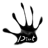
I have a bad habit when I’m blocking in pages with my sketch layer. I like to establish as much detail as I can in my figures so there’s no questions when it comes to inking what is what, I can just ink and go. But sometimes I’ll draw a page and I’ll just get stuck. I’ll have a hard time finding the right camera angles, the right transitions and the right shots to establish the rhythm and tones I’m looking for and I’ll just spend a day banging my head trying to hash out perspectives in my brain. Time dwindles, and I often reach a point where I’ll say to hell with it, I’m going to throw down broadly where everything is supposed to be and I’ll sort out the details when it comes to inks. I did a lot of that in this page, because I spent too long puzzling and I just said “whatever”. You can see this in a lot of the hands I drew, where they’re just shapes in roughly the orientation I want them to be in. “This is fine”, I’ll say to myself. “This will work. What could possibly go wrong?” I like to establish as much detail as I can in my figures so there’s no questions when it comes to inking what is what, I can just ink and go. I can just ink, and go, no sorting things out, except for the nights where I throw my hands up and say, I’ll fix it in inks.
This is my creative process for fleshing out this comic. I’m hoping to finish and post it by the end of next week. I’m sure no unforeseen troubles could possibly hinder this ambition.