Last week I did an overview of my comicmaking process up to the point where I had my sketches done. This week I’m going to continue the series for this page just to push it along as quick as possible. Over the years I’ve developed a somewhat-efficient system of making comic- “somewhat” being that these things still take me like forty hours of work to finish- so every step of the way has something worth talking about! Last week was the sketch, so this week I inked and toned all my characters! I’m like a day or two away from having a new page finished and posted.
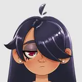
My inking is usually pretty basic, so it’s not a step I often get hung up on. I may have mentioned in another article, but the focus in my comics are on the tones, so the inks rarely get very complicated. They’re mostly there to contain the broader shapes I make in paint. They’re the supporting actor. My comic pages’ official dimensions have always been 9x17 inches, but the first ones were drawn at 72dpi for hardware reasons. Modern comic pages are still 9x17”, but they’re drawn at 800dpi and scaled down to 100dpi for the web. I work exclusively in Photoshop, and when I start inking I’ll reduce my sketch layer to 30% opacity so it doesn’t visually interfere with my ink lines. I use a 15 pixel brush to do all my lines, and then when I finish a panel I go back in with a 40 pixel brush to outline the characters. I like to give them a thick outline because it helps define the silhouette, especially against the background, and when figures overlap it helps visually identify which part of what character ends where. I’ll try to keep my linework minimal, just defining broad shapes, and I’ll occasionally add guidelines which I’ll end up erasing in the final painting phase, but that’s largely as complex as my inking will get. I made up a bunch of hands on the fly. I think they came out alright.
One camera trick I’d like to highlight here, which I don’t think I pointed out before, was the way I chose the specific camera angles I did. In the first panel my focus was on Mayor Richardson and Deputy Staggs, who featured in the last panel of the previous page, so I put them on the left, and Sheriff Tanner’s face, being addressed, is on the right. In the second panel, even though the camera spins around to face the Sheriff instead, Deputy Staggs is still on the left and Tanner is still on the right. This conservation of placement helps keep panel sequences consistent for the reader to follow- even though the perspective changed, X is on side A and Y is on side B. Of course, in the next row of panels I shifted this so the Sheriff is on the left and the Mayor is on the right. This makes sense since the Mayor is to the right of Deputy Staggs and the camera is in between the two, so if it pivots to the right it puts the Sheriff on the left; the position of the camera is conserved within the sequence. Also, since the Sheriff is addressing someone new we can shuffle our characters’ page position. Once the conversation’s focus is shifted, however, it stays locked in until the end of the page- even as we rotate and pan out to Lizzie’s arrival, the Sheriff stays on the left and the Mayor stays on the right. The first two panels act as a transition from the previous page and the middle block of three sets us up for the pan-out reveal in the last two panels. It all strings together!
The hardest part of making a comic for me is the paint job. Generally I can gauge how long a comic will take me to finish by how many figures are on the page- I can knock out a page with maybe one character across five or six panels, but one where there are many, many characters, like the previous page, will take me much much longer. This page is sort of on the far end of the middle for how many characters usually end up in a comic, and it’s mostly because of the bottom two panels. The other major factor, weird as it is, that largely determines how quickly I can draw a page is legs.
The more legs there are on a page, the longer it’s going to take me to do. I’ve come to understand it as being a thing because when you paint the top half of a person the bottom half can sorta drape off a page and you can fudge things a little bit. The top-facing features, like our chest, shoulders and face, are the places most directly under our light sources so they’re nice and bright and easy to model. Our legs, however, represent challenges our upper body alone never presents. You can’t just run legs down off a page, they end in feet and they’re very definite so you need to be precise when you’re drawing your legs. Gravity doesn’t pull our cloth down against solid round bodily architecture like it does with our shoulders; our legs are where clothes hang and bunch up so there’s tons of crease and wrinkle considerations to make. How they connect to the hips can be a bit of a trick to render, and a problem that might be unique to me and other artists like me is working with complex light and shadow, painting legs can be a nightmare without a good plan. The issue here is you have facets that face forward and catch your primary light source, but you also have many facets that curve away or underneath and creates dark shapes that define our hips and legs, and you’ve got to be careful with these shapes because you don’t want them to be lewd, but you have to balance the shadows and highlights just right. Legs tend to take a lot more work than upper bodies. Fortunately this page has a lot of people sitting down at a diner table so legs aren’t an issue here.
Normally when I paint my pages I’ll start with the foreground characters and do the backgrounds afterwards. This is easy for me because I can lay a solid mid-tone grey down on its own layer, ctrl+click that layer in my Photoshop window and it’s selected, and now I can paint my tones and never worry about painting outside of the lines. It’s very convenient! Before I paint I’ll lay out a midtone grey on my backgrounds to kill all the white. You really don’t want to be choosing values set against a solid white background because that white will make all of your values look dark by comparison, even if something is 90% white! By neutralizing my white background I can make my highlights look like highlights and my shadows look like shadows. Part of the reason I like to do my characters first is because they’re the primary focus of the comic, I can get the lighting just right on them and then tailor the backgrounds to make the characters look good, rather than fitting the characters to a background.
On a typical page I’ll start with the first panel and just work my way through my figure painting but I did things a little different for this page. I tend to have an obsessive compulsion with overlapping, where I try not to overlap things too much- especially word bubbles overtop of characters- but my last panel had a lot of overlap and I wanted to get that squared away first so I started at the bottom and worked my way up. The key problem to solve here is basically Lizzie showing up and overlapping across two whole people, I wanted to make sure she stood out as being in the front and the other two were still clearly readable behind her. My approach to this panel was to start out with Lizzie, defining some rough highlights and shadows on her dark shirt, and then also plot out my tones on the deputy behind her. In order to make her pop out I had to make sure my contrast plotting worked out well- where Lizzie has highlights, Deputy Martin has very dark darks. His suit jacket is pure black, and even though he’s wearing a white shirt underneath it I’m using a darker grey value than Lizzie’s darker shirt’s highlights to represent it behind her elbow- because the surrounding values are so dark such a dark value reads as a light shirt, and since all of it is so dark Lizzie’s arm and her notepad stand out. The shadow side of Lizzie’s torso is lighter than the pure black dark of Deputy Martin’s coat, and I gave her a little bit of rim lighting just for good measure. Since I’ve established my light source as being somewhat behind Sheriff Tanner and Deputy Martin it makes sense that it’s to Lizzie’s left as well, and since she’s oriented to the right her face would be cast in shadow. To help stand out against the background I’ve given Deputy Martin a night highlight on the side of his face and his hand, so the shadow of Lizzie’s face contrasts against it, it doesn’t run the same value and the two shapes read as separate, overlapping entities. The shadow on Lizzie’s face sort of hides her most expressive feature, though, so I’m not entirely happy with the job I’ve done here. I think her cheek needs more highlight like the Sheriff and Deputy have, even if it breaks the rules of light a little bit, a face is important to read so it’s important to make them readable places an eye is drawn towards.
The penultimate panel has a similar issue of overlap and clarity, but this one has a bit of a different intention. I wanted to establish Lizzie’s silhouette in front of the other characters but I want to to be sort of loomy and cut into the shot, so I wanted it to be very dark compared to everyone else. This intention is good on paper but it’s complicated by the fact that both Sheriff Tanner and Deputy Martin are wearing dark shirts and facing into the shadow-side of themselves so their values come off very dark to begin with, so if I wanted a dark Lizzie silhouette cutting in I don’t have any room for contrast. I need to either lighten up the values of their dark coats while blacking out Lizzie entirely (I don’t want to do this becasuse I sorta like the highlights giving her finger positions depth) or come up with another solution, like spiking the contrast between Lizzie’s lights and darks. The major contrast is going to come from the wall behind them being a big field of light paint- this page is great for that, by the way, because the camera rotating to pan out to where Lizzie is means there’s wall in all the shots, so the backgrounds should be a cinch to paint. But before that I need to solve my dark-silhouette-in-front-of-dark-shadows problem. As of this writing I don’t have a good solution for that, but figuring that out is all part of the game.
This page isn’t too far from being done. I know what I want the words to say and where I want them to go, I’ve got my figures established and my camerawork is set up so I have an easy time doing backgrounds, so the finished version of this page should be up and posted by the end of the coming weekend. I’ve got one more page plotted out before I need to hit the thumbnails and hash out how I want the next scene arc to pan out- I know what it will be, I just need to put it down on paper. Comicmaking is a malleable process, you gotta find what works and make it work for you.