I like to make very painterly comics, as you may have noticed, and I like to draw backgrounds in all of my panels. I also write a story which can call for lots and lots of people to show up in the background, and since I’m not just doing lineart and simple tonework for all of my art all those background figures can really add up to lots of extra time spent fleshing out my pages. Fortunately, over the past several years I’ve developed a couple tools to help expedite this process, and this week I’d like to share what I call the Scratch Paint Method for quick character illustration, a tool I use very frequently to put background characters behind my scenes’ main focus.
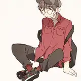
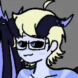
As far as making comics go I’ve experimented with a number of different styles, but for my main focal characters I use a combination of black inkwork outlines and painted tones, to help them stand out from complex painted backgrounds. This is a bit more time-consuming but it also tends to make my compositions look sharper, but I can’t reasonably make tiny little outlines for everyone in the backgrounds of my comics or it’d take twice as long for me to get them out than it does now! So when I need to fill a background with figures I’ll knock them out quick using a no-sketch no-outline method of knocking out painted figures with just my brush- they don’t have to look perfect, if they’re in the background then a little jankiness will make them seem more outside the camera’s focal range- but they have to be readable, painterly and most important of all, speedy. So to demonstrate I did a quick Scratch Paint painting of Lizzie, at the top of this page. If you click the download paperclip on this article you can download an animated overlaid version so you can spot the minute changes easier. Here’s a breakdown of the process, from left to right, top to bottom:
The first step in my Scratch Paint Method is to block in my figure’s major shapes with the brush. This is quick and dirty and usually very simple, and I’ll leave little gaps around shapes to help them stand out easily. Blocking it in doesn’t have to be perfect, it just has to establish how much space your figure is taking up and build a sense of how their weight is settled and how they’re postured. Here I started a block-in of Lizzie sitting down writing in her notepad, so I began by drawing her shins and feet cross-legged. Behind that I modeled in her hips where her butt is on the ground and gave her torso a slouchy angle to show how her weight is settling- she’s leaning forward, not sitting upright. The notebook was an important shape so I splotched that in and gave her head an egg shape to show she is looking downish, so we’ll see more of the top of her head. Since Lizzie wears bangs I’ll often block in one of her hair strand chunks just to establish where her hair will be. That’s the basic start of the quick scratch painting.
Once I’ve established the basics the next thing I’ll do is flesh out the silhouette into something close to what I see the finished product looking like in my head. Going by these two examples at the top of the page it might look like I just erased a lot of detail markers I established in the first stage, but in my head while I’m fleshing things out I’m visualizing where certain features will be anyways. For example, when I blocked in the torso and drew the little notch where Lizzie’s workshirt sleeve will be I noted in my head where her arm will go, since her left hand is the one holding her notebook. I “covered up” the notebook but I also established that the top page flips backwards- I know the width of the book and the angle it comes down at. I blocked in this black thing on the right side of the notebook because, I think that was a hand holding a pencil, but it ended up being more fittingly a place for the right arm to come down from the shoulder. I also fleshed out the shape of her face and added the little bits on the back of her head that help reinforce the notion that she’s looking down. And so I have my silhouette!
Next thing on the list is to take my silhouette and begin establishing major shapes and values inside of it. There are three ways I’ll usually do this, depending on the context and my general compulsions at the time: if you start with a midtone silhouette (greys) you can flesh out your lights and darks, but this can take a while, so I’ll make the silhouette either all black or all white and lighten or darken from there. Here I’m keeping it all black and building up my lighter greys on top of that, since its a demo on a white background. Also- since I work in Photoshop I’ll have these figures on their own layer, and if I ctrl+click that layer in my Layers window it will highlight everything in the layer, and then with ctrl+h I’ll hide the dotted line animation (known as ants) and now I can paint with impunity and not worry about going outside of the line! I’ll actually alternate between selecting and deselecting areas depending on if I’m painting in shapes or making changes to the silhouette. Keeping those lines from earlier fresh in my head I blocked in a really quick set of shins and an arm cutting across the torso. The hand is sorta holding the notepad, and I defined the cover in my shapes. I blocked in some hair and a face and generally set up where my major lines, shapes and values are going to be. Nothing about this process is set in stone so I’m constantly making changes, and thanks to the digital format that’s incredibly easy to do on the fly. I decided I didn’t like the angle of the shins I had in my original mockup so I highlighted her left shin, ctrl+T rotated it a little bit and welded the seams with flat colors (“weld the seams” is my term for when you make Transform tool changes and gaps in the art show up.). I also didn’t like the expressiveness of the pen writing in the notebook from this angle since the notebook was covering the pen and the whole hand, so I erased it and knocked out a hand resting the pen on her chin. You can see that weird black shape from earlier did end up becoming her other arm. I’ve also started establishing where my light is coming from and where the shadows will go- it’s coming in from over her left shoulders to I made a couple marks on her hood to indicate this for later.
With our basic shapes blocked in it’s time to start fleshing them out into three-dimensional forms, so I start to develop geometric facets to my figures and figure out where the light might catch the subject’s features at different angles. The first thing I did was I put a bit of light contour on Lizzie’s cheek to give her a facial plane and a taper around to the sides of her face. I also gave her a bit of an angled shadow in front of her face, since her hair has mass it casts a bit of shadow, I like to put a bit of shade I evened out the darkness on her shin and brought out the grey on her knee and thigh, to show that her leg is coming forward and hooking around- since the light is coming from the top right back, then the facets at the front, left bottom will be dark and consideration is made for light reflecting off of surfaces onto the backside, and so on. I gave her fingers on her left hand a bit of shadow to show where they bend and how they’re gripping the notepad. I also started blocking in minor details like her nametag and her gunbelt, since I had the basics established it’s easy to just plop that in overtop where I know its supposed to go. The original block-in of her left arm was sort of incomplete so I made some adjustments and fleshed it out, giving it depth and contour. Since Lizzie wears a workshirt over another shirt I like to make a little shape with the shadow just under the workshirt sleeve to show it’s on top and sort of hanging over it a bit- it gives a sense of depth and dimension which I find quite nice. One other thing I like to do is use a rim of highlights in hair; I find this is a good way to imply the roundness of the head, by indicating the shape of the skull in a ring of light incorporated into the design, showing that it isn’t a flat block, it has shape.
Once we’ve done a bit of modeling in our figure we can start what I like to call “the fun part”. This is where I take all the groundwork I laid out and just start fleshing it out into proper details! Here I’ve brought out the darkwork in the hair to make it look a bit more ragged and gave the ear some detail- using highlights in some parts I can imply a sense of geometric dimension, such that you can see which facet is the “top” by just blotching on a spot of highlight. I didn’t like Lizzie’s expression before so I made it more thoughtful, and since the corner of her mouth is lifted I gave a bit of cheekline just under her eye, where her mouth muscles would be pushing up on that part of her face. I made some modifications to the left arm in consideration of where the highlights are coming from- since the light comes in from the left side I figured it’d make more sense if the left side of the upper arm received highlight and the inside of the arm was in shadow. I added a couple flipped pages to Lizzie’s notebook to give it a more interacted aesthetic and I cast a bit of shadow from her knee onto her left hand. There are two key details in the painting of her legs I’d like to point out: one is when I’m drawing pants I like using the side seam as a contour to help further define the direction and dimensions of the legs and I find that line really adds a lot of dimensional emphasis if its contoured right. The other is rim lighting- when I’m working in dark areas I’ll add a bit of a rim light line to the outside to help define the shape in the darkness, and to help indicate the reflected light coming on from behind that part of the body. Rim lights are just faint little lines but they do wonders towards making things pop. Since I’m adding details I also added the magazine pouches to Lizzie’s belt and fixed the lighting on the cuff of her sleeve- originally the forward-facing rim of the sleeve just before the cuff was highlighted, but that didn’t make any sense given my light direction so I made it shadow and worked the highlights into the upper arm, and the result looks much better.
The last and final stage is the noodle stage, or where I’ll noodle around with final little details and make tiny changes before deciding I’m done. This noodling usually involves deepening light/dark contrasts- I’ll make some dark areas darker and take my pure-white highlights and lightly spot that on the high points in my figure, to help bring out the dimensionality. One thing I noticed stepping back was I drew Lizzie’s legs too big and I wasn’t satisfied with the proportions, so I used a lasso tool, highlighted her arm, notepad, shoulder and head and expanded them out a bit bigger, and then welded my seams and arrived at a final proportion I like. I used my eraser to do a bit of trimming underneath the hips, behind the feet, since I didn’t really focus on that area at all during the painting. Whenever I draw Lizzie or Monday the whites in their red features are always the last things I do, as sort of an “I’m done” capstone- here she’s replaced her Union Jack with a Jolly Roger, and so I decided its done!
All in all it took about 40 minutes to knock out this example illustration. Background characters aren’t always fleshed out this deeply, since they’re usually pretty tiny relative to the page dimensions and all that detail would be lost, but the Scratch Paint Method is also one of my favorite ways of doodling for fun between pages, and it’s how I made all my Three Color Critter illustrations (see Patreon Milestones for reference links). If something doesn’t warrant going through the trouble of penciling, inking, flatting and painting I’ll just take my paintbrush and paint it from scratch, hence the name. It’s a lot of fun and it’s one of my favorite ways to work, and if you’re an artsy type you can maybe give it a try yourself sometime.
Thanks for reading!