My comics are usually very visually dense. I’ll pack as much detail into the backgrounds as I can basically all the time. But even as noisy as my pages might get, I’m always thinking about the negative space of my compositions, so this week I’d like to write a whole bunch of words about nothing.
When I was younger I had a problem with some of the real-media drawings I would do on paper. I’d start with a central figure, which I’d draw just fine, but then I’d start to add some black-tone shading, but then I’d feel like the other side wasn’t detailed enough so I added a little more black, and soon I added a ground shadow to balance the internal shading, and the ground shadow led to ground texture, which turned into a perspective environment which then necessitated a sky and by the time I was done with my drawing I’d just about ruined the nice figure I had an hour ago. These were the years where I first began to really understand the importance of minding your negative space, and it’s something I’ve thought about ever since.
In general terms “negative space” refers to the space around a printed subject, and its relationship to the subject itself. You can see negative space used effectively in a lot of graphic design, where the white space around a black printed shape will imply a different shape in the context of the printed shapes around it. The most famous example of negative space is the FedEx arrow, where the space between the E and x form an arrow pointing forward. Another famous example of negative space is the vase made of two faces, or the two faces that form a vase, depending on which way you’re printing it. In any case, negative space is the implication of meaning built from the context of the creation of something else, such that the space which is “not used” becomes meaningful in itself, and as a part of the whole.
Negative space, in a broader sense, can be seen as areas of high detail concentration and areas of low detail working in tandem to define one another and create something greater than the sum of its parts. It’s a concept where an absence contextualizes the presence around it, or a presence gives meaning to the absence in its surroundings. Negative space is the silence between notes that turns noise into a song. It’s the horizon defining the sky and the sky defining the horizon.
That’s a whole lot of words for “the nothing is important”, but it’s a tricky concept to really nail down. In my old drawings my figures looked great before I ruined them because the blank space around them helped draw the eye to the subject, and let them assume their own spatial perspective. By marring that negative space with needless ink marks I ruined the pristine openness of it and dropped an anchor of definition into a space which was moments earlier an abstract contextualization of the thing I just drew, and that which was perfect was no more.
When it comes to comics, negative space is a great asset to keep in your toolbox for a number of reasons. The first, most practical and possibly the most abstract use is leaving yourself space to put text. When I make my comics I try to design a panel so it is visually balanced, with a clear position of where my focal subject is and leave enough space around them where I could later come in and give somebody something to say in a speech bubble. Speech bubbles are an unfortunate necessity in many comics because they represent an intangible concept but need to take up physical space in your shots so the reader can hear what’s being said. I tend to regard speech space as negative space, since I can’t put any visual focus in that space. The context of what’s in the positive space will help define what’s in the negative, and even though I cover parts of the panel in white bubbles the reader can still take in the page as a meaningful and consistent whole.
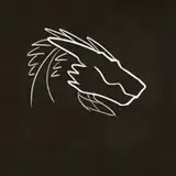
Another excellent use for negative space is what I like to call “quiet space”. If you mind your Rule of Thirds and frame your focal points correctly you can use empty space to convey a sense of stillness and quiet in your drawing. A light touch of detail can give negative space an atmospheric quality, and create a thickness of air or a sense of distance from your subject. Another more conceptual power of negative space is to create a feeling of isolation. You can create a very powerful sense of lonehood or solitary being by surrounding your subject in subdued negative space. I tried to capture all three of these concepts in the top drawing above. The “positive space” would be the area where the eye is drawn to, the darker detailed shapes, and the negative space is the quiet around it. I placed the key point of interest at the intersection of two lines which divide the panel in thirds, which is what the Rule of Thirds means, and this creates a balanced composition.
One of the other more-abstract ways I look at Negative Space in my comics is in laying out my panel borders. We fit most of our panels in a rectangle just for space efficiency but sometimes I’ll play with the panel shape to give the scene some extra contextual horsepower. A good example of this is pages 387 and 388 of the comic: to represent an oncoming tide of danger I made one panel a tidal wave, and then in the responding panel I shaped it like an explosion going in the opposite direction. When you are focused on a panel in a meta sense that becomes your positive space, and the panels you’re not looking at are your negative space, and you can use this to your advantage by shaping the panel in a way that conveys motion, direction or added meaning.
When working with negative space as empty space, it’s important to keep the balance of your image in mind. If your positive space is somewhere visually unappealing, like the dead-center of your canvas, and the surrounding space isn’t serving any contextual purpose or working with the positive at all, then you don’t have negative space, you have dead space. Dead space doesn’t do anything but take up space. You don’t want dead space, you want balance between positive and negative and visual harmony.
Negative space is a tricky thing to master, since it really feels like the opposite of drawing but as a meaningful addition to a drawing. It’s creating the unseen to be seen, and to give context to the also-seen. Sometimes, if it does its job right, people won’t even know it’s there…