As mentioned before, we got the last minute opportunity to go to ECCC in Seattle March 2-5, we weren't planning on having the chance to go this year since we were waitlisted so we're in the mad scramble to get something to share, which means the comic page is going to have to drop into first gear for a bit. I want to look out for you guys, though, so I got the sketch phase of the page out, and I'll talk a little shop for you, go beneath the surface on what I'm doing. Anyways lets get into it.
My comic has always had a sort of day/night cycle to it, where the sun comes up, things happen, the sun sets and the characters rest. I use these rest times as break points in the narrative, it feels like a natural way to give a long-form story a sort of footfall pace, like when they wind down to sleep you know the story is planting one foot and preparing to lift the other, and it creates locomotion. That's something I've always tried to achieve with my work and even though I'm on the slow pace these days it's something I try to maintain for the archive read, and the current comic point is the start of a new foot forward.
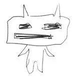
I've tried to make wardrobe changes at different points in the comic and I usually find these diurnal rest points are good times to do that. If you're strictly a comics patron, I've been working on the arcade game about the comic for a while and I made some outfit changes, mostly minor ones. I've been slowly trying to bring the comic cast in line with those changes which is why Lou switched from his knit cap and goggles back to his backwards hat, for example, but this page features a case I wanted to give a bit more meaning to.
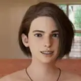
At some point I tried drawing Lizzie's bandanna with a different design on it since over time the Union Jack felt a little off but it was what it was and I couldn't change it. It was always meant like a reminder of home, and keeping her family on her mind. As the comic has progressed, though, her home and her family have shifted slightly, so I thought it would be appropriate to reflect that, and since Alice was the one who put the medical cross on their shirt backs I could rewire a retcon and say like, "I made this for you but didn't know when would be a good time to give it to you", and the diurnal new-day beat creates a good opportunity for that. Lizzie's bandanna has always been very iconic to her character, she's worn it the whole comic and it's one of the only two red items in the whole comic, so if I was going to change it it had to be meaningful, and I think Lizzie's growing friendship with Alice is meaningful enough that I could make the switch. Also, as an aside, for a long time I've had Lizzie wearing pants that had zip-off lower quarters, like they zip into capris, but no one ever understood what they were, so in the game- and in the comic- I'm deciding she found a more regular pair of pants. The tassles on the zippers for the zip-off capri pants were fun to draw when she was in motion but if it doesn't communicate well, well.....
This page was originally in my notes as two pages, one that was sort of a quiet introspective about still getting called into work and the second which was the above page, but I realized that the first page was unnecessary so I compressed the two into one and left a lot of stuff on the cutting room floor. The top two panels, in particular the camera shot moving back into the apartment from the front door towards the kitchen route to their bedroom, directed by the angle of the sunlight coming in the window, give that sense of motion and transition I had a whole page dedicated to in my notes, and it works much better compressed into one. If you make comics, or you're interested in storytelling, I think this is one of the most valuable skills to have- know when to cut, know when to compress. Don't be afraid to throw out something you wrote, making things is a messy affair and writing is no different. Make big cuts, get your hands dirty, keep it lean and you'll be better off in the long run.
Panel layout is another big thing to learn, and I think there's some features on this page I can reference to talk about that. The English-speaking human eye reads from left to right, top to bottom. We scan visual language the same way we scan sentences in a paragraph, there's a natural flow to how the eye moves across a page and it is imperative that you work with that flow, that you respect and serve nature and try not to demand your reader break what comes easy to accommodate whatever you're doing. This doesn't mean don't make cool layouts- lord knows I've done some zany things with panels- but experiment and build these novel layouts *with that reader flow in mind*!! When I start a page the very first thing I always do is divide the page with my major horizontal borders. The thickest borders are always the horizontal ones and I always start dividing into three or four rows before I do anything else. What this does is it creates "paragraphs", where the panels within that paragraph are read left to right, top to bottom before you get to the big consistent horizontal break line beneath them, and you know to move down to the next row. Throughout the ten years I've been making comics this has always been the foundation of how I built pages, creating my rows and subdividing panels from there, because this serves the way the eye scans the page.
One problem I came across in building these visual paragraphs, however, is when I have a set of four panels in a quadrant layout, like the bottom third of the page above. If you arranged them evenly, like so: [-|-] then you have a consistent horizontal line beneath the top two panels, which implies scanning from top left to top right (remember it's left to right, top to bottom; not top to bottom, left to right). But in that layout, since its within our initially divided third of the page, we could also read from top left to bottom left- if the rightmost panels were one solid panel this would be the natural flow. So you can see the confusion in creating a quadrant grid in your panels, how do you solve this to ensure readers are guided where they need to go?
My solution over the years has been to break the horizontal line so it can't be mistaken for a paragraph, and to put the left half lower than the right half. The way I see it, when you read the top left panel and get to the bottom right corner of it, you hit a wall. The panel to the right of it is up and over, the panel immediately connecting that corner is the bottom right, so jumping there would skip two other corners of the paragraph and we wouldn't naturally do that. Instead we move to the top left of the panel below us, and from there we can move to the top left of the top right panel from the bottom right of the bottom left, ensuring we read the panels in the right order. If the panels were reversed and the horizontal border on the left was higher than on the right, when we get to the bottom right corner of the top left panel we have a big open border into the top right panel, and that guides the eye away from the bottom left. It's in breaking up the horizontal to put that wall in the way that we can guide the eye where we want it to go, by following how it wants to move.
I'm going to switch to focusing heavily on gamedev for February but I'll be posting all of those updates for everyone to read, so you may be seeing something different from what you're used to if you've never been a games patron. I opened up my previous games post if you'd like to go back in the timeline and have a taste of what this entails.
Thanks for sticking with me!
Kit
2017-01-25 23:31:57 +0000 UTC