This week feels like it went by super quickly, like I was just here yesterday typing up last week's report. I got a bit done but it doesn't quite feel like it's as much as I wanted to. I have been sorta mentally checking the one-month mark from the previous page I posted as a "don't you dare delay beyond this point" marker and that point is two weeks away so I think I'll be fine on this one. I'm nearly at a gamedev milestone with Lizzie's attack animation coloring so I have a lot more mental space to focus on getting this comic wrapped up- I expect I can have it done this week- but until then let's look at what I've been working on this week.
I expect this shouldn't be too difficult a page to finish, fingers crossed, partly because of the way I have my backgrounds frames. There is depth to the shots but a lot of them only have like two or three building facets in the backgrounds, compared to the previous update where the penultimate pair of panels were shots down a long road full of building facets. That's sort of my rule on page speed, is how few walls I have to paint behind my characters, with the "Monday And Lizzie Chat" a few scenes back in the diner being the extreme end of just painting in one wall behind chest-high panel cropping. Two of the panels on this page are basically freebies- the second one with flat-tone Mondays in the background and the bottom one which is an excited burst design instead of a dynamically-lit 3D space. For a six-panel page four out of six isn't too bad to work with.
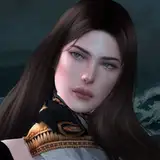
Over time my art style has evolved a lot, and I feel like right now it is evolving again having bounced back over from working on game sprites. I'd been on a very facets and shapes bend lately but I've felt like I'm swinging back to blending those facets a bit more like how my old style looked and the result is looking really sharp and clean. Like this panel in particular:

I really like how this shot came out and I want to recapture this feeling moving forward. Like, the blended way the lighting on Lizzie's hood looks while still retaining a faceted definition between the top and the side faces, and the smoothness on her face while still having facets defining her cheekbone and muzzle shape. It might seem like a small thing but I really like this direction and I want to try to consciously follow it. Also! Another small detail I don't remember if I pointed out but this is a good panel to highlight it: in my game sprites I needed to find a way to represent the shirt pockets on Lizzie's button-up Dickies shirt, and the solution I came up with there was to draw rectangles representing the tops of the pockets rather than the whole squares, so I started importing that technique into the comic here and I think it looks nice and clean.
I think that's what I got for you today. I have some gamedev art to share in the article after this one but I'm gonna try to get as much of this page done this week as I can. Thanks for your patience with my work, hopefully I'll be back sooner than later with the textless page to share.