Krea parfait Process
Added 2024-06-25 12:04:47 +0000 UTCThis drawing was meant to be very straight forward! Start out with a sketch and get a rough feeling for the colors, this time I did it twice.

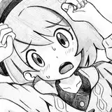
Since I knew I wanted to do it on watercolors I also figured it would be a good idea to test out some collage elements, the sketch turning out like this, very cute!

Now that I have a printer I can sort of skip the penciling step, I clean it up on my PC and print it out for it to be inked over. I have a light mat which is very handy!

I decided to scan the inks just in case I screwed up really badly so I could have them as a back up lol

And so far so good, no real issues during most of it. But once I started getting closer to the finishing line I started feeling a bit dissatisfied with how the picture was coming out.

The colors weren't as soft as they had in the sketch, and the washi tape elements didn't really click with me. I figured I overdid both the paint and tape in some aspects so I tried to correct it as best as I could.

The picture was borderline done and I was still not happy with it, but I decided to just finish it for the sake of it.

Comparing it to the original sketch two things instantly came to mind:
Krea's boots were a mistake to have added, her white legs added a lot of needed contrast to all the collage behind her, and the colors weren't as vibrant as they originally were.
Strawberry parfait day was on the 25th and I had finished this on the 22nd, so I still had an extra day to give it another shot, so I did!
From the get go I didn't want to just try to do the exact same thing I had before and expect different results, so I didn't even use the same type of paper. The original picture was made with a hot press sheet, which has a much smoother texture compared to cold pressed paper.
Due to this instead of inking it I chose to draw it with color pencils, as something else I noticed looking back at the sketch was that the brown ink I had originally used gave everything a more uniform look compared to the harsher black

Cold pressed paper seems to be way better at handling water, which makes mixing colors way easier, if a bit tedious considering the ammount of wait, but it was worth it! The colors felt much more accurate to how I originally envisioned it.

I was having so much fun combining colors that I accidentally ended up overdoing what little background there was, so in the end I opted out from using washi tapes as they would just cover what I had done.

The process was much more easy to go through, compared to the original I just felt more and more satisfied the further it went along.

After being done with the painting I gave the linework another touch up, this time with a variety of color pencils, and after that I could call it done!

I think both pictured turned out fine, although I do greatly like the latter way more than the former. At the very least it was a good learning exercise! I need to buy cold pressed paper in bigger sizes, even though both drawings are based from the same printed sketch, you can clearly tell Krea barely fits on one of them lol..

And that's it! I will try to remember to keep taking pics during the process of traditional drawings so I can share them..
Comments
I enjoy traditional more! I just don't do it as often lol
mogy
2024-06-26 01:33:21 +0000 UTCWow! thank you so much for sharing your process! i had no idea that you did any of these tradtionally and just assumed it was all digital works, imo both are super impressive and i love them so much! ^w^
Issun
2024-06-25 15:52:50 +0000 UTC