![сЃЕсЃєсЃЃсѓ»сѓ╣сЂфсЂЕсЂ«ТЈЈсЂЇТќ╣ "How to draw latex" [#1]](https://img5.samsuka.com/storage/3/hl/qf/c6f9d9-019e8c09-0569-7080-80ea-dda7bbe68f84.png)
![сЃЕсЃєсЃЃсѓ»сѓ╣сЂфсЂЕсЂ«ТЈЈсЂЇТќ╣ "How to draw latex" [#1]](https://img5.samsuka.com/storage/10/ou/az/c6f9d9-019e8bde-da9b-703b-ae07-e7e7859b1b98.png)
![сЃЕсЃєсЃЃсѓ»сѓ╣сЂфсЂЕсЂ«ТЈЈсЂЇТќ╣ "How to draw latex" [#1]](https://img5.samsuka.com/storage/6/wk/wa/c6f9d9-019e8bde-daa1-72d9-b7e8-4856c09c4ab1.png)
![сЃЕсЃєсЃЃсѓ»сѓ╣сЂфсЂЕсЂ«ТЈЈсЂЇТќ╣ "How to draw latex" [#1]](https://img5.samsuka.com/storage/11/lx/ry/c6f9d9-019e8bde-daa2-7daa-8290-816b443110b3.png)
![сЃЕсЃєсЃЃсѓ»сѓ╣сЂфсЂЕсЂ«ТЈЈсЂЇТќ╣ "How to draw latex" [#1]](https://img5.samsuka.com/storage/2/pw/ye/c6f9d9-019e8bde-daa7-71ac-b156-db16f90e5485.png)
![сЃЕсЃєсЃЃсѓ»сѓ╣сЂфсЂЕсЂ«ТЈЈсЂЇТќ╣ "How to draw latex" [#1]](https://img5.samsuka.com/storage/7/zu/yw/c6f9d9-019e8bde-daaf-7fa5-91e2-e44f857436fd.png)
![сЃЕсЃєсЃЃсѓ»сѓ╣сЂфсЂЕсЂ«ТЈЈсЂЇТќ╣ "How to draw latex" [#1]](https://img5.samsuka.com/storage/2/ok/qh/c6f9d9-019e8bde-dab8-7544-a8b3-0b5b3db12ce3.png)
![сЃЕсЃєсЃЃсѓ»сѓ╣сЂфсЂЕсЂ«ТЈЈсЂЇТќ╣ "How to draw latex" [#1]](https://img5.samsuka.com/storage/4/ua/hz/c6f9d9-019e8bde-dac3-7351-9df2-fb93b18e538c.png)
![сЃЕсЃєсЃЃсѓ»сѓ╣сЂфсЂЕсЂ«ТЈЈсЂЇТќ╣ "How to draw latex" [#1]](https://img5.samsuka.com/storage/9/ka/xs/c6f9d9-019e8bde-dac6-7f45-8c6f-e005c9af343b.jpg)

сЂЊсѓЊсЂФсЂАсЂ»сђѓ
С╗ітЏъсЂ»Тћ»ТЈ┤сЃЌсЃЕсЃ│тљЉсЂЉсЂФтАЌсѓіТќ╣УДБУфгсѓњСИісЂњсЂдУАїсЂЇсЂЪсЂёсЂеТђЮсЂёсЂЙсЂЎсђѓ
PSDсЃЋсѓАсѓцсЃФсѓѓСИісЂњсѓѕсЂєсЂІсЂеТђЮсЂБсЂдсЂёсЂЪсЂ«сЂДсЂЎсЂїсђЂуёАТќГУ╗бУ╝ЅсЂфсЂЕсѓѓсЂѓсѓІсЂеУЂъсЂёсЂЪсЂ«сЂДсђЂжЁЇтИЃсЂЌсЂдсѓѓТДІсѓЈсЂфсЂёсѓѕсЂєсЂфсЃЋсѓАсѓцсЃФсЂФжЎљт«џсЂЌсѓѕсЂєсЂеТђЮсЂёсЂЙсЂЎсђѓ
уЈЙтюетАЌсѓіТќ╣сЂїт«їтЁесЂФтЏ║т«џсЂЋсѓїсЂдсЂёсѓІсѓЈсЂЉсЂДсЂ»сЂфсЂёсЂ«сЂДсђЂС╗ітЙїтцЅсѓЈсЂБсЂдсЂЈсѓІтЈ»УЃйТђДсЂ»сЂѓсѓІсЂеТђЮсЂёсЂЙсЂЎсђѓсЂЮсЂ«та┤тљѕсЂЙсЂЪУДБУфгсѓњСйюсѓісЂЪсЂёсЂеТђЮсЂёсЂЙсЂЎсђѓ
УДБУфгсЂФСй┐сЂєсѓцсЃЕсѓ╣сЃѕсЂ»С╗ЦтЅЇсЃфсѓ»сѓесѓ╣сЃѕсЂДсЂёсЂЪсЂасЂёсЂЪсѓбсЃфсѓ╣сЂет▒▒жбесѓњтЈѓУђЃсЂФсЂЌсЂЪсЂёсЂеТђЮсЂёсЂЙсЂЎсђѓС╗ітЏъсЂ»сѓбсЃфсѓ╣сђЂТгАтЏъсЂ»т▒▒жбесЂ«жаєсЂДсЂЙсЂџсЂ»УДБУфгсЂЌсЂЙсЂЎсђѓ
сЂЮсѓїсЂДсЂ»ТюгуиесЂФтЁЦсѓісЂЪсЂёсЂеТђЮсЂёсЂЙсЂЎсђѓ
English descriptions will follow at the end. The description numbers are set to each screenshot.
тЈѓУђЃсЂЙсЂДсЂФт«їТѕљсѓцсЃЕсѓ╣сЃѕсѓњсЂЙсЂџУ╝ЅсЂЏсЂЙсЂЎсђѓ
1)
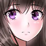
сЃЎсЃ╝сѓ╣УЅ▓сЂ«уіХТЁІсЂІсѓЅсђѓ
тАЌсЂБсЂдсЂёсЂЈсЂєсЂАсЂФУЅ▓сЂїТ«хсђЁТ┐ЃсЂЈсЂфсЂБсЂдсЂёсЂЇсЂЙсЂЎсЂ«сЂДТюђтѕЮсЂ»Т»ћУ╝ЃуџёУќёсѓЂсЂ«УЅ▓сѓњтЁЦсѓїсЂдсЂёсЂЙсЂЎсђѓ
Сй┐ућесѓФсЃЕсЃ╝сЂ»ТюђтЙїсЂФсЂЙсЂесѓЂсЂдУ╝ЅсЂЏсЂЙсЂЎсђѓ
2)
№╝Љтй▒сЂесЂЌсЂдсЂЙсЂџсЂ»т░ЉсЂЌтйЕт║дсЂасЂЉСИісЂњсЂЪУЅ▓сѓњсђїжђЈТўјТ░┤тйЕсђЇсЂфсЂЕсЂ«Т░┤тйЕсЃџсЃ│сЂДтЁЦсѓїсЂЙсЂЎсђѓ
сЃгсѓцсЃцсЃ╝сЂ»С╣Ќу«ЌсЂ«СИЇжђЈТўјт║д30%сЂДсЂЎсђѓ
№╝Љтй▒сѓњтЁЦсѓїсѓІу«ЄТЅђсЂ»тй▒сЂїсЂІсЂІсѓІсЂасѓЇсЂєсЂфсЂесЂёсЂєжЃетѕєсЂФсЂќсЂБсЂЈсѓісЂеТ║ђжЂЇсЂфсЂЈтЁЦсѓїсЂЙсЂЎсђѓтЁЅсЂїтйЊсЂЪсѓІжЃетѕєсЂ»сЂАсѓЄсЂБсЂесЂасЂЉТ«ІсЂЎТёЪУдџсЂДсЂЎсђѓ
3)
ТгАсЂФ№╝њтй▒сЂесЂЌсЂдтйЕт║дсѓњСИісЂњсЂдсђЂТўјт║дсѓњСИІсЂњсЂЪУЅ▓сѓњС╣Ќу«ЌсЂ«30%сЂДтЁЦсѓїсЂдсЂёсЂЙсЂЎсђѓ
сЂЊсЂЊсЂДсЂ»сђїТ┐ЃсЂёТ░┤тйЕсђЇсѓёсђїGсЃџсЃ│сђЇсЂфсЂЕсѓњСй┐ућесЂЌсЂдсЂёсЂЙсЂЎсђѓ
№╝њтй▒сѓњтЁЦсѓїсѓІжЃетѕєсЂ»Уљйтй▒сЂїС╗ўсЂЈсЃЮсѓцсЃ│сЃѕсЂФсЂќсЂБсЂЈсѓітЁЦсѓїсЂдсЂёсЂЙсЂЎсђѓ
GсЃџсЃ│сЂДсЂ»сЂЈсЂБсЂЇсѓісЂЌсЂЎсЂјсѓІта┤тљѕсЂ»сЂѓсѓІсЂ«сЂДсђЂсЂ╝сЂІсЂЌсЃёсЃ╝сЃФсѓѓт░ЉсЂЌтЁЦсѓїсЂдсЂёсЂЙсЂЎсђѓ
сЂ╝сЂІсЂЌсѓњтЁЦсѓїсѓІжЃетѕєсЂ»сЂфсѓІсЂ╣сЂЈтЁЅсЂїтйЊсЂЪсѓІсЂДсЂѓсѓЇсЂєта┤ТЅђсЂесЂ«тбЃуЋїсЂФтЁЦсѓїсЂдсЂёсЂЙсЂЎ№╝ѕсЂЪсЂасЂЌтЁеСйЊсЂФсЂ»тЁЦсѓїсЂџСИђжЃетѕєсЂ«сЂ┐сЂФсЂ╝сЂІсЂЌсѓњтЁЦсѓїсЂЙсЂЎ№╝ЅсђѓтцфсѓѓсѓѓсЂ«уюЪсѓЊСИГсЂѓсЂЪсѓісЂїтѕєсЂІсѓісѓёсЂЎсЂёсЂІсѓѓсЂЌсѓїсЂфсЂёсЂДсЂЎсђѓ
4)
ТгАсЂФ№╝Њтй▒сЂДсЂЎсЂїсђЂсЂЊсѓїсЂ»№╝Љтй▒сЂе№╝њтй▒сЂ«тЁЦсѓїсЂЪта┤ТЅђсЂФТ┐ЃсЂЈтАЌсѓІТёЪсЂўсЂДтЁЦсѓїсЂдсЂёсЂЙсЂЎсђѓсЃгсѓцсЃцсЃ╝сЂ»жђџтИИсЂ«100%сЂДсЂЎсђѓ
уЅ╣сЂФУљйтй▒сЂїуЎ║ућЪсЂЎсѓІжЃетѕєсЂФсЂ»сЂЈсЂБсЂЇсѓісЂесЂЌсЂЪтй▒сѓњтЁЦсѓїсђЂсЂЮсѓїС╗ЦтцќсЂ»СИІсЂ«УЅ▓сѓњтАЌсѓісЂцсЂХсЂЋсЂфсЂёсѓѕсЂєсЂФсЂ╝сѓЊсѓёсѓісѓѓсЂЌсЂЈсЂ»сѓ░сЃЕсЃЄсЃ╝сѓисЃДсЃ│сЂїУдІсЂѕсѓІсѓѕсЂєсЂФТ░┤тйЕу│╗сЂ«уГєсѓёсѓесѓбсЃќсЃЕсѓисЂДтЁЦсѓїсЂдсЂёсЂЙсЂЎсђѓ
тидУЁЋсЂ«Т┐ЃсЂёжЃетѕєсЂ»т▒▒жбесЂ«УЁЋсЂеТјЦУДдсЂЎсѓІжЃетѕєсЂДсЂЎсђѓ
сЂЙсЂЪсђЂжЮ┤сЂ«тй▒сѓѓсЂЊсЂЊсЂДсЂцсЂёсЂДсЂФтЁЦсѓїсЂдсЂёсЂЙсЂЎсђѓУЅ▓сЂ»жЮњу│╗ух▒сЂ«сѓ░сЃгсЃ╝сЂДсЂЎсђѓ
5)
ТгАсЂФсЃЈсѓцсЃЕсѓцсЃѕсѓњтЁЦсѓїсЂдсЂёсЂЇсЂЙсЂЎсђѓсЃгсѓцсЃцсЃ╝сЂ»сЃЈсЃ╝сЃЅсЃЕсѓцсЃѕ100%сЂДсЂЎсђѓ
сЂЊсЂЊсЂДсЂ»сђїТ┐ЃсЂёТ░┤тйЕсђЇсѓёсђїGсЃџсЃ│сђЇсЂДуЎйсЂФУ┐ЉсЂёУЅ▓сѓњтЁЦсѓїсЂдсЂёсЂЙсЂЎсђѓсЃЈсѓцсЃЕсѓцсЃѕсЂ«ТЏИсЂЇтДІсѓЂсЂеухѓсѓЈсѓісЂ«жЃетѕєсЂ»сЂ╝сЂІсЂЌсѓњтЁЦсѓїсѓІС║ІсЂїтцџсЂёсЂДсЂЎсђѓ
сѓисЃ»сЂФсЂфсѓІжЃетѕєсЂ»у┤░сЂЈтЁЦсѓїсђЂтЈЇт░ётЁЅсЂїсЂѓсѓІжЃетѕєсЂФсЂ»тцфсѓЂсЂФтЁЦсѓїсЂЙсЂЎсђѓ
6)
ТюђтЙїсЂФуЁДсѓіУ┐ћсЂЌсѓњтЁЦсѓїсЂЙсЂЎсђѓ
тѕєсЂІсѓісЂФсЂЈсЂёсЂ«сЂДсђЂуЪбтЇ░сѓњС╗ўсЂЉсЂЙсЂЌсЂЪсђѓ
уЁДсѓіУ┐ћсЂЌсЂ»СИ╗сЂФтцќсЂ«тЁЅсѓњтЈЇт░ёсЂЎсѓІжЃетѕєсЂет▒▒жбесЂ«жФфУЅ▓сѓњтЈЇт░ёсЂЎсѓІжЃетѕєсЂесЂД№╝њуе«жАътЁЦсѓїсЂдсЂёсЂЙсЂЎсђѓсЃгсѓцсЃцсЃ╝сЂ»жђџтИИсЂ«50%сЂДсЂЎсђѓ
сЂЊсЂЊсЂДсЂ»сђїжђЈТўјТ░┤тйЕсђЇсЂ«уГєсЂДТЈЈсЂёсЂдсђЂсЂ╝сЂІсЂЌсЃёсЃ╝сЃФсѓњСй┐ућесЂЌсЂдсЂёсЂЙсЂЎсђѓ
уЁДсѓіУ┐ћсЂЌсѓњтЁЦсѓїсѓІу«ЄТЅђсЂ»СИ╗сЂФСйЊсЂ«сѓесЃЃсѓИжЃетѕє№╝ѕсЂасЂёсЂЪсЂёуиџућ╗сЂДТЈЈсЂёсЂдсЂёсѓІжЃетѕєсЂ«У┐ЉсЂЈ№╝ЅсЂДсђЂуњ░тбЃтЁЅсѓњТёЈУГўсЂЌсЂдтЁЦсѓїсЂЙсЂЎсђѓ
сЂЙсЂЪсђЂтЪ║ТюгуџёсЂФсЂ»СйЊсЂ«СИІсЂ«жЮбсѓётй▒сЂїТ┐ЃсЂЈсЂфсѓІжЃетѕєсЂФтЁЦсѓїсЂдсЂёсЂЙсЂЎсђѓсЂАсЂфсЂ┐сЂФсђЂСИісЂ«жЮбсЂФсЂ»сЃЈсѓцсЃЕсѓцсЃѕсЂїТЌбсЂФтЁЦсЂБсЂдсЂёсѓІсЂ«сЂДсђЂуЁДсѓіУ┐ћсЂЌсЂ«та┤тљѕсЂ»сЂЮсЂ«жђєсѓњсѓцсЃАсЃ╝сѓИсЂЌсЂЙсЂЎсђѓ
жЄЉт▒ътЁЅТ▓бсЂ«сѓѕсЂєсЂфтЈЇт░ёсЂїсЂѓсѓІуљЃСйЊсЂ«сѓѓсЂ«сѓњУдІсѓІсЂесѓесЃЃсѓИжЃетѕєсЂ»ТўјсѓІсЂЈсЂфсЂБсЂдсЂёсѓІсЂЊсЂесЂїтцџсЂёсЂДсЂЎсђѓсЂЮсѓїсѓњУАеуЈЙсЂЌсЂдсЂёсѓІсЂесЂёсЂБсЂЪТгАуггсЂДсЂЎсђѓ
УЅ▓сЂ»тЈ│сЂІсѓЅжаєсЂФсЃЎсЃ╝сѓ╣сђЂ№╝Љтй▒сђЂ№╝њтй▒сђЂ№╝Њтй▒сђЂсЃЈсѓцсЃЕсѓцсЃѕсђЂтЈЇт░ётЁЅ№╝ѕтцќтЂ┤№╝ЅсђЂтЈЇт░ётЁЅ№╝ѕт▒▒жбе№╝ЅсЂесЂЌсЂдсЂёсЂЙсЂЎсђѓсЂЊсЂЊсЂІсѓЅУЅ▓сѓ╣сЃЮсѓцсЃѕсЂДсЂЇсѓІсЂесЂ»ТђЮсЂёсЂЙсЂЎсђѓ
сЂЊсѓїсЂДУДБУфгсЂ»С╗ЦСИісЂДсЂЎсђѓ
УЄфтѕєсЂДсѓѓсЂЙсЂасЂЙсЂаТћ╣УЅ»сЂ«СйЎтю░сЂїсЂѓсѓІсЂеУеђсЂѕсѓІтАЌсѓіТќ╣сЂДсЂЎсЂїсђЂтЈѓУђЃсЂ«СИђтіЕсЂФсЂфсѓїсЂ░т╣ИсЂёсЂДсЂЎсђѓ
сѓѓсЂЌсЂЈсЂ»сЂЕсЂєтАЌсЂБсЂЪсѓЊсЂасѓЇсЂєсЂеУѕѕтЉ│сЂїТ╣ДсЂёсЂЪТќ╣сЂФт┐юсЂѕсѓЅсѓїсѓІтєЁт«╣сЂФсЂфсЂБсЂдсЂёсЂЪсЂ«сЂфсѓЅтгЅсЂЌсЂёсЂДсЂЎсђѓ
С╗ітЙїсѓѓсЂЊсЂ«сѓѕсЂєсЂфУДБУфгсѓњтЁЦсѓїсЂдУАїсЂЊсЂєсЂеТђЮсЂБсЂдсЂёсЂЙсЂЎсђѓ
УдЂТюЏсѓёУ│фтЋЈуГЅсЂѓсѓісЂЙсЂЌсЂЪсѓЅсѓ│сЃАсЃ│сЃѕсЂДтЈЌсЂЉС╗ўсЂЉсЂдсЂісѓісЂЙсЂЎсђѓ
сЂЕсЂєсЂъсѓѕсѓЇсЂЌсЂЈсЂіжАўсЂёсЂЌсЂЙсЂЎсђѓ
English below.
*Here I am using Clip studio but the names of the brush may not match as I haven't checked the English version. I hope the names are something close to their names.
1)
from the base color.
The color will gradually become darker as you apply it, so I use a relatively light color at first.
The colors used are in the screenshot above.
2)
For the first shadow, first add a color with a slightly increased saturation using a watercolor pen such as "Transparent Watercolor".
The layer is 30% opacity of multiply.
When adding shadows, place them roughly evenly in the areas where the shadows will be cast. Leaving a little bit of the part where the light hits.
3)
Next, I increased the saturation as the second shadow and added a color with reduced brightness at 30% multiply.
Here, I use "dense watercolor" and "G pen".
2. The part where the shadow is put is roughly put in the point where the shadow is attached.
There are times when the G-pen is too sharp, so I also added a little blur tool.
The part to be blurred is placed on the boundary with the place where the light will hit as much as possible (however, only a part is blurred, not the whole). It may be easy to see around the middle of the thigh.
4)
Next is the 3rd shadow. Layer is normal 100%.
In particular, I add sharp shadows to the parts where shadows are generated, and other than that, I use a watercolor brush or airbrush so that the gradation can be seen so that the colors underneath are not painted over.
The dark part of the left arm is the part that comes in contact with Yamakaze's arm.
I also added the shadows of the shoes here. The color is blue-grey.
5)
Add the highlights next. The layer is 100% hard light.
Here, I used "dense watercolor" and "G pen" to add a color close to white. I often blur the beginning and end of highlighting stroke.
Use thinner lines for wrinkled areas, and thicker lines for areas with reflected light.
6)
Finally add the reflection.
It's hard to see, so I added arrows in the screenshot.
There are two types of reflections: the part that reflects the outside light and the part that reflects the hair color of Yamakaze. Layers are 50% of normal.
Here, I draw with a "transparent watercolor" brush and use the blur tool.
The parts where I want to add the reflection are mainly the edges of the body (roughly near the part drawn in the line drawing), and I put them in with the ambient light in mind.
Also, I basically put it on the lower face of the body and areas where the shadows are darker. By the way, the top side already has highlights, so if you want to reflect the light, imagine the opposite.
When you look at spherical objects that have a metallic sheen to them, the edges are often brighter. I guess that's what I'm expressing.
The colors are, from right to left, base, 1st shadow, 2nd shadow, 3rd shadow, highlight, reflected light (the edges), and reflected light (Yamakaze). I think you can use the eyedropper tool from the color history screenshot.
That's it for the explanation.
Although I can say that there is still room for improvement in the painting method, I hope that this will be a helpful reference.
Or, I would be happy if the content was able to respond to those who were interested in how it was painted.
I plan on adding more explanations like this in the future.
If you have any requests or questions, please leave a comment.
Nice to meet you.


